I am looking for Experience Design Internship for Summer 2020
List of Projects
Portfolio
Resume
About Me:
Hi, My name is Bowen 😛

I am currently a master student at UC Berkeley with a passion for experience design. I studied Computer Science as an undergrad at National University of Singapore back in 2016. After that, I spent the next 3 years working as a Business Analyst and Product Manager in the Finance and Technology industry in Singapore. My dream is to leverage my design and technical skills together with my diverse cultural background to create more appealing experience for users of the technology industry and themed entertainment industry.
There are two things that sparked my interest in experience design. The first one is the IDEO shopping cart video. When I first watched that video, I was impressed by its new way of problem solving using design thinking. I love the human-centered solution since I can tell how much the designers care about the users and details.
The other thing is my experience at Walt Disney World. When I went to Walt Disney World, I used my magic band on my wrist to enter the theme park, purchased a Mickey shape ice cream, and even used it to unlock my hotel room. During my 5 days at Walt Disney World, I truly enjoyed myself going everywhere with a simple magic band. This really inspired my interest in design wonderful experience for people.
I am a big fan of theme parks! I have been to all the Disneylands in the world except for the one in Paris. I have always touched by the breathtaking experience and amazing memories theme parks created. Hope I can create the magical experience to people!
Nice to meet you 😉
Design Manifesto
INFO 213 is the first design thinking class I take in school. During this model, I had great opportunity learning the design process and design methods systematically and practically. From empathy, define to ideate, prototype and test, we learn when to diverge our thoughts and when to focus on the solutions. The whole process is substantial and interesting. As a person from an engineering background, I used to obsessed about the emerging technologies and love to use technology to solve problems. After this course, I learned that novel ideas are important, but the more important step before the solution is to understand user’s needs. I am still very interested in emerging technology and ubiquitous computing. I want to combine the design process I learned together with my technical skills to create more products that benefit people. The following are 5 important things I learned throughout the class.
Firstly, it is very critical to identify users’ need. And it is important to talk to/interview wide range of target group users and empathized their needs. Because of the time constraints for our project, most of the time, we interviewed 4 people per group and these people are around Berkeley area. These interviewees may not truly reflect the needs from target user groups. For example, during my model 2 need finding phase, we try to find problems that vegan people are struggled with. Most of our interviewees stated that they have no problems of finding vegan restaurants in the Bay Area. However, this is not true for vegan people in the world in general. For country like Japan, my vegan friend need to take train to another town to purchase vegan friendly food. Another example is during my museum experience project, I interviewed 3 different ages people in BAMPFA. I noticed that the problem that they encountered at museums are different. The 64 years old visitor said, he had trouble in figuring out the opening time of the museums. However this is not a problem to the 21 years old college student at all. If we want to find the needs for general museum visitors, we need to interview more people who come from different backgrounds and with enough age diversity. Therefore, in order to fully empathize user’s need, we need to interview more people from the target users group and define their needs from there.
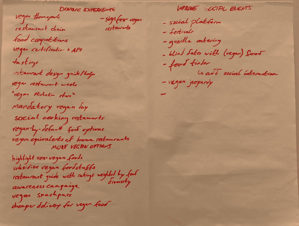
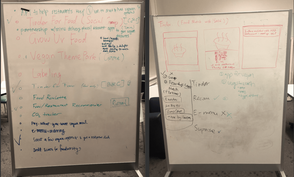
Secondly, be creative during the ideation phase. This is also my favorite part of the design process. Ideation allows us to go for quantity, defer judgement and these are the period where many good ideas arise. Throughout the course, we design our prototypes from rational choice to dark horse ideas. I love the ideation phases because at this time, people can think freely and there are lots of good discussion during this period. I remember during our “Vegan food” project ideation phase, we build up our ideas on each other’s ideas and the ideas flow! Even for the same “Food Tinder” idea, my group member and I think differently and we are able to combine our ideas in our final prototype. I love thinking widely and thinking about the extreme ideas. These are the starting point for new products to be invented.
Brainstorming: ideas
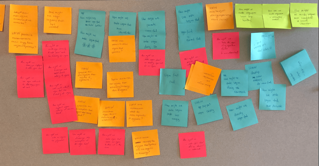
“How Might We” Statement
Thirdly, it’s all about users. User interviews and usability testing are great way to evaluate if the design satisfies user’s need. From user interviews, we use empathy map to find out user’s need. Empathy map serves a great way to summarize the main points of user interviews and identify user needs/goals. By combining different empathy maps, we are able to find out target user group’s needs. After ideation and prototyping, conducting usability testing is a good way to assess the design. During our usability testing for museum wearable product, users pointed out that there was no feedback for “saving the installation” function from our original wristband design. When we designed the wristband, these functionality seemed natural to us, and we forgot to add on the feedback to the products (unlike digital products, where it is easier to remember that if user clicks on some buttons, feedback needs to show on a screen). This caused users confusion of if they save their installation. Therefore, “adding feedback” is necessary for our future iterations. Usability testing of the prototypes is a good way to evaluate the design success. Only when we care about user centered design, understand user’s need and test out the prototypes with users, the final solution is able to solve user’s problem.
Usability Testing
Moreover, using different design methods to help you make design decisions. One good way to make design decision is to talk to users. During the usability testing of museum social app, I provided 2 designs (comment and emoji) to test out which way was preferred by users when they wanted to express their reaction on museum art piece. The result was emoji! Emoji provides more direct and instant way for visitors to express their opinions of an art installation. Asking about users opinions and then making your own judgement are great ways to make design decisions. Some other ways I tried during INFO213 that was helpful for me to make design decisions including: Design Critique, Brainstorming, Heuristic Evaluation, SWOT, Dot Voting. In museum social app design, each of my team members used Heuristic Evaluation developed by Jakob Nielsen to evaluate my ArtChat app independently. These help me to find out the usability problems in my UI design which I can further iterate on to make it more user friendly. In the “vegan food” model, we use SWOT and Dot Voting to converge our ideas. During the brainstorming session, we came up an idea of helping vegan people to find friends eating together with them and we had a lot of possible solutions around it. We listed out our proposed solutions, and then analyzed 1)how does each solution will help us achieve our design goal and 2)their limitations and risks. After the analysis, we eliminated solutions which doesn’t really match our design goal, combined some solutions to better serve our design goal and keep the remaining solutions. Then we used dot voting technique to vote for top 4 solutions that we wanted to pursuit to achieve our design goal. During the design process, there are always a lot of design decisions designers need to make, use those design methods: get critique from experts and always ask user’s perspectives, these will help designers to make better design decisions.
SWOT analysis and Dot Voting
Finally, It’s not all about design screens. People nowadays love to use mobile application to solve problems, however, solutions to solve problem should not be “screen based only” solution. When we use design thinking to solve problems, we should think it in more holistically way. During my museum experience iteration design, we try out AR solution in the museum for our first iteration, however, immersive interaction design should not be limited to screen based design, what if screen is the cause of the distraction in the museum? In the second iteration of the museum project, we aim to design a screen-less, touch based wearables to facilitate museum visitors to immerse themselves in the museum environment. Although the wearables solution may still have a lot of room for improvements, trying out solutions outside of phone based application is a good start. I also love our first design model topic where we design for friction, we usually design for convenience, how about design for friction? Maybe the best way to reduce the addiction to social media is not design another mobile application but something outside of the phone-based application. I love to design for experience. If we can think out of the box and design user experience as a whole, maybe the best solution is not another screen based mobile application and finding out that best solution is what we want to achieve from design thinking process.
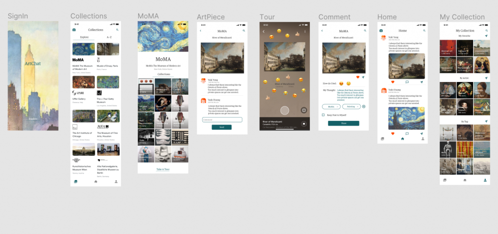
Museum experience design in Mobile App
Museum experience design in beyond phone based application
To sum up, I learned the design process and different design methods for design thinking during the course. I really enjoy the process and hope I can use user centered design to help more people/business solve their problems in the future.
Design Doc– Design for Iteration — Selah
Introduction:
In the final design project, we choose to continue on my model 3 museum project to design a better museum experience for visitors. In the previous model, we focused on exploring different pathways that users can interact with art and each other including AR feature, museum social chatting App, Museum interaction map. In the final project, we focus on the experience outside of a phone-based application with one objective in our mind to create a more immersive experience for museum visitors.
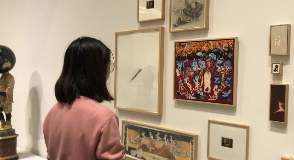
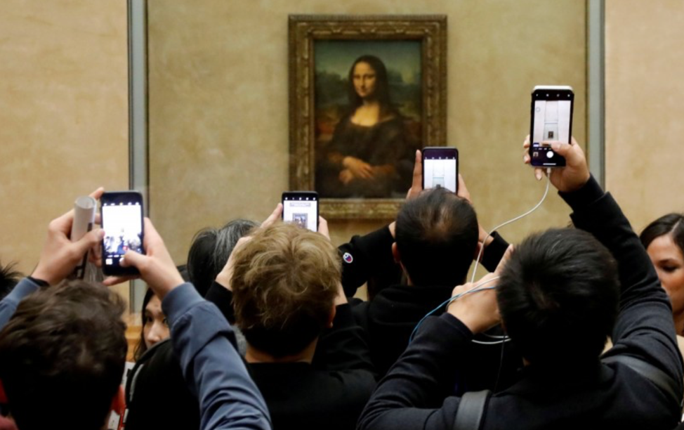
I love museums and art galleries very much. Some of my experience in visiting museum is not very pleasant. For example, when I visited Louvre, a lot of people were taking photos of the famous Mona Lisa. Instead of enjoying the paintings, visitors spent a lot of time trying to take a photo without too many other visitors in it. Besides, I love to dig out the stories behind those different installations in the museum. If the museum provides tour guide or audio guide, I will join those tour. However, the guided physical tour is not always available at the time I am visiting. And for audio guide, you need to pick up your audio guide in the specific place, select the language that you are familiar with. Then you need to pay attention to find out the art piece with either QR code or number, and use your giant audio guide machine to scan or input those code and listen to each story. These experiences are not very pleasant to me. Therefore, I would like create a more immersive experience for museum visitors.
Experience in Museum
Needfinding:
In order to fully understand what is the immersive museum experience to users, we conducted user interviews on four individuals who visit museums at least 4 times per year.
The target users are frequent museum visitors (visit at least 4 times per year) who are also familiar with new smart technology.
We asked interviewees “how do you interact with museum installations” “Experience of using audio guide in museums” to find out their current museum experience and their needs for ideal immersive museum experience. The detailed interview guide is here.
Interview Results and Key Insights:
User 1:
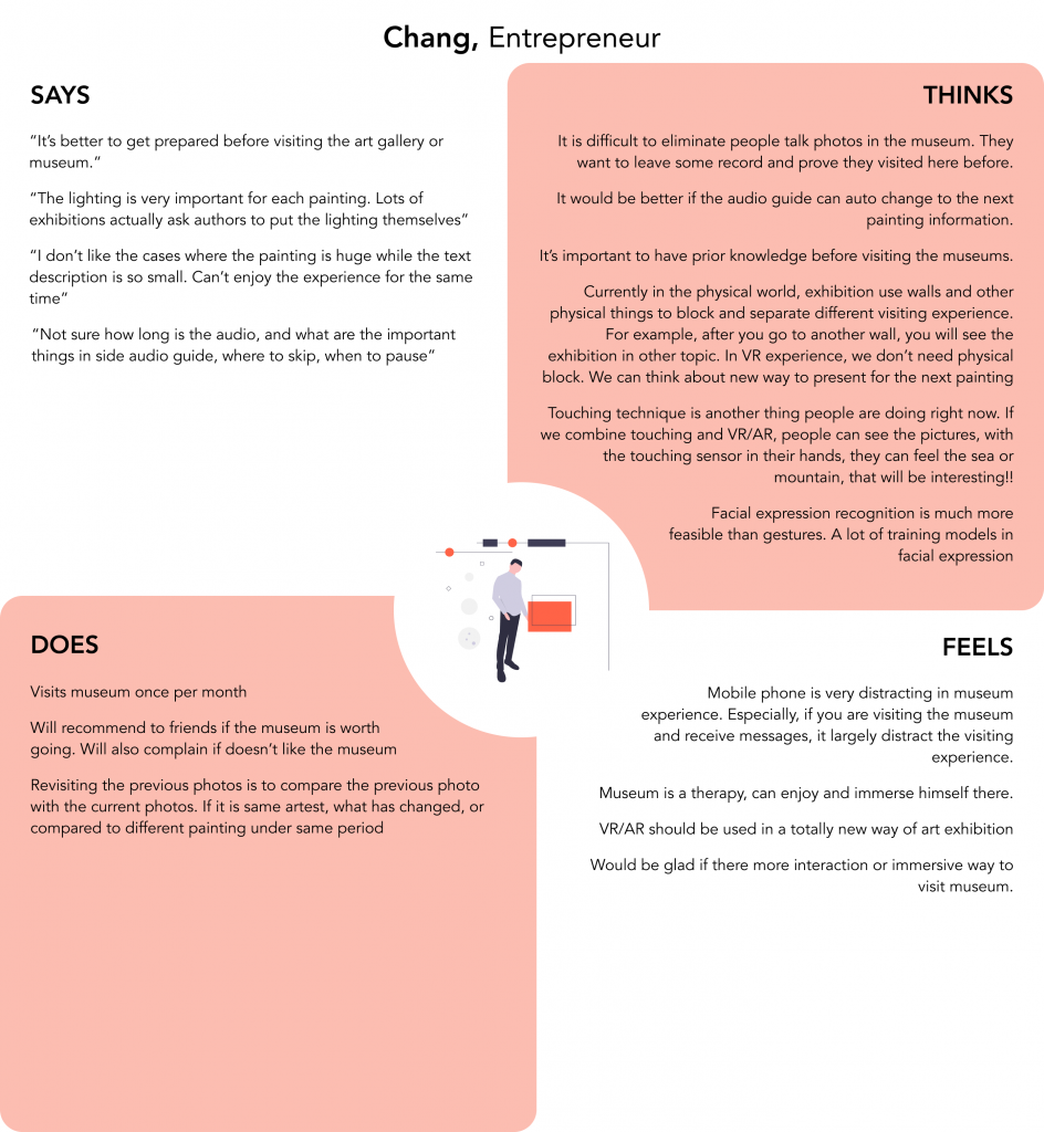
Name: Chang
User profile: Male, 23 years old, Entrepreneur. He goes to museum once per month.
Interview Notes: Interview Notes for Chang
Empathy Map:
Empathy Map for Chang
Key Insights:
Chang thinks that in order to fully enjoy the museum, it’s better to prepare the prior knowledge before visiting. Audio guide is a good way to introduce those background stories. However, most of the time, he is not sure how long is the audio, what are the information interest him in the audio guide and where to skip and when to pause of the audio guide. He wishes there is a way to auto play the audio guide when he approaches the next painting (instead of click in the number or scan the QR code with the heavy audio guide machine). He also suggests other ways of interacting with museum installation such as including touching sensor on special gloves in front of paintings so that visitors can feel sea (water), mountains etc. through the gloves. He feels mobile phone is very distracting for museum experience. If you are taking picture using your phone in the museum and see your friends message notification, you might easily be distracted by the notification. He also mentions one bad experience that he has in the museum where the painting is huge but the text explanation panel is so small and near the painting. He can’t read the explanation and enjoy the painting from a far distance at the same time.
User 2:
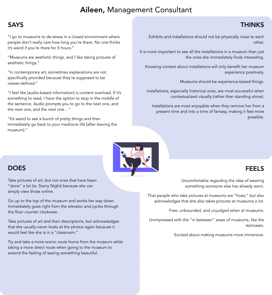
Name: Aileen
User profile: Female, 21 years old, Management Consultant.
Interview Notes: Interview Notes for Aileen
Empathy Map:
Empathy Map for Aileen
Key Insights:
Aileen thinks knowing the context about installations benefits her museum experience. Sometimes, she takes pictures of the installations and their descriptions but she never looks those photos again. She doesn’t like to see a lot of people taking photos in front of a famous installation but she acknowledges that she also takes a lot of pictures at museums.
User 3:
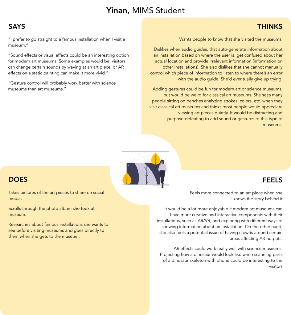
Name: Yinan
User profile: Female, 22 years old, MIMS student. She goes to museums twice per semester.
Interview Notes: Interview Notes for Yinan
Empathy Map:
Empathy Map for Yinan
Key Insights:
Yinan researches the stories behind those famous installations before visiting. She prefers the control of the audio guide including which piece of information to listen, where to stop. She feels different museums should have different ways of interactions (with installations). For example, AR might be suitable for science museums. Gestures based interaction might be weird for classical art museums.
User 4:
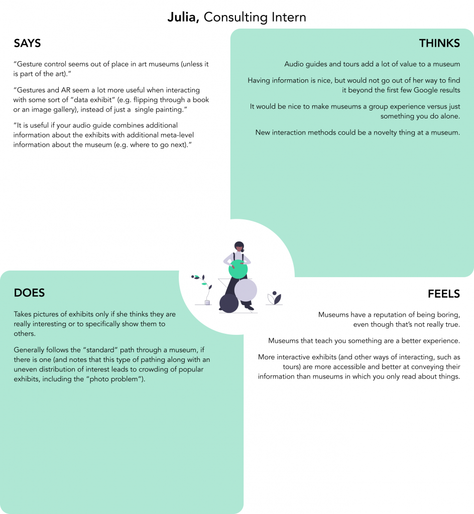
Name: Julia
User profile: Female, 18 years old, Consulting Intern @ Mercedes-Benz Powertrain. She goes to museums 4-5 times per year.
Interview Notes: Interview Notes for Julia
Empathy Map:
Empathy Map for Julia
Key Insights:
Julia suggests that gesture interaction inside art museums is a little bit strange. They are more suitable for data related installations. She thinks the audio guides and tour would add a lot of value to a museum visiting. She wishes to combine audio guides with additional meta-level information about the museum to make museums visiting in more guided and immersive way.
From the above 4 interviews, we noted several similar patterns:
- People are interested in the stories or backgrounds behind each installation. They would love to explore new immersive way to interact with installations.
- They often took photos (to share with their friends) during their visits to a museum but they don’t revisit those pictures after the exhibition. They notice that using phones may cause the distraction from the exhibition.
- They wish to have better control and easy to use audio guide.
- People prefer stress-free and distraction-free museum environments.
Based on those patterns, we identified following user needs to focus for our project:
- A discreet way to experience and capture museum installations without distracting others.
- A better way to control auditory experience at museums
These lead us to update our How Might We statement from:
“How might we make museums experience more immersive for visitors?” to
“How might we provide an immersive, yet stress-free museum experience for visitors without distracting others?”
Ideation
We started the ideation process with 3 what-if questions:
- What if we could take advantage of screen-less technology to lessen distraction?
- Screen-less technology lessens distractions because people’s eyes are now focused more on museum installations. Besides, it may be more cost friendly (to museums) compared to screen based technology.
- What if we could facilitate control of audio guides via touch for a multi-sensory experience?
- When museum visitors visually enjoy the installation, audio makes their experience more immersive. Besides, touchable control of audio guide also provides visitors better control of their audio experience.
- We could utilize personal, discreet wearables so that users do not distract others as well
- Personal, discreet wearables do not distract other visitors at the museum as opposed to large-scale interactions like gestures
Based on the above 3 what-ifs, we further shape our ideas based on the following directions/decisions:
The product is a museum-provided wearable that connects to the user’s phone via Bluetooth. We decided to not rely on users having, bring wearables which may cause multiple technical problems such as how to connect user’s devices with museum facility.
The product provides location based audio, which means based on location, certain music and audio clips are available for the specific installations. If users approach to the next installations, music and audio clips will automatically switch to the corresponding one. This will eliminate the troubles of finding out the number or QR code associate with the specific installation and input to the audio devices.
Users are able to control via touch commands on the wearable.
- Based on needs finding, we define the minimum number of necessary interactions that users can control on the wearable. Start/Stop, Play/Pause, Next/Previous audio section, Volume controls.
- We also introduce “Save” feature (Save installations to “view later” to make sure users can record an exhibit without having to interact with their phone, e.g. Instagram notification etc.)
If necessary, museums will set a specific space/room to teach visitors the touch commands they can perform on the wearable. When they leave that room, the phone goes to sleep mode, so that the user’s only needed interactions are via the inconspicuous wearable. They can fully enjoy themselves in the exhibitions.
Based on the what-if questions and design decisions, we develop our Low-fi and Mid-fi prototypes:
Low-fi Prototype
Low-fi Prototype
Mid-fi Prototype
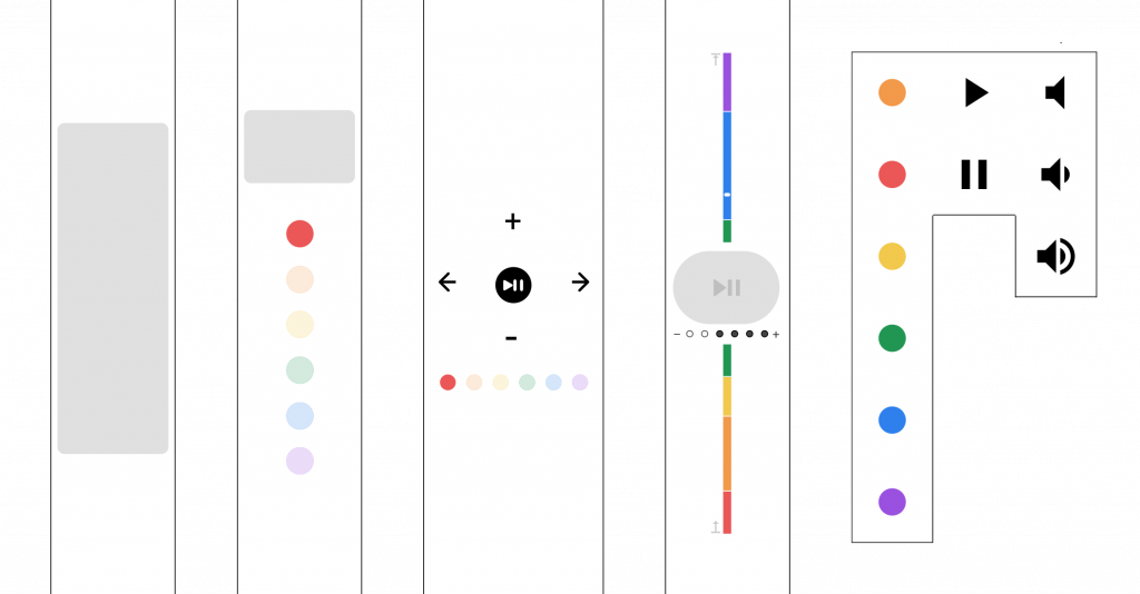
Mid-fi Prototype
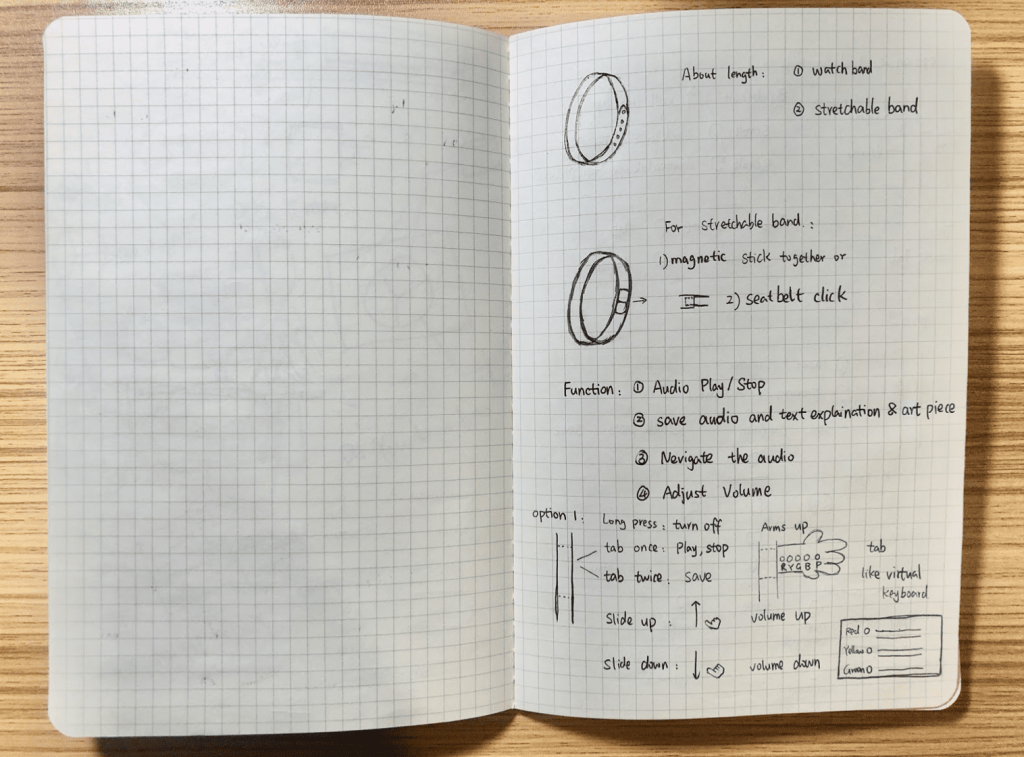
The general constraint of the design space is that we don’t have the actual materials to make the actual physical wearable, we use paper prototype instead. Our focus is on the interactions between users and wearables, therefore, I just briefly discuss the wearable material here.
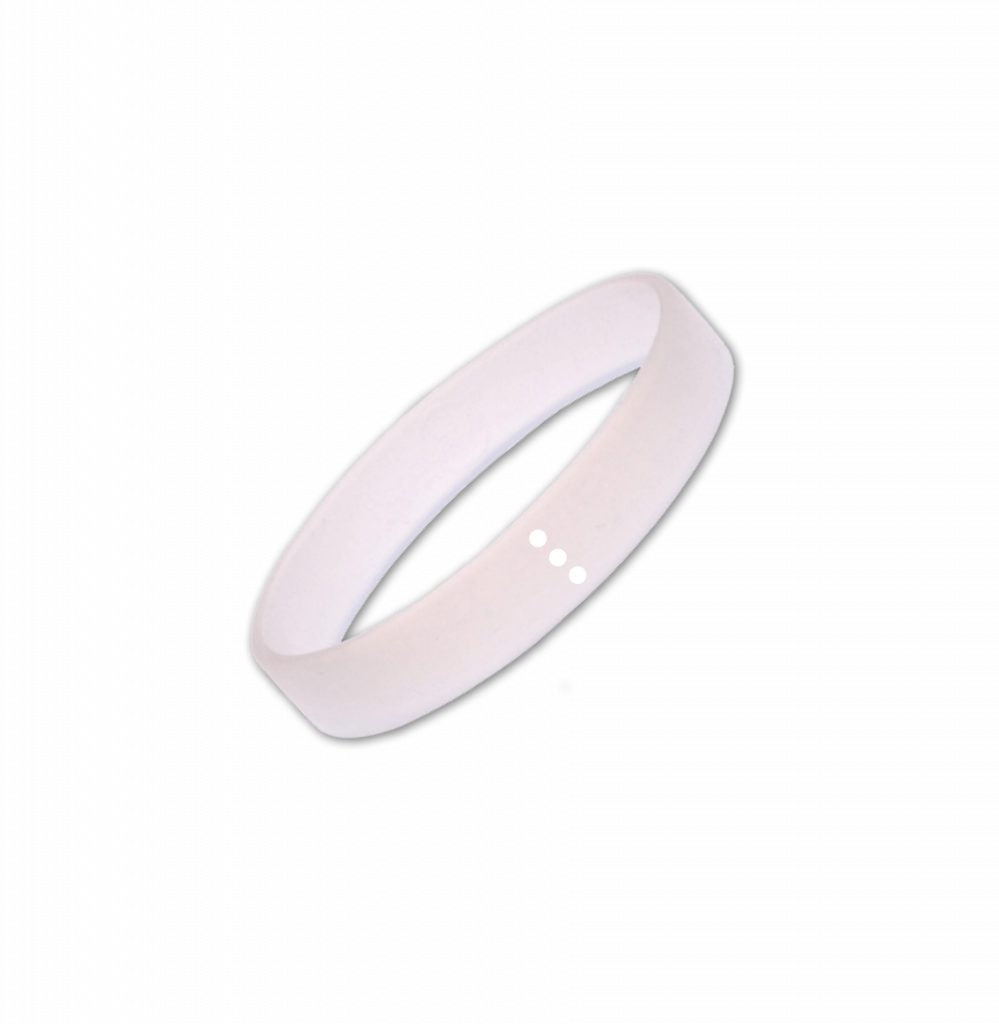
- Watchband
- Stretchable band which uses magnetic to stick them together or use the seatbelt click to make the wearable fit users perfectly.
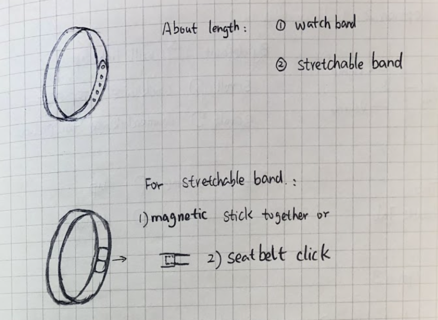
Wearable Material
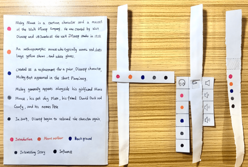
We want to design every text panel (refer to the first mid-fi prototype)in the museum contains 6 sections including:
1) Introduction, 2) About Author, 3) Installation Background, 4) Stories behind the Installation, 5) Possible explanation of the Installation, 6) Influence of the installation
and we use 6 color codes to represent those sections.

Color codes to represent different sections on text panel
Prototypes Details:
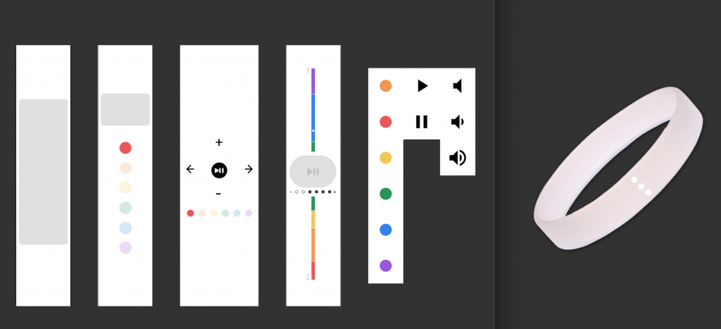
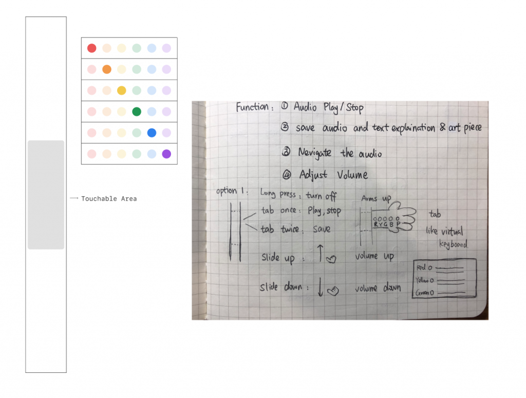
Option 1:
I am inspired by the virtual keyboard (laser projection keyboard) and think about displaying the visual colors on people’s hand.
The touchable area is for users to perform start/stop, play/pause, volume up/down and save
Every time users lift their arms up, the laser projection 6 dots appears, and users can click and select which sections they want to hear from the audio.
Option 1
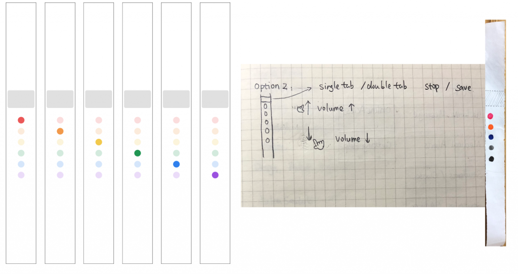
Option 2
Grey area is for start/stop, play/pause and save, slide up and down along the 6–colors touchable LEDs is for volume and tab each LED color is to listen on that section.
Option 2
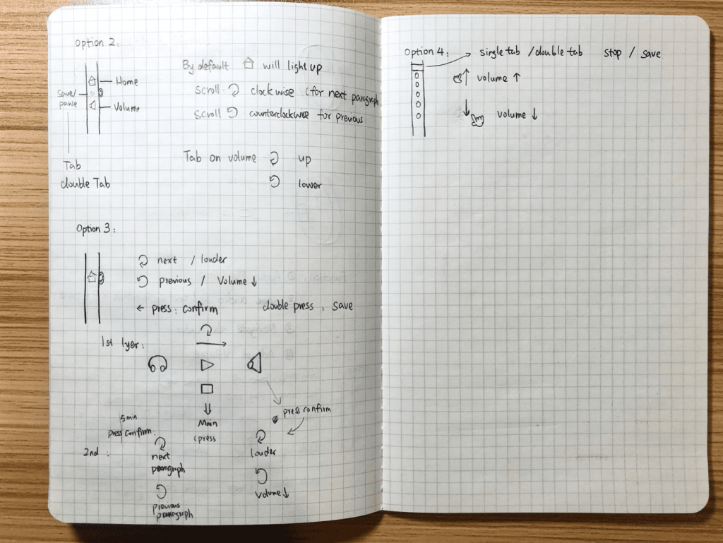
Option 3
The indication is clear from visual. Arrow is for switching among different section and the LED color part will light up when that section is selected. +/- is for volume. The start/stop, play/pause and save is the middle button
Option 3
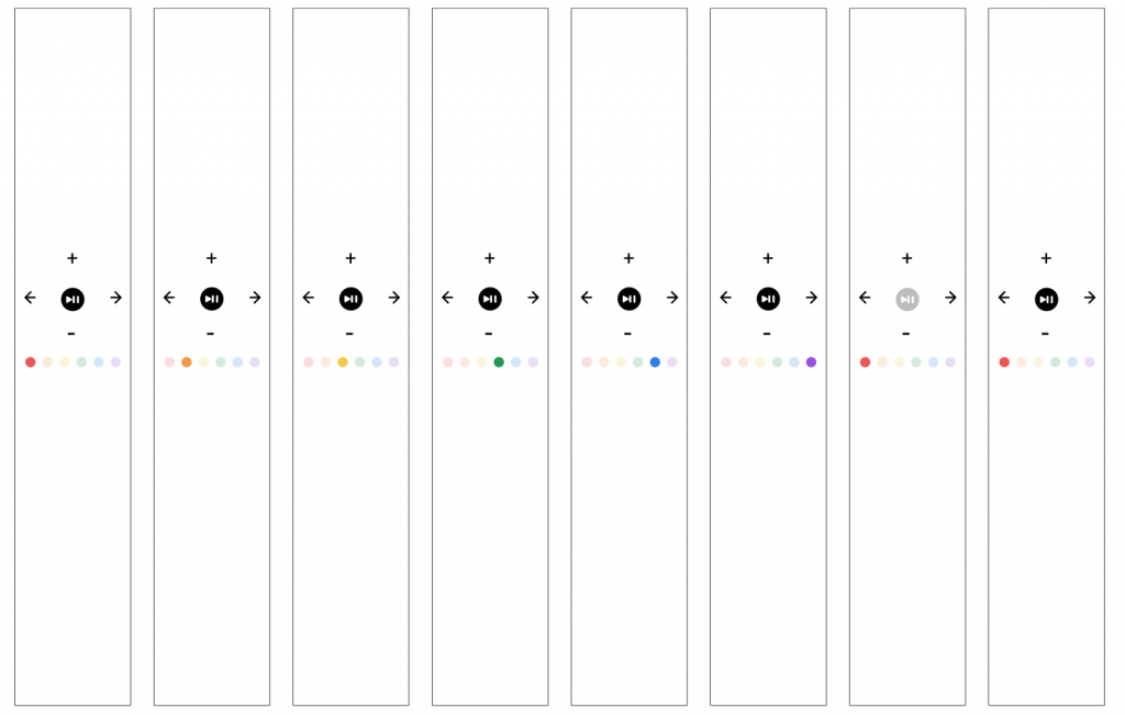
Option 4
The volume is represented by +/-. start/stop, play/pause and save is the big button in the middle. The section color dot is displayed as a color stripe. The length of each color represents the length of that section, users can use slider to slide to their target section.
Option 4
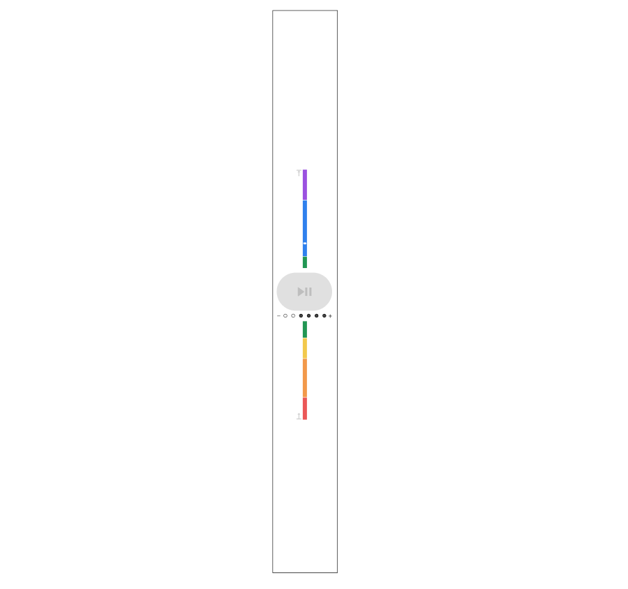
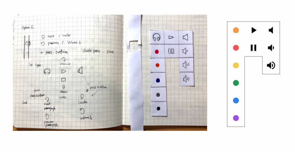
Option 5
I try to use similar model of Apple watch digital crown in the option 5 design. Scroll the digital crown is move to next function. For example, from color dot if I scroll, it will go to play/pause function, continue scroll it goes to volume function, if I press the digital crown, it means confirm this action. E.g. If I am in the color dot section and press the digital crown, It will go to the color dot function, the next time I scroll the digital crown, it goes to a different color. If I press the digital crown, it will play that color code section in the audio.
Option 5
Usability Testing:
After creating the 5 prototypes, we create the usability testing guides to conduct usability testing sessions with 4 users. We aimed to answer the following 2 questions:
- What must the wearable look like for it to blend seamlessly into the user’s museum experience?
- What general touch interactions are common and intuitive amongst users when controlling audio?
For each usability testing, we first performed “wizard-of-Oz” via blank stripe of paper. We provide users the connected AirPods (play British Museum podcast), and ask them to wear the blank paper as bracelet. Then we ask users to control the audio through their wearable using their most intuitive interactions. The control includes start/stop, play/pause, save, volume up/down, select sections. We recorded those interactions.
After that, we showed users our prototypes and ask them to perform similar tasks mentioned above. The detailed usability testing notes are here. We also took videos of user performing the tasks.
From the usability testing, we learned that:
- Users are more receptive to a “blank canvas”. They are less confused when given a blank piece of paper than our prototypes, especially when they have a mental model in their mind (E.g. apple watch). Most of them perform the same basic interactions for play, pause, volume up/down, switch between sections. But they required more learning with less intuitive ones such as “saving” function. Most of the users have no clues of “saving” through the wearable wristband.
- Users need feedback from the wearable. Users might not sure if they perform the correct action, therefore feedback is important. One users suggest us to add on feedback when there is a status change. Such as, when users press the save, add feedback either through the LED light or receive the feedback through the users’ audio (AirPods).
- Users expect all affordances to be indicated the same way. If we indicate the basic action for play/pause, volume up/down, and switch between sections, users are expected us to indicated “save” action as well.
Final deliverables — Selah
Based on the usability testing, we finalized the museum wearable interactions. Besides, we also design the mobile screens after users tab “save” through their wearable.
We call the product
Selah, which means “taking a deep breath in between singing of the psalm” in Hebrew.
 This is a museum-provided, touch-based wearable that allows the user to control the audio guide. By using our products, we want users to fully immersive themselves during their visits in the museum.
When museum visitors go into the museum, they will be given Selah and earphones, they can also choose to use their own earphones. Then, they will be guided to a learning room to learn how to interact with Selah. After visitors left learning room, their phone will be in sleep mode automatically and Selah starts working.
Selah will auto play the audio guide with music based on user’s location. Users are able to control the audio guide through the basic interaction with Selah.
The main features of Selah include:
- Screen-less, totally touch-based interaction avoids distracting both the wearer and those around them
- Simple interactions like tapping and swiping facilitate control of the audio guide
- Haptics and nondescript LED lights provide feedback to the wearer
If users saved the paintings and audios that they are interested in, they can replay later on the App. In addition, they can also share saved paintings with friends or on social media.
Sample App screens:
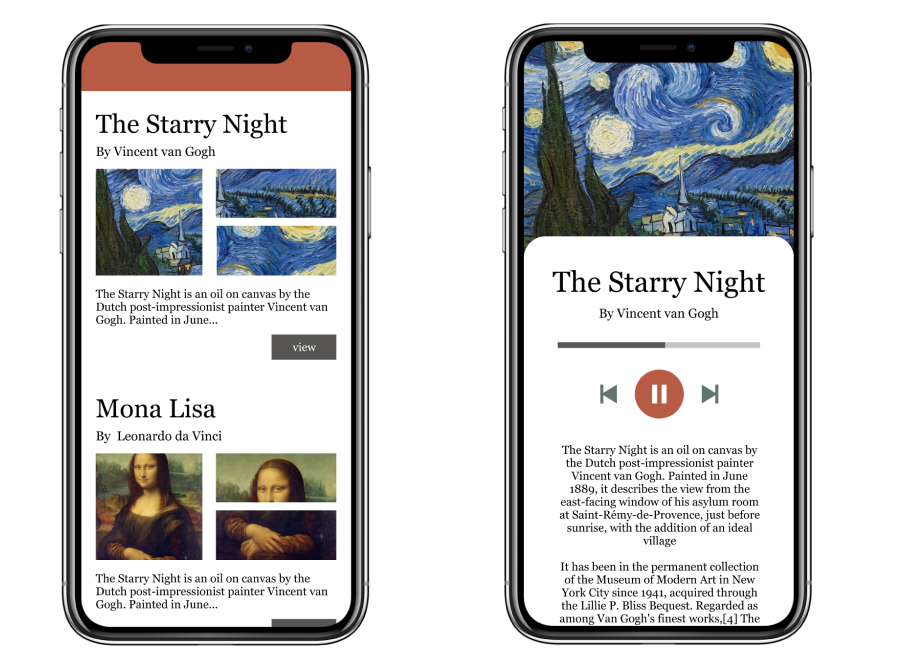
Selah “Save” Function
Future Improvement:
For the future exploration,
- More usability testing with more high-fidelity prototype, build real wearables for usability testing
- Explore prototyping options for the learning experience
- Define and design other screens to create better experience after users save their paintings during exhibition
- Explore the social aspect of sharing one’s museum experience
Lessons Learned:
This project is the first time I tried on non-screen based design. Here are several things I learned from this project.
- Novel is good, but it needs to be realistic
- I am interested in new emerging technology and want to introduce different novel ways of interactions. For example, I really like the gesture control idea where users are able to use their body language to perform the interactions with the installations. Or they are able to wear special glasses and special gloves which make them to virtually explore the actual scene in the paintings. However, these ideas are not realistic for museums in general. Imagine a lot of people standing in front of an installation and trying to interact with the installations using their body languages, this will be technically and practically difficult to implement. Thus, when we design the new experience, we need to keep the objective (How Might We) in our mind. Immersive museum experience doesn’t mean a totally new experience. Think widely and realistically, ask your users what they want and find the most suitable solution to achieve goals.
- Mental (Conceptual) model is powerful
- With the help from music App/ Podcast App, and wearable products like Fitbit, Apple Watch, Users are easily form the mental model about the wearable in their mind. If our design align with user’s mental model, it will make users learning not so difficult. On the other side, is the current mental model the best way to present our design ideas? In the museum setting, we want users quickly learn how to use the wearables, in this case, follow the mental model or make the design interaction very simple might be a good solution.
- Extend the experience to a broader way
- In our design, we only focus on the experience: how do we create better audio guide experience when visitors next to installation. And we include the learning video at the beginning of users’ visit to better explain the functions of the wearable. If we think in a broader way, from the moment users step into the museum, we should already create an immersive experience for them, How do we expand the immersive experience from the ticket line? How do we extend the experience when users in transit between different exhibitions? These are the interesting areas that are worth further exploring.
More Projects:
Design For Friction – When Disruption is not innovation: How to prevent BAD e-scooter Parking
Design for Social Web — How To Improve Visitors’ Museum/Art Galleries Experience?