Hey!

I am Christoph, a graduate student in Electrical Engineering from Munich, Germany. Currently I am doing my semester abroad at the EECS faculty at UC Berkeley. In my studies I have been focusing mainly on Robotics and Machine Learning. However, I have always been interested in interdisciplinary topics!
My semester here in Berkeley did not only give me the chance to learn more about Machine Learning but also to explore other areas that I always wanted to look into.
The Info 213 course was a great chance for me to get a deep-dive into user interface design and user experience!
Design Manifesto
Why does an Electrical Engineer care about design?
One of the things that have been the most surprising to me during my studies is definitely the importance of design.
I learned that, if I want to work on or develop anything that will eventually be used by humans, I need to make sure that it will be accessible and easy to use. I know that some fellow engineers will disagree but in my opinion design has to come first in every development process. There is no reason to spend endless hours to develop the most sophisticated and advanced technology if there is no actual need for it. Especially in a time where it seems to me that everything that has the label “AI” is considered a potential break-through innovation, it is necessary to think about what we need to work on to really bring innovation that matters into our society.
What do I consider my personal approach to design?
During this semester I have explored a plethora of different approaches to design, so it is hard for me to wrap it all up in a short manifesto. However, I think there are a couple of thoughts and principles that continuously appeared in the design decision I have been taking during the semester:
Consistency is key!
When we learned in class about consistency as one of the ten Usability Heuristics, I initially considered it as a rather not so important side note. For me it was something one only needs to care about at the very end of the design process when everything is polished into the final high-fidelity prototype. When we developed our first medium-fidelity prototypes I consequently did not put an emphasis on it. We split up the design of the different screens between the people collaborating in our group. In my head, the rest was easy: Just put all the screens together and we are done with the overall prototype. Unfortunately I saw that it is not that easy. In their head everyone had a slightly different idea about how the prototype is used. Combined with personal preference we ended up with three different designs that could have not been more different. It was evident that during the following usability test our users could not even concentrate on giving objective feedback since they were overwhelmed to understand what even is a button in each screen. I learned that consistency is key and we can only create usable products by closely working together and collaborate on a consistent design from the beginning.
Think process!
Closely related to a consistent visual design is a consistent user-flow. I am convinced that we should always first think about “How do we efficiently get the user to perform the tasks he needs to within each part of the product?”. Again this is closely tied to the experiences I had doing usability tests during this semester. When I thought about what tasks I could give to the user I realized two things: First, if you think too much about visuals and your own perspective you might end up making some tasks that are very central for your user group very hard to execute. This was either because it was simply not possible to do the task efficient using the type of visual design I initially wanted to or because this task was just not as important to me as it was to the average user. Second, it is almost guaranteed that you will find a corner-case that your current design handles poorly. There is only one way to deal with this: Accepting that no design will ever be perfect. I learned this the hard way after wasting a lot of time on such corner-cases that nobody cared about and basically bloated the prototype with functionality that is rarely used. In German we would call doing something like that “verschlimmbessern” (making something worse while trying to improve it). Now, I am always trying to first think about the process (“What does a standard user need to do here?”) and then start designing.
Don’t re-invent the wheel!
Just as trying to fix corner cases, most of my failures in the beginning of this class actually appeared in situations where I wanted to make something especially good. One of these failures was definitely when my primary goal was to design something very unique. I was prototyping an app for this class which will blur your phone screen whenever you are hanging out with your friends to encourage more real social interactions. I was thinking about ideas of how to connect the friend groups and wanted to make this process very fancy. I thought it would be the easiest if people could literally just place their phones next to each other and use NFC to connect. What I did not realize that using NFC is not very popular (apparently iPhones do not even have this technology). This made it very confusing and I had to put a lot of descriptions in the app of how to perform this type of interaction. In hindsight I should have thought more about how other popular apps connect a group of people to each other. For example, it would have been a lot easier if the app would have allowed people to simply share a link for people to join the friend group via their favorite messaging app since nowadays it is safe to assume that friends are already connected with each other on some kind of app. So one main take-away from this experience is definitely that there is no shame in looking at how other popular products deal with a similar problem that you are facing. The chances are high that there is already a similar process that the users are used to. And as I learned in class, it is not easy to change users habits (unless you are Facebook or Apple maybe).
Guide the user!
While I could have avoided having a lot of explanatory text in the screen blur app I described above, sometimes a process is just to complex to be self-explanatory. For example we worked on an app that allows users to easily apply for jobs in a Tinder-like fashion (see the final project below to get to know more about it). In this case the user had to set up a profile, set filters for what kind of companies they are interested in and much more. I learned that such cases it is very helpful to offer contextual help to the user. Think of the short introductions that a lot of apps give you nowadays. They quickly highlight the most important buttons and give a short intro to what you can do with the app. Whenever you seem to be stuck somewhere the design should show some hints towards how you could potentially achieve what you are looking for. I am convinced that given the current rise of AI and machine intelligence it will be easier than ever for technology to realize where people get stuck in processes and reason about their intent. In my designs I definitely want to incorporate this since I am sure this can greatly improve the experience for users.
Know your audience!
I have talked a lot about “the user”, not only in the previous paragraph, but who are they? A major learning I take with me from this class is definitely how important is to either define your target user group very concisely when designing something new or know your user groups when iterating on the design of an existing project. In class I learned that designs can become too playful very quickly, if you are using a lot of colors initially. So you need to know from the very beginning if this is going to be a product that will be mostly used for fun or if it will rather be used in a professional business setting. In the first case, yes it can be colorful. However, in the second case I would go as far as to say that I too colorful design could seriously limit the success of your product if it does not look professional enough. Probably nobody will believe you that your product can bring great insights in a business context if it looks like Candy Crush Saga.
Final Class Project
Seek – The Job-Finding App
Design for Iteration
For the final class project I was working together with my lovely teammates Ananya and Cameron to build a job-application app that provides the best user experience for job applicants and recruiters alike. In this section I would like to give you some insights on the process we followed and how we eventually prototyped our app.
Since this module was all about iterating on a project that has been worked on in class before, we chose this prototype to start:
This prototype tries to answer the question:
“How could a tinder-style application process look like from the applicant’s perspective?”
Need-Finding-Phase
Since we tried to improve on the current prototype and tried to get further insights into potential user groups we decided to conduct need finding interviews. Next to applicants in different stages of their career (university graduate and senior employee) we also decided to interview a recruiter. This was especially important since recruiters are playing a crucial role on the other side of the application that has not really been investigated yet. If the app does not address the needs of recruiters as well, there would not be a lot of jobs postings on the app, which would in turn make it very unlikely for applicants to consider using the app.
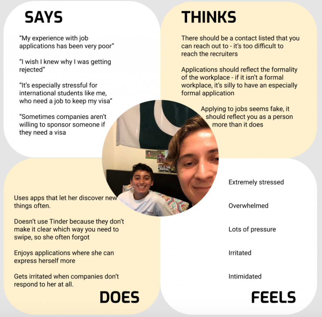
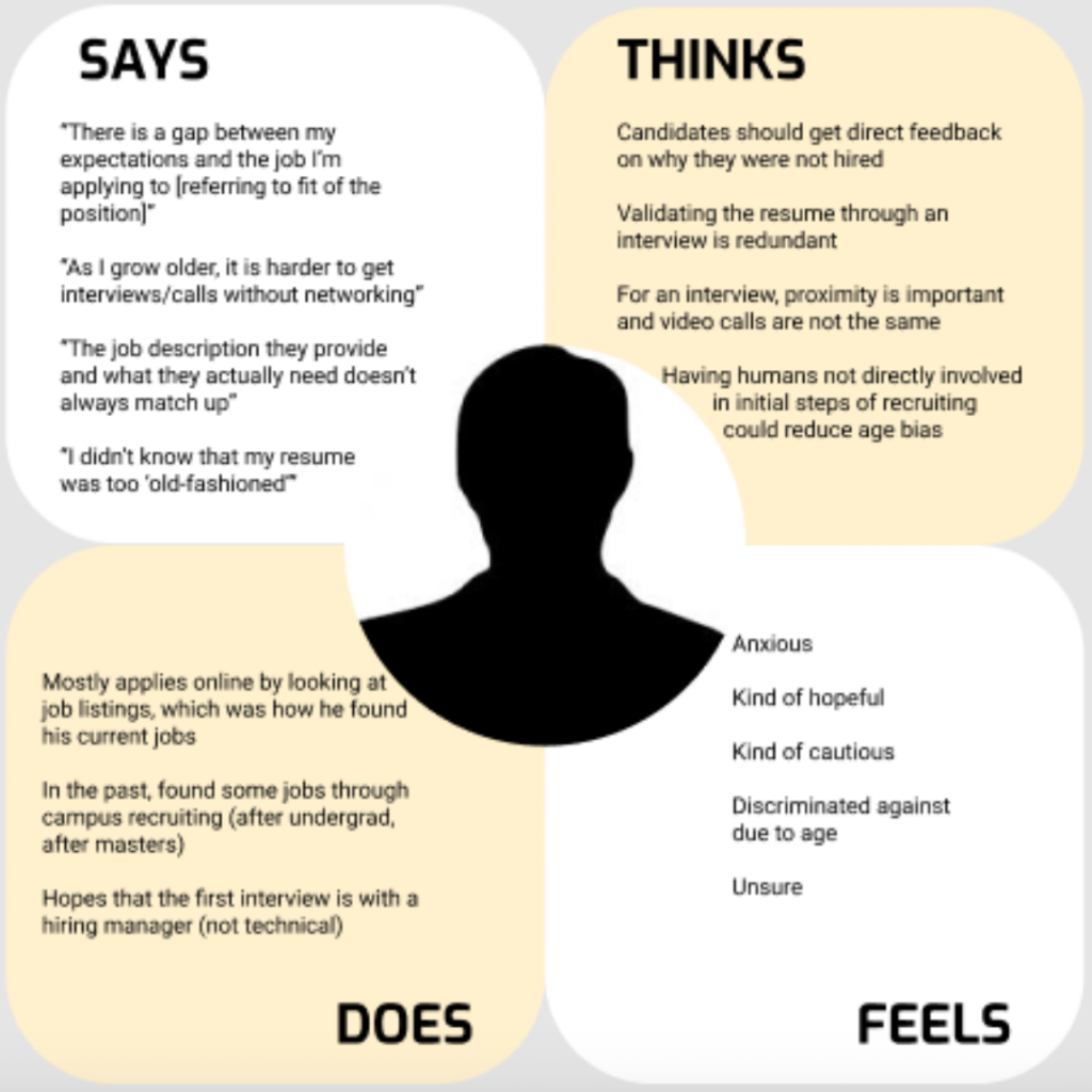
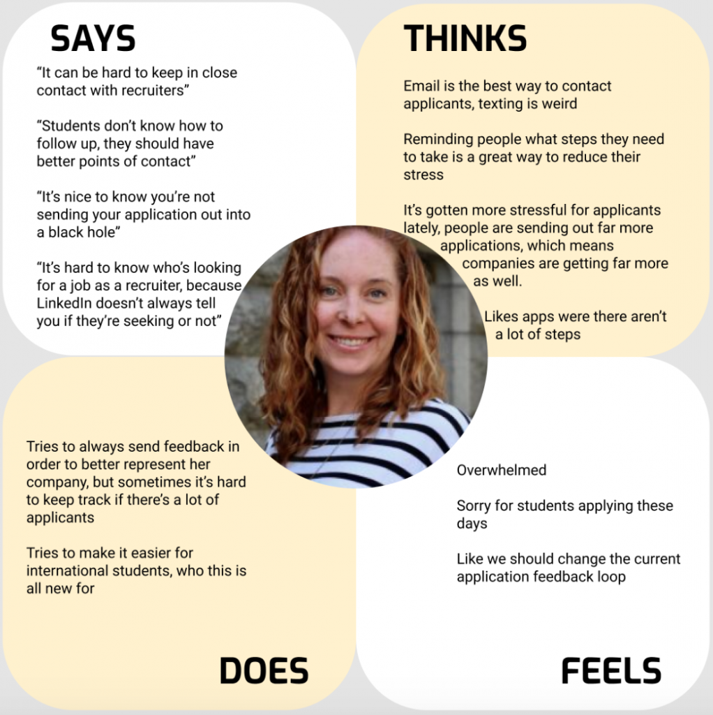
We structured the findings from the interviews in the following empathy maps which analyze what the interviewees said, thought, did or potentially felt.
Entry-level applicant:
Senior-level applicant:
Recruiter:
Conclusions from the interviews
Looking at these empathy maps and the results from the previous iteration on the prototype we could define the target group of our app more precisely. In fact there are actually two crucial target users that depend on each other:
- Applicants: More specifically we focus on entry-level job applicants, since they are usually the ones that send out a large number of applications before or after graduating from university. Also this user group is very used to using app-based products such as the one we are trying to build.
- Recruiters: This user group covers people of all ages that are working in the HR departments of any type of employer (from start-ups to established companies to the government).
We came up with a longlist of How-Might-Wes (HMWs) from the perspective of both user groups which we eventually boiled down to these three:
- How might we minimize response time of companies?
- How might we make feedback more transparent for the applicant?
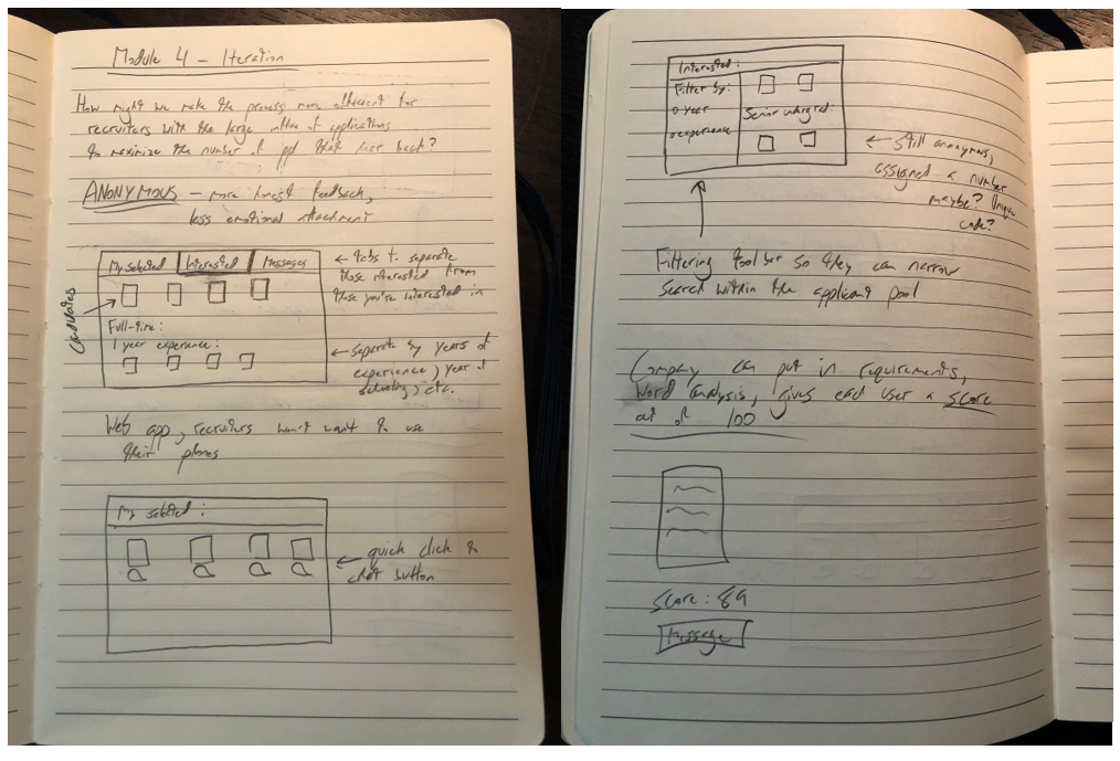
- How might we make the process more efficient for recruiters with the large influx of applications?
Prototyping
Considering the HMWs from the section above we flared out and brainstormed a plethora of different ideas on how to tackle the user needs. During this process we made sure to also include ideas that we consider “dark horses” (which describes ideas that sound really crazy at first glance but could however still be quite impactful). We eventually discussed how we can combined or prioritize all of these ideas to come up with three main features that we want to test on potential users. Each of the features specifically tackles one of the HMWs from above.
How might we minimize response time of companies?
Decreasing the response time of companies is quite a challenge since they have to handle such a large influx of applications. However, we realized that applicants are most upset when they do not receive an answer at all. This situation is even worse than getting formally rejected since the applicants are left in the unknown, hoping that they might still get a positive answer. Still, not getting back to applicants that are not considered anymore does not lead to very drastic consequences for recruiters so it is evident why this is still a practice that is found quite often.
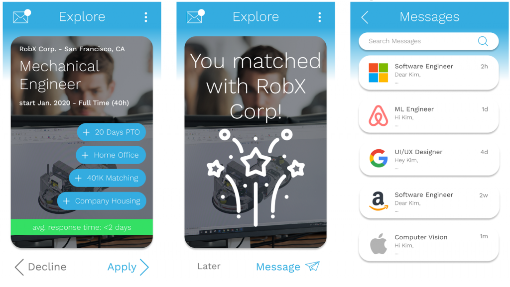
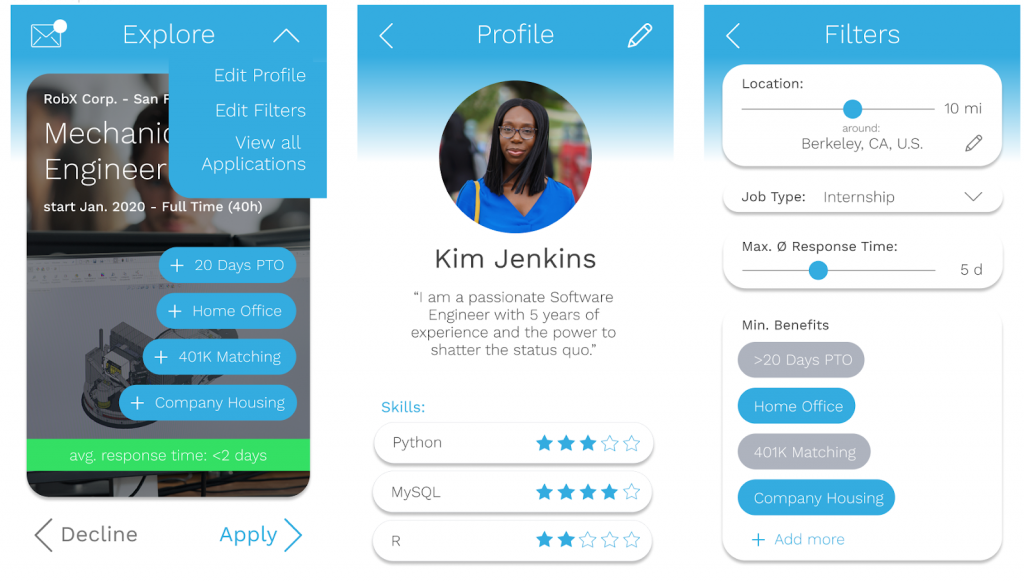
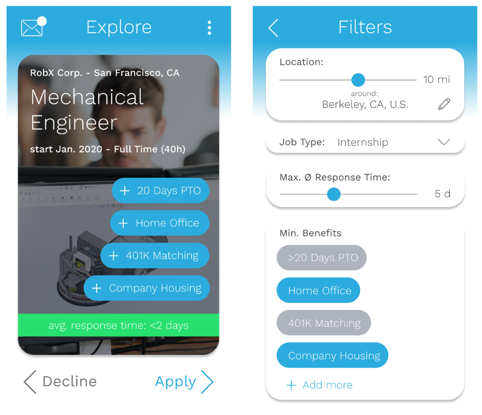
This is why we thought about a feature that does on the one hand incentivize recruiters to actually reply to all applications and on the other hand give the applicants an idea of when to expect an answer. To achieve this we implemented a score for companies that displays the average time before they respond to applications to the user. The user can see this number whenever a company profile shows up and also set filter options to only see companies that reply fast.
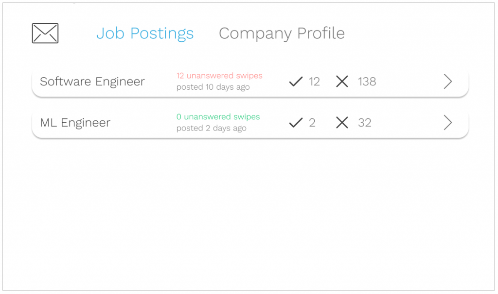
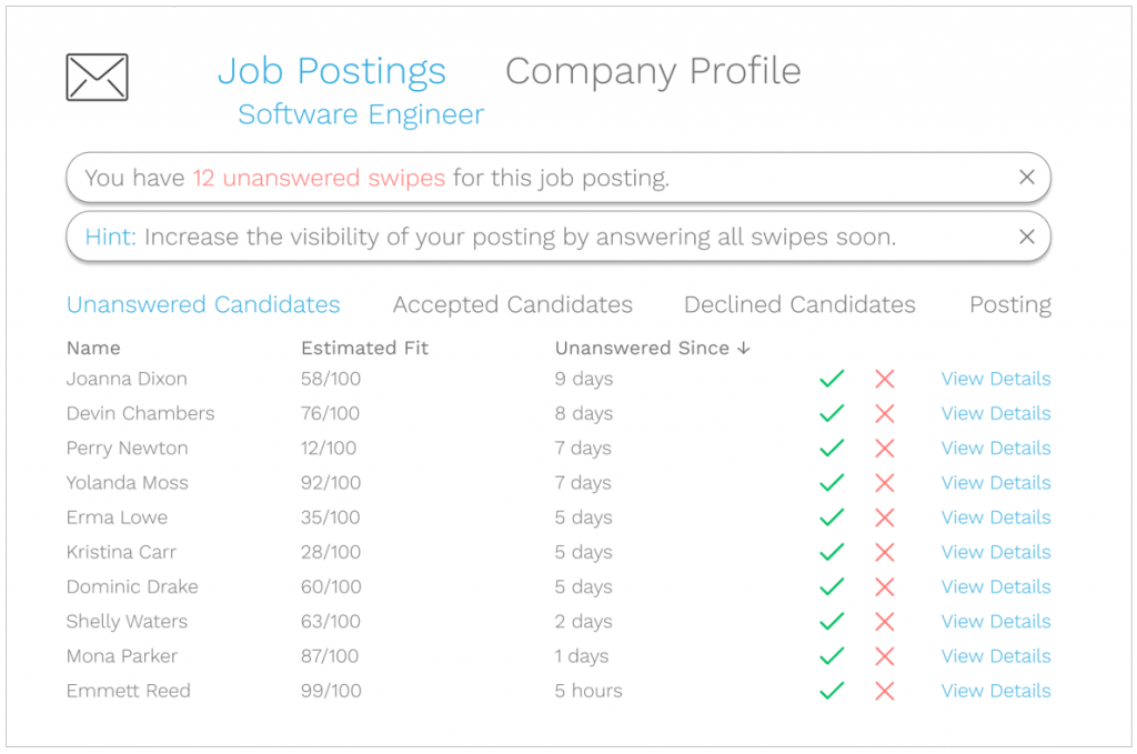
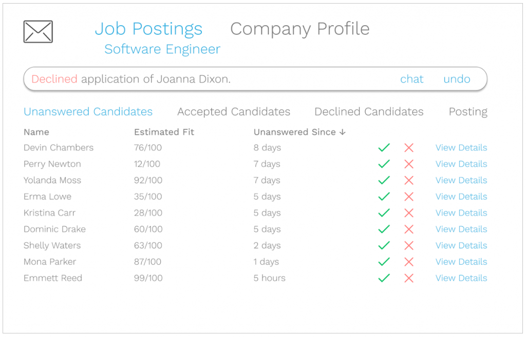
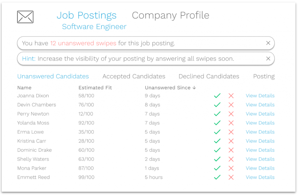
On the recruiter side we will provide a tool that reminds recruiters to respond to applications that have been unanswered and also incentivizes them by increasing or decreasing the visibility of their job posting depending on how fast they answer to applications.
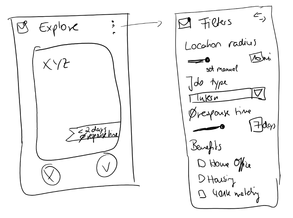
These pictures show some initial sketches for the filter-options and the response time score from the applicant’s side:
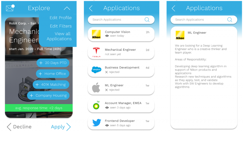
The following screenshots show how these features where then implemented into our medium-fidelity prototype:
For the recruiters we developed a desktop or tablet based version of the app, since it is not very common to use mobile devices in a work environment and the larger screen size allows for a more efficient way to deal with a large amount of applicants. These screenshots show the overview of applications for the recruiter as well as the pop-up messages to remind them to answer all the applications:
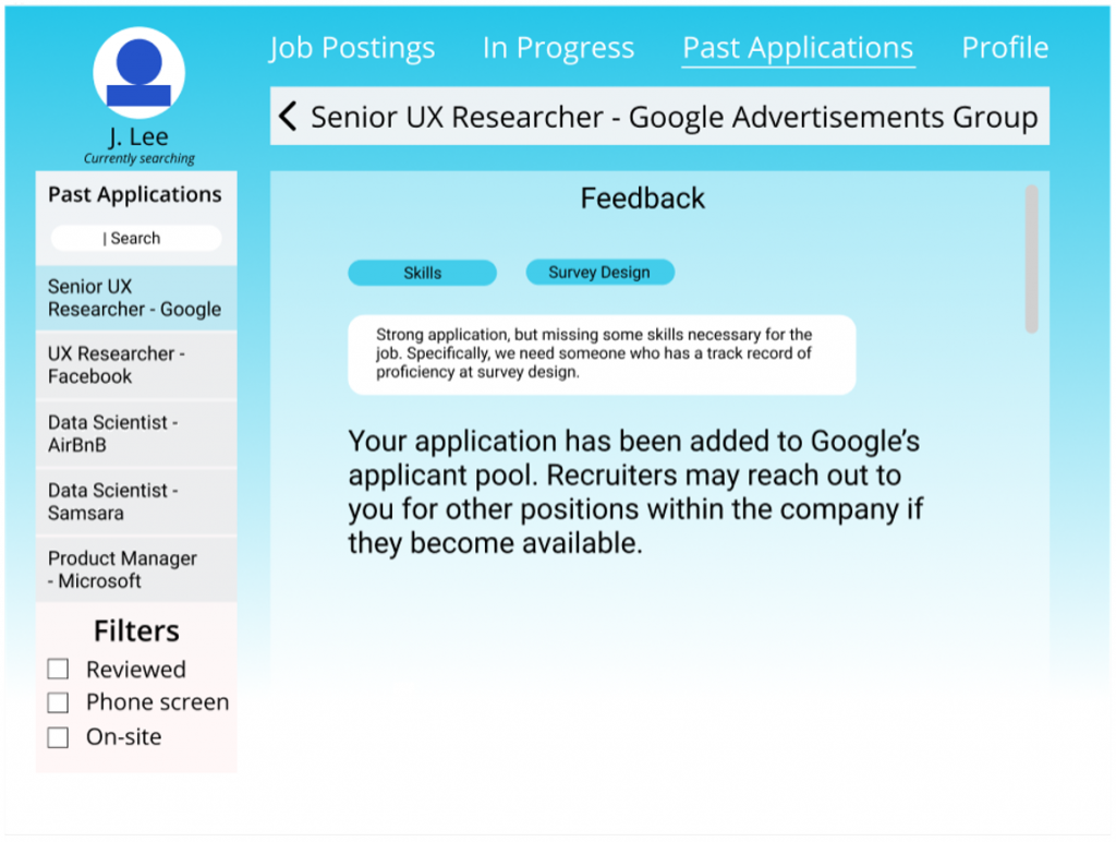
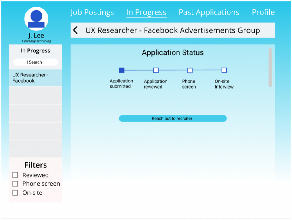
How might we make feedback more transparent for the applicant?
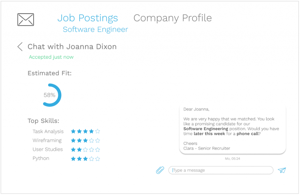
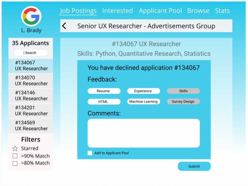
To answer this HMW we added some elements to both the applicant and the recruiter interview. We tried to identify what type of feedback would be considered important for the applicants while keeping in mind that we do not want to place too much additional burden on the recruiters. One of the options were “quick-reactions” for the recruiter and an option to give more detailed text based feedback. Also an important point was conveying the status of the application to the users.
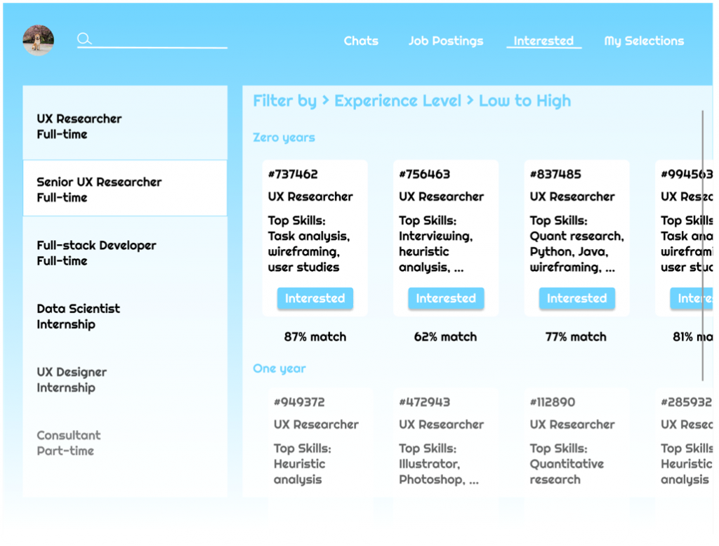
How might we make the process more efficient for recruiters with the large influx of applications?
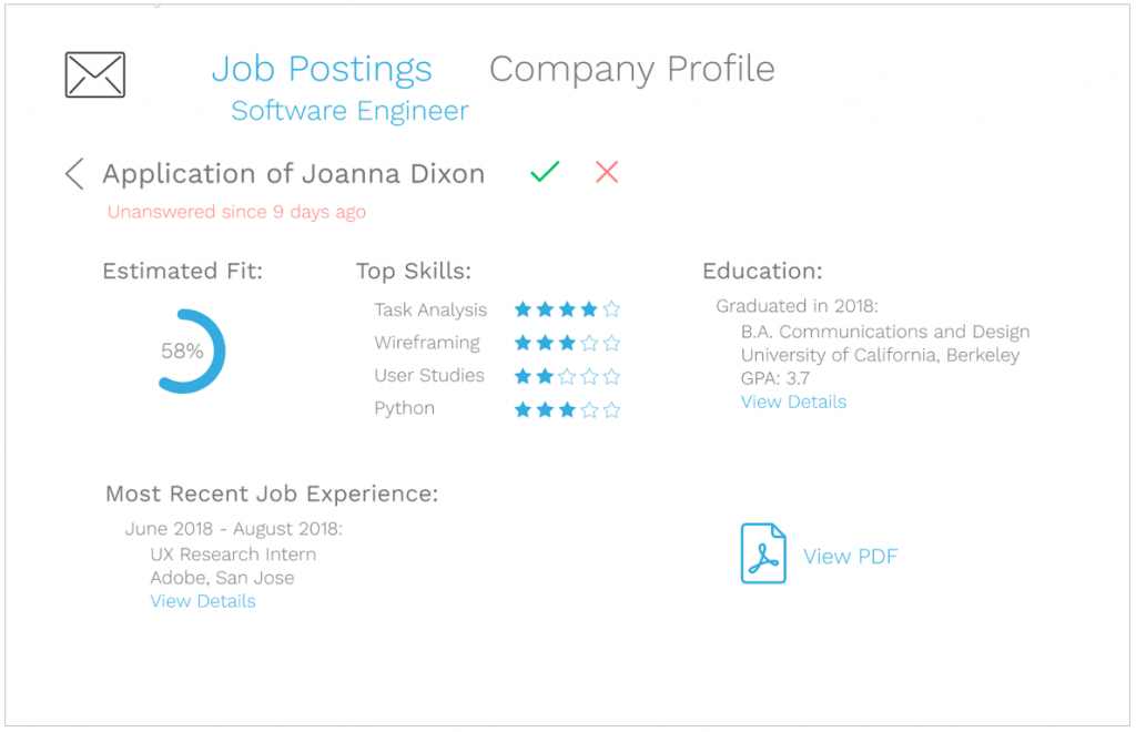
We focused on providing a grid-style overview for recruiters to see as many applicants as possible on one screen. This grid also contains an automated score that would indicate to the recruiter if an applicant appears to be a good fit. From the overview the recruiter can always open up a more extensive page about each applicant.
Usability tests
We did multiple usability tests on the prototypes described above to find out how users like the new features and which ones were the most important to them.
We asked users about the type of feedback that recruiters can give them and what would be an efficient way to display it:
Using the prototypes above we figured out that the following things were the most important concerning feedback for the user:
- Feedback on what was good or bad about the application itself is nice to have but not necessary
- Feedback in tag format can be confusing and hard to interpret
- Timeline about the application status is the most helpful feature
- It is important to know that the application made it to the recruiter.
We also asked users how they would use the information about the response time and the filter options associated to it:
We found out that:
- The response time is very important since users want to have an estimate of what is going to happen in the future
- Filter options are nice to set to the personal preference
- Users would probably change the filter to not miss any companies (start with companies with low response times, successively setting it higher and reswiping).
Furthermore we asked which interface would allow the recruiter to process the highest volume of applicants efficiently:
We found out that:
- Filter options and the chat function are useful to recruiters
- The job posting itself is less important to the recruiter
- The percent match feature could be a big time-saver for the recruiter if it worked reliably
- The grid layout is too cluttered with information
- The list layout with minimal information is better because the recruiter would click on every applicant anyways
- Reducing the visibility of a job posting that is not accepting a large amount of applicants is a smart way to incentivize hasty feedback
More detailed information about the user user interviews and usability testing can be found here.
Final High-Fidelity Prototype
Based on the interviews and the usability tests, we designed the final high-fidelity prototype combining the features that balanced the desires of both recruiters and applicants. In the following section I will share the most important screens of the final prototype with you. You can find the full version of the interactive prototype here.
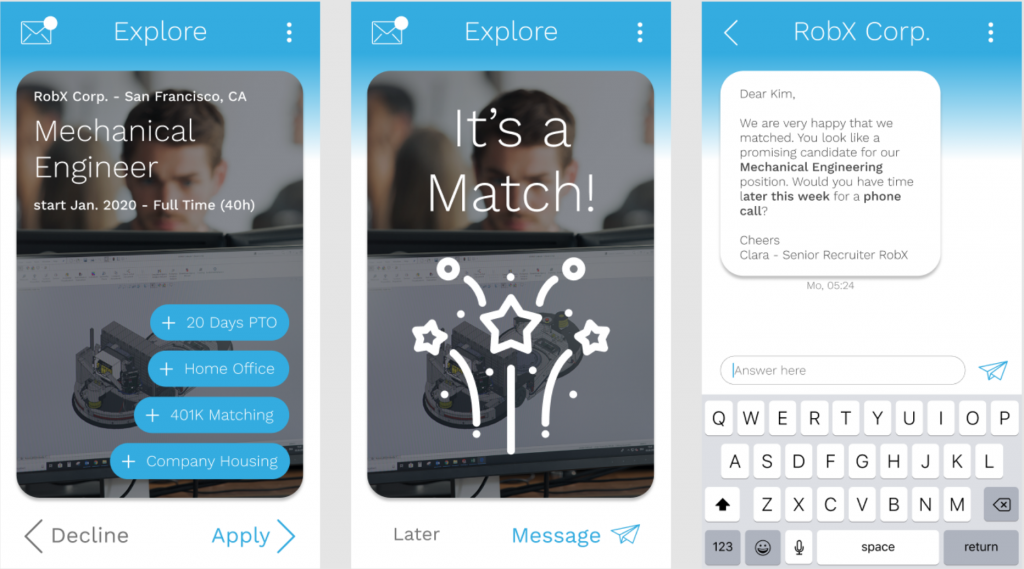
Main-screen for the applicant to swipe and message