About Me

I am a 4th year Cognitive Science major at UC Berkeley and aspiring UX designer & researcher. I’m passionate about understanding human’s needs and behaviors to design useful, intuitive, and enjoyable products.
I gained practice in human centered design through my club Invention Corps, a human centered design project based club, cs160 – User Interface Design and Development, INFO 213, and several other design focused courses.
On the side, I love to dance. I am involved in several hip hop dance clubs here on campus as well!
Design Manifesto
Through my experience as a human centered designer I have learned valuable techniques when approaching design. Some main concepts I’ve learned and keep in mind when approaching design are:
- Iterations upon iterations in all steps of the process
- Throughout the design process, it is always helpful to iterate upon the first draft in order to improve and strive as close as possible to the best solution. For example, in Module 4, my group did 2 rounds of interviews because we did not get enough insights the first round. This allowed us to figure out better questions to ask to extract the information we needed for the second round.
- Separate brainstorm → group brainstorm
- Throughout all of my projects from this semester, I’ve found that for brainstorming it works best to individually come up with many ideas then discuss ideas as a group. This allows individuals to thoroughly think and bring their own creativity without the pressure of a group and then build off of each other’s ideas through group discussion. My groups used this tactic for brainstorming for the HMW questions and ideating solutions.
- Mapping a user flow
- For prototyping, it is very helpful to create a general flow of how a user would use the app before actually implementing all the details. This technique allows for a more intuitive application. It also helps the designing to be more efficient because sometimes you can create all the details and then realize the flow of the app is not intuitive which leads to having to change it. For Module 4, my group created a user flow chart to help all of us understand and be on the same page about how our app works.
- Less direction equals more insights for Usability tests
- During usability tests, I’ve found that not giving the user too much direction can give you a lot more insight about the intuitiveness of the app and point out any crucial problems. This also simulates a more realistic situation because there won’t be someone giving them guidance when actually using the application. During all of the usability tests I’ve conducted in this course, I have found myself having to hold back from helping the user because I know it is better to let them work through it themselves to see their thought process and natural interactions.
- Open mindedness
- I think it is so important to be open minded throughout the whole design process because sometimes certain things work that you don’t expect. Also, open mindedness encourages more creativity.
FriendTime: Design Document
Strengthening the connection between long-distance friendships
Everyone has experienced the separation of best-friends during childhood, high school, college. It is difficult to stay in close contact with friends who you don’t get to see as often due to physical distance.
My three teammates and I wanted to address this problem by creating an application that could re-connect and enhance long distance friendships.
Needfinding
Target user group
Our app is designed for all people who want to stay connected with their long-distance friends. The target user group will be younger generations, such as college students, recent graduates, etc.
User interviews
We conducted two rounds of user interviews to gain further insight into this problem. Each of us interviewed one person per round. The interviewees had very diverse backgrounds and gave us a lot of insights into shaping the app features and themes.
The key findings we got from the user interview were:
- Users need to do fun activities with close friends to make the friendship more complete
- Users need a convenient way to stay updated with each others’ lives
- Users need common topics to feel more connected to each other’s lives
- Past pictures with friends re-enforce cherished memories
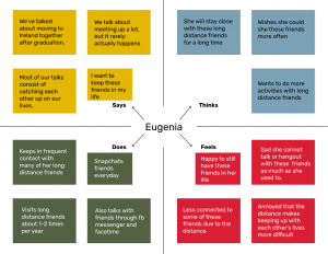
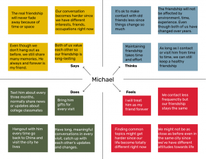
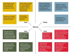
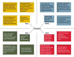
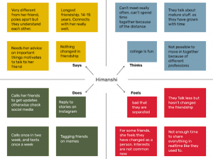
Empathy maps
Round 1
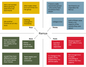
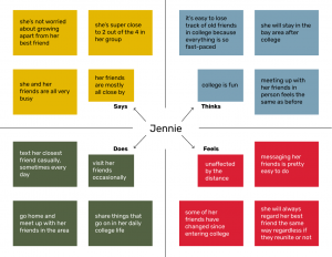
Round 2
How Might We…
To further define the problem, we utilized the needs from our user interviews to come up with 3 “How might we” questions:
- How might we provide an easier way for friends to reminisce about cherished memories?
- How might we help people prioritize long-distance friendships among their busy life schedules?
- How might we make long-distance friends feel like they are closer to each other?
Brainstorming
Based on our HMW, we brainstormed many ideas such as past event reminders, visualize memory between friends, mystery box for shared challenges, day-by-day photo books, etc. We finally narrowed down our ideas to four to prototype:
- Day-by-day photo book
- Challenge box
- Specialized event app
- Notification for looking at past memories
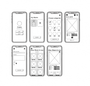
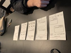
Low-fi Prototyping
- Notification for looking at past memories:
- Prototyped as an additional feature, the notification system focuses on displaying users their old memories (photographs) with friends. Often users complain that they don’t have time to catch up with old friends, this notification system analyzes user’s social activity like Instagram, Facebook browsing frequency to prompt users to check their memories instead of spending time looking at others’ pictures.
- Prototyped as an additional feature, the notification system focuses on displaying users their old memories (photographs) with friends. Often users complain that they don’t have time to catch up with old friends, this notification system analyzes user’s social activity like Instagram, Facebook browsing frequency to prompt users to check their memories instead of spending time looking at others’ pictures.
- Day-by-day Photo Book
- Create on-going shared memories photo book between long-distance friends by asking them to take a “shared” picture every day. The photo will be based on a prompt. Users need to collaborate in both taking and editing phases to finish the photo for the day.
- The prompt will be based on different categories, users can also create their own prompts and contribute to the poll
- Challenge box
- Challenger is an application where friends can create an activity list together that they agree to complete in a certain time span. Once one of the friends completes a task, the other friend gets a notification with a picture of them doing the task and prompts this friend to then complete the task. The idea behind this prototype is to allow long-distance friends still feel connected in each others lives by giving a sense of doing activities together.
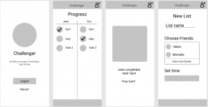
- Challenger is an application where friends can create an activity list together that they agree to complete in a certain time span. Once one of the friends completes a task, the other friend gets a notification with a picture of them doing the task and prompts this friend to then complete the task. The idea behind this prototype is to allow long-distance friends still feel connected in each others lives by giving a sense of doing activities together.
- Specialized Events Application
-
- Hologram resembles the Facebook events feature, where users can create, join, and share events with their friends. On Hologram, users will also be able to go back to an event and see “memories” from it, which include photo albums, their “squad”, and even a timeline of what they did. Ultimately, users can use Hologram to connect with people they met at that event without having to go through the often laborious task of manual search.
-
Low-fi Usability Testing
- Notification for looking at past memories:
Use notifications to remind users to check some memories when the user is using applications like Gallery, Instagram for more than a few minutes. The aim is to help users prioritize the time wasted on looking at pictures of others’, instead show them their lovely memories (Prioritize)
Usability Testing Procedure
While taking a break from your busy schedule, you plan to browse the Social Media application ‘Instagram’. Complete the following steps
-
- Unlock Phone
- Open and Surf Instagram Application
- Interact with the notification that pops up
Test 1:
Cousin’s birthday, by chance, came through the pictures of a friend and called German friend so he feels this kind of notification is good. Will occasionally open this notification but not every time, wasn’t really sure. Talks about Google photos, It also does the same, uses AI to create weekly videos and search for specific photos.
Video
https://drive.google.com/file/d/1pgknBhAZkniNnjbFaaE0YMvMYLYyXSlu/view?usp=sharing
Test 2:
Will use this feature occasionally, but what if someone doesn’t wants to think about someone but your application shows that image. Wouldn’t want this notification to pop up every time, Frequency matters. Feels, he doesn’t really think about the past that much but his girlfriend will love this feature.
Test 3:
Thinks It’s pretty cool, similar to managing time and balancing friends with other life events. Images are definitely one of the best ways to start conversations. Some applications show friend posts like the interviewee’s father uses Facebook just for looking at pictures of friends.
-
- Specialized Events App
Usability Test
Be able to navigate around the app and explore key features like the specific location events, event highlights, and event timeline. Being able to grasp how the year toggle bar at the bottom of the first screen works would be a plus.
I asked one of my close friends to participate in the usability test, as his familiarity with the events and locations I used for the lo-fi prototype would show whether or not this app would be engaging to users or not. By having someone who could clearly conjure up a memory of the event test this prototype, I would be able to get feedback on whether or not the features I created were something desired when looking back on fond experiences.
Tasks
-
-
- Find the party that happened on November 21st
- See who attended the party with you
- Play around with the interface and see if there’s a feature you like!
-
Observations
User was able to easily navigate around the app, and displayed good intuition with touch gestures such as swiping left and right to “navigate” the photo carousel, scrolling down the event highlights view to find more memories of the night, and toggling between years on the home screen bottom menu. User showed particular interest in the timeline feature, saying that he wished there were a couple more screens so that he could explore it further. When I asked him what he thought the app was for, he first said that it was a birthday surprise planner, which, while incorrect, showed that he had connected the screens to the actual event that happened.
Design Process
We first created a mood board to gain inspiration for our general design theme and decide on a color scheme.

![]()
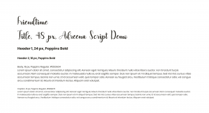
We also created a typography document. We chose to use Adreena Script Demo for the app name because we wanted it to be a fun, flowy feel to go along with our application.
High-Fi Prototypes
User flow
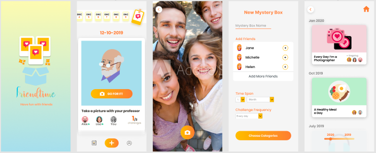
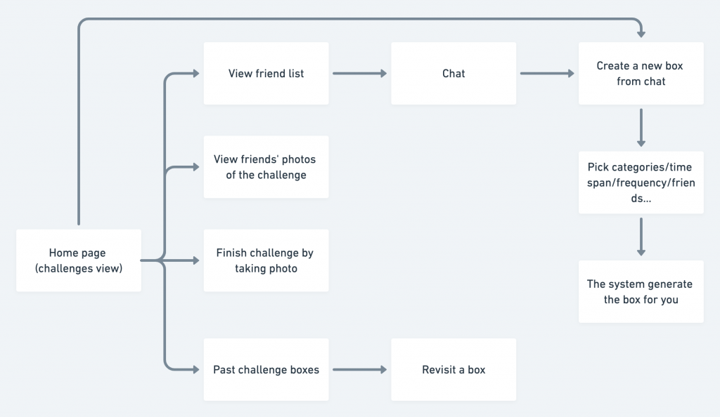
- After sign-up/log-in, the user will enter the homepage, where the user can see all of the challenges for today from all on-going boxes.
- On the homepage, the user can swipe up/down to switch between different challenges. If the challenge is not finished yet, the user will see the “unfinished” mark on the challenge and will not be able to see the friends’ photos. After the challenge is done, the challenge will be marked as “done” and the user will be able to see photos of his/her friends for that challenge.
- On the homepage, the user can also add a new box, view friend list, or view past challenges. The user can also view photos history from past days for the box.
- On the past challenge boxes page, the user will be able to see past boxes he/she has done, aligned as chronical order.
- When entering a past box, the user can see past photos, as well as each challenge timeline.
- On the create new box page the users will be able to choose the time span, frequency, and categories for the challenge. The app will generate challenges for the user.
- On the friend list page, the user can chat with friends, as well as creating new boxes directly from the chat.
Key features
- Mystery box
- Since the box is generated by the app, users don’t know their future challenges, making the activity of connecting with your friends more fun and surprising.
- The mystery box is also a good option for connecting people with long-distance since they can finish the same challenge in different locations, as well as keep track of each other’s updates.
- Generate photo book so users can always refer back to the memories they share together.
- We will also implement a notification system based on one of the low-fi prototypes, so the users will be reminded to look back on their memories.
Links to videos of key functionalities:
Link to Figma Prototype:
Usability Test
We conducted a usability test on our high-fi prototype to gain insight about the overall flow, usability, and usefulness of our application. How we structured this test is we first asked the user to complete several different tasks and then asked some conceptual questions. During the task-based portion, we asked the user to talk aloud through their thought process to allow us to better understand important features and possible problems.
The key takeaways from the task-based analysis were:
- Able to complete most tasks without difficulty
- Some design inconsistencies: navigation bar, button designs
- Unsure of the connection between the past boxes page vs home screen
- Distinction between mystery box and challenge was unclear
We asked the user conceptual questions for the second portion of this test to understand if our app is successful in tackling our initial problem at hand. We wanted to know if the user would want to use our app, when they would use it, who they would use it with. The questions we asked were:
- What do you think the purpose of this app is?
- Would you use this app?
- When would you use it?
- What Friends would you use this app with?
- Would you use it for long-distance friends?
The key takeaways from this portion were:
- The user would use this app with friends in person for a fun activity
- The user would be more likely to use it if the tasks were more integrated into their life
Overall Lessons
- It can be helpful to do multiple rounds of user interviews to learn what better questions to ask to gain even further insights.
- Creating a mood board and a typography document was very helpful to create a coherent design pattern coherent with the concept and feel of our application
- It is helpful to do both user testing and usability testing. User testing is useful to understand if the user would actually use your product and to see if it addresses the user’s original needs. Usability testing is useful to understand the intuitiveness and common interactions with your application.