About Me
 Having worked in learning & development, customer experience, and operational analytics in Ireland and the United States in education, healthcare, and tech industries, and tutored kids on math and coding at the Karibu Centre in Thika, Kenya — I’ve discovered that I am inherently drawn to the intersection between people, design, and technology.
I hope to use the empathy and the interdisciplinary skillset developed through my background in cognitive science, psychology, and my culturally diverse upbringing in Taiwan & U.S. to solve challenging problems and empower users in their daily life.
Design Manifesto
In my User Interface Design & Development class (Info 213) at UC Berkeley, I learned how to conduct user research, prototype iterations, heuristic evaluation, and usability testing in the product design process. The major pieces that impacted my design decisions throughout the class were to 1) conduct user interviews to make sure we focus on user needs, rather than what we think the users need, during the ideation phase, and 2) conduct usability testing on our early prototypes to discover insights and problems we hadn’t discovered in previous phases, and use these insights to iterate on our prototypes.
Both pieces were valuable because by having users directly tell us what their pain points are, we make sure that we keep users’ needs in mind when we brainstorm possible design solutions for the users. By having users test out our early prototypes and provide feedback and reactions, and having my team conduct heuristic evaluation individually and record our findings, we make sure to incorporate these insights into our later iterations to come up with user-centered final deliverables.
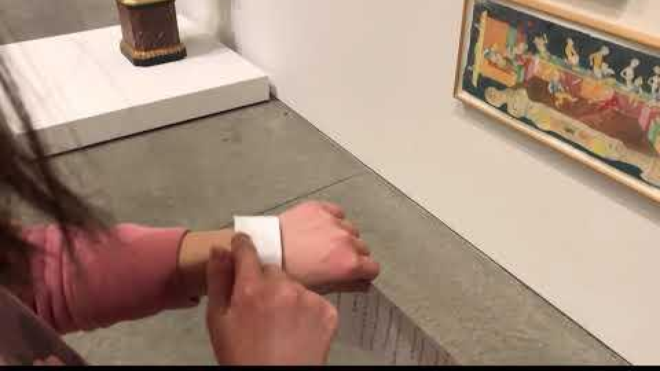
One design method I used was tangible prototype. At first, my module 4 team members each developed a wristband that physically represented our own concept of how the museum audio experience control should look like and work for the users. However, as we tested these with our users, we discovered that each user already had a mental model on what gestures they should use for each audio control action, so we decided to use a blank piece of paper as a wristband to test out users’ mental model on the gestures. Tangible prototype worked for us because the prototypes were low-fidelity and allowed us to quickly test and iterate functions and features quickly by serving as a communication tool between my design team and our users. The users could physical feel, touch, and manipulate our physical prototypes to give us insights into what works and what doesn’t work for them.
Another design method I used was heuristic evaluation for my module 3 project: a mobile app that allows users to easily search for environmental volunteer opportunities. Each team member individually judged whether each element of our mobile app user interface follows Jakob Nielsen’s list of established heuristics best practices. It helped us catch usability issues on our user interface design and define what could be improved in the next iteration. We employed this design method as part of the requirements for the project. The method worked for my group because it allowed us to discover different usability issues pointed out by each designer in the group. You can view each team member’s heuristic evaluation here.
When we user tested our tangible prototypes in module 4, it was illuminating for me to find that users expected to receive visual feedback when they performed an action on the wristbands even when these didn’t have a screen. It was interesting to reflect on how my team did not think of incorporating visual feedback when we first designed our screen-less tangible prototypes in module 4, versus how my module 3 team automatically included visual feedback early on in our mobile app interface design even before we user tested the prototype with users. We also automatically evaluated this against Jakob Nielsen’s list of established heuristics best practices. In this case, the usability testing feedback in module 4 served as a great reminder to always check my own biases when it comes to designing products for users. I can’t help but wonder if the difference between our approaches to designing a screen-less tangible prototype in module 4 versus a mobile app interface in module 3 was influenced by our past experiences with screen-less tangible products and mobile screens.
Another surprise finding occurred while my team user tested the wristbands we developed for module 4. I was surprised to find that what seemed clear to us was actually confusing for the users. For example, for some of our prototypes, we purposefully designed them to clearly indicate (or so we thought) the gesture and function with icons. However, our users still did not seem confident when they were performing the actions that we asked them to perform with the prototypes. They asked “am I doing this right?” a few times and were eager to seek affirmation from us that they were performing the actions in a “correct” way. On the other hand, when they are testing our blank prototype, our users seemed confident and quickly showed us their own mental models of gestures when we asked them to perform certain actions. It was very interesting to see the same users’ vastly different reactions to our marked prototypes vs. a totally blank prototype.
I learned from this experience to always conduct user testing on the prototypes we build based on the insights we gathered from user interviews. Even though we may think that our prototypes should capture the user needs, since they were based on our finding exercises with the users during the needfinding phase, this is not always the case. Since design is rarely divorced from our personal lens — our experiences, our expertise, our beliefs — it is very common for designers to interpret user needs through their own personal lens and produce a solution that is biased with the designer’s own experience. It could be challenging for the designer to remain user-centered in their design approaches. Therefore, it is imperative to for a designer to always validate their assumptions through usability testing to ensure the proposed design solution is really what the users need, and not what the designer thinks the users need. There’s always some new insights and usability issues the designer can discover during the usability testing phase, which can be used to further enhance the prototype.
Final Project Design Doc
Target User Group
Based on previous modules, we decided that we want our target user group for the final project to be museum visitors.
Needfinding
We conducted user interviews with four people that visit museums at least four times per year. We asked them questions centered around how they interact with installations:
- “How do you decide which installation to visit first?”
- “How much value would it add to your experience if you knew more information about the installation?”
You can find our full interview guide here.
We noticed similar patterns across our four interviews: users mentioned they enjoy learning about the story behind art installations, like taking photos of installations for sharing with friends, wish they had better control over audio guides, and prefer stress-free, distraction-free museum environments. Below 4 empathy maps summarized our interview findings for each user.
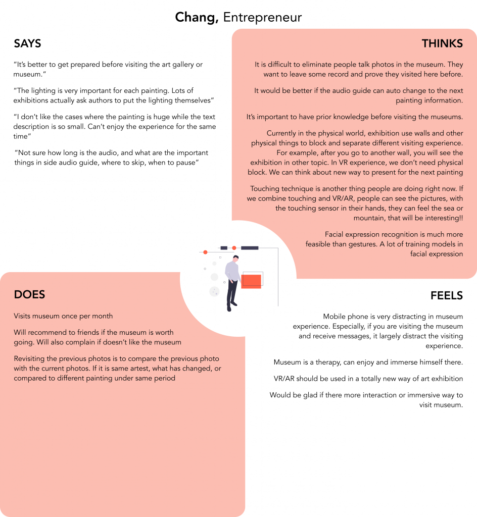
Find Chang’s interview notes here.
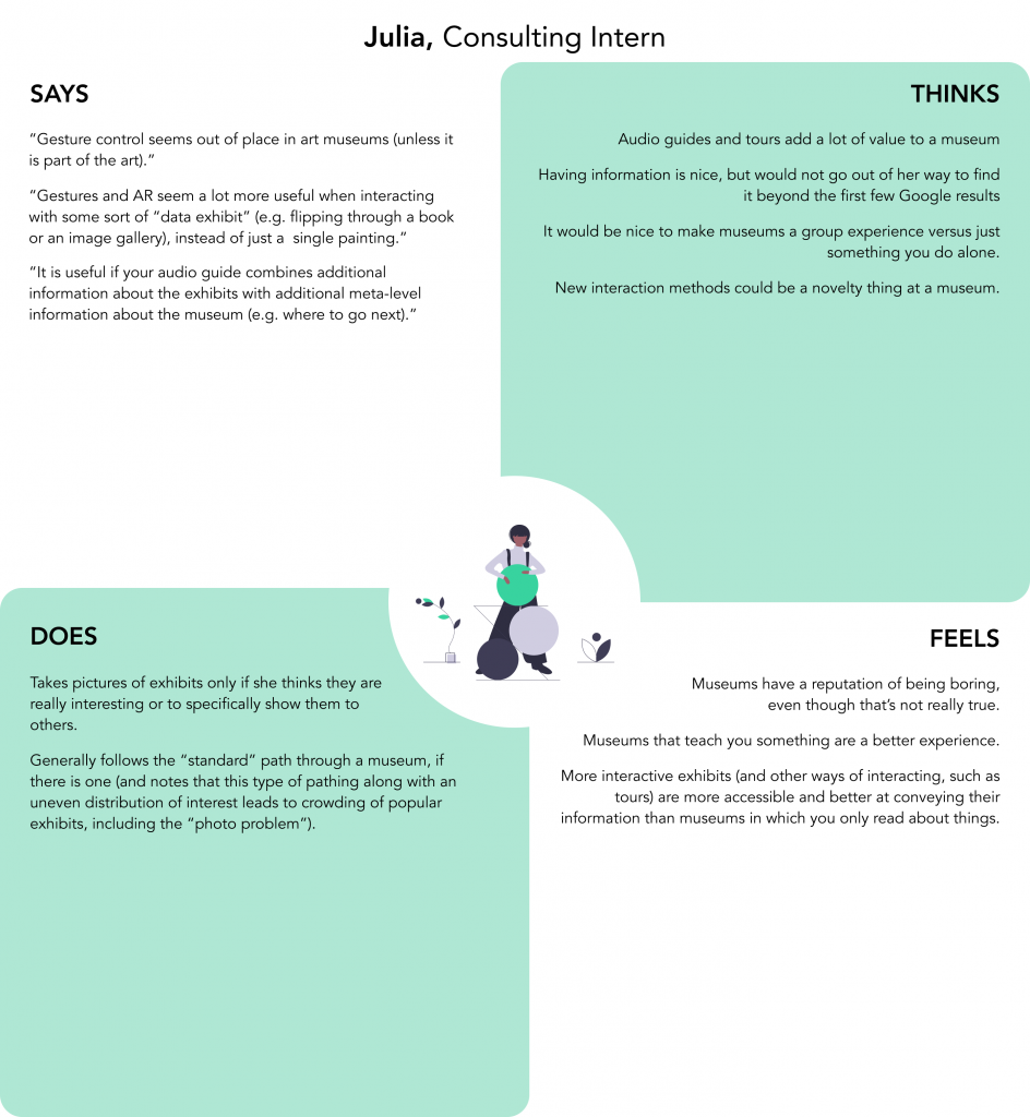
Find Julia’s interview notes here.
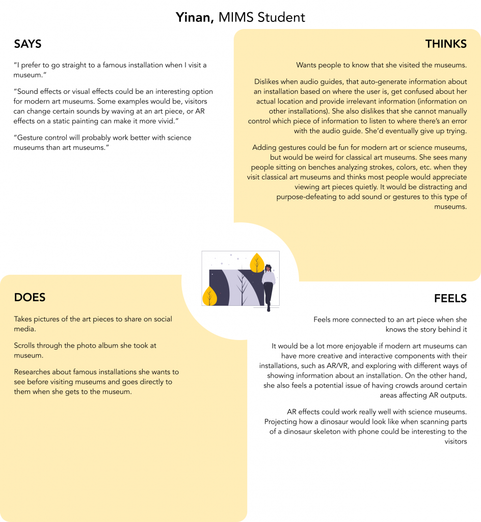
Find Yinan’s interview notes here.
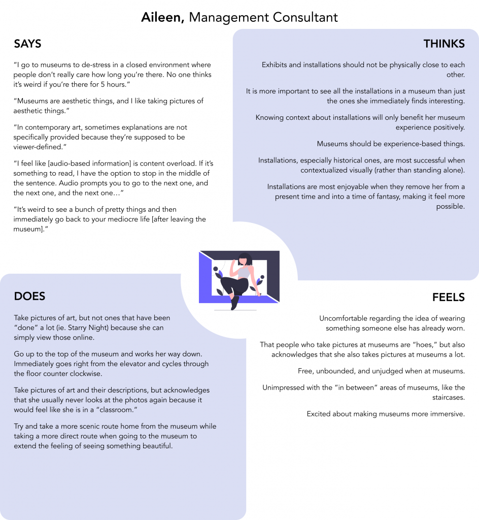
Find Aileen’s interview notes here.
Based on our user interview findings, we identified 2 user needs to focus on in our project:
- A discreet way to capture museum experience without distracting others.
- A better way to control auditory experience at museums.
With these insights, we updated our original how might we statement from “How might we make museums more immersive for visitors?” to “How might we provide an immersive, yet stress-free museum experience for visitors without distracting others?”
Low-fi/Med-fi Prototypes
We asked ourselves 3 what-if questions:
- What if we could take advantage of screen-less technology to lessen distraction?
- What if we could facilitate control of audio guides via touch for a multi-sensory experience?
- What if we could utilize personal, discreet wearables so that users do not distract others as well?
and each created a wristband that physically represented our own concept of how the museum audio experience control should look like and work for the users. We developed these prototypes in Figma and printed them out to conduct usability testing with users.
Usability Testing
We created this usability testing guide to ensure all members are consistent in our ways of conducting the testing sessions with the 4 users. Our usability testing sessions were aimed to help us answer these questions:
- What must the wearable look like for it to blend seamlessly into the user’s museum experience?
- What general touch interactions are common and intuitive amongst users when controlling audio?
From the sessions, we found that users were less confused with the prototype when given a blank piece of paper than one of our prototypes designed with icons, buttons, and LED lights. It seemed like the users already have a mental model regarding which gesture to use for each task that we asked them to perform on the wristband. They had the intuition to perform certain tasks in certain ways, such as same basic interactions for play, pause, volume up/down, and go to next/previous section. However, some of them required more learning with less intuitive actions like saving the audio. One user also mentioned that she needs visual feedback from the wearable whenever she performs an action, such as receiving feedback lights when she saves an audio.
We also found that users expect all affordances to be indicated the same way. If we indicate the basic interactions for play, pause, volume up/down, and go to next/previous section, users also expect us to indicate the interactions for more complicated action like saving an audio. In one of our prototypes, we only highlighted the basic interactions and not the more complicated ones, and our users were super confused by it.
High-fi Prototypes
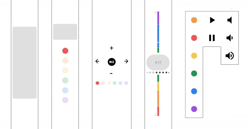
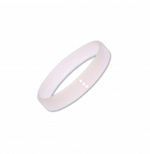
Based on our usability testing findings, we created a museum-provided, touch-based wearable wristband named Selah that allows the user to easily control the audio guide. Selah, in Hebrew, means “taking a deep breath in between singing of the Psalm”. We decided to adopt this word as the name of our wearable to signify “taking a deep breath in between viewing different installations at museums”.
Selah features:
- Simple interactions like tapping and swiping facilitate control of the audio guide
- Haptics and nondescript LED lights provide feedback to the wearer
- Screen-less, totally touch-based interaction avoids distracting both the wearer and those around them
Selah Wristband
Learning Video
We will play this video to the users when they first arrived at the museum, to demonstrate to the users how they can interact with Selah.
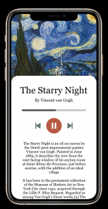
App Interface
This is an example of how the user’s captured experience with an installation will look like on the museum app, if the user performs the “saving” interaction via Selah. User can choose to view their experience via the museum app later and share with friends or on social media if they’d like to.
Design Decisions
We decided to design our Selah wristband with no screens and just simple touch-based interaction to avoid distracting both the wearer and those around them. We are hoping that with no screens to look at or show notifications, user can focus on their interactions with the installations and better immerse themselves in the museum. We are also hoping by enabling users to control their museum audio guide with touch-based interactions via the wristband, users can have a stress-free experience learning about the installations and capturing their museum experience.
Constraints
- A museum-provided wearable that Bluetooth connects to one’s phone.
- Cannot rely on users having, bringing wearables.
- Based on location, certain music and audio clips are available.
- Solves the problem that a lot of people have with audio guides (fiddling with putting in numbers of clips), also no extra device (just use your headphones).
- Indoor location tracking needs to work well enough.
- One is able to control start/stop of music/audio through the wearable.
- Play, pause, next/previous track, volume controls are bare minimum in terms of interactions expected by pretty much all users.
- Learning experience through mobile phone in a specific/separate room. Once the user leaves the learning room, the phone goes into sleep mode so that the user’s only needed interactions are via the inconspicuous wearable.
- “Save” feature tries to make sure users can record an exhibit without having to interact with their phone, i.e. their instagram notifications etc.
High Level Lessons I Learned
One interesting insight our team learned during our iterations was that our users already had a mental model regarding which gesture to use for each task that we asked them to perform on Selah, our touch-based wearable. They had the intuition to perform certain tasks in certain ways, such as same basic interactions for play, pause, volume up/down, and go to next/previous section. I learned that it was imperative to find a way to test our and learn about their existing mental models during our user testing sessions. By acting on this insight, my team was able to design a solution that fit our users’ needs. If we had more time to work on this project, we would like to further test out and learn about their mental models of what works and what doesn’t work for them when it comes to learning possible interactions with Selah. We would also like to further explore prototyping options for the user’s learning experience.
My Professional Portfolio
To see some of the more high-fidelity projects I’ve worked on, check out my professional portfolio here.