 BIO
BIO
I am an undergraduate student in Cognitive Science at UC Berkeley, graduating Fall 2019 (this semester!).
Learning about many interdisciplinary topics that all analyze the topic of understanding the human mind (such as philosophy, psychology, neuroscience, and linguistics) has sparked an interest in making all kinds of technology accessible and adaptable for all. I took Info 213 to learn more about what methods are out there to facilitate user empathy and how we can assess usability in an evidence-based process.
DESIGN MANIFESTO
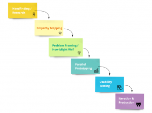
(image credit: Kimberly Hirsch)
My design process (co-developed by the team I collaborated with on my final project for Info 213) is characterized by 6 key components, and can be visualized using the graphic above. It operates on iteration and organization, and capitalizes on the efficacy of working as a team. Having a clearly laid out process helps clarify the overall vision, keeps team members on the same page, and propels the design process forward.
0. Ideate: Come up with an idea that the team can agree has potential.
- Needfinding/Research: This phase is all about developing a user group by identifying a need. The secret to coming up with a workable idea is that there is an associated market with a genuine need for the proposed product. Without that, the design process will have nothing to drive it forward and will inevitably fall apart. The most robust and effective designs all originate from a solidly identifiable need. This phase is an important backbone for the entire project ahead.
- Empathy Mapping: Once a user group has been established, it’s time to do the initial assessment and determine whether the assumptions made in stage 1 are testable and applicable to the real world. In this phase, it’s essential to identify specific users and interview them.
- Problem Framing: With the data and insight collected from the previous stages, it is time to specifically identify a problem. One useful format for framing that problem is a “How Might We” statement that outlines specifically the real-world, empathetically minded problem that the design is trying to solve.
- Parallel Prototyping: This is where working in a team becomes essential. The parallel prototyping method is very efficient and allows the flexibility of pursuing multiple design concepts without committing. It also allows different team members to assess each others’ work without the bias of being a contributor. The parallel prototype phase will ideally result in a final product that pulls the best components from each designer’s prototype.
- Usability Testing: Before fully merging the parallel prototypes from phase 4, it makes sense to check again with the user group and ensure the design is still in line with the originally identified need from phase 1. It’s a good idea to discuss with the team what types of tests are most effective. It may be preferable to test specific functions of the design rather than the whole thing, or to ask the usability test subject to compare between two design ideas such as in A/B testing.
- Iteration & Production:In this phase, the parallel prototypes officially merge once the results of the usability test elucidate the most effective elements of the design. The process is intended to be repeated, not necessarily in the exact same order, until a workable design can be legitimately produced.
FINAL PROJECT: GOOD SAMARITAN APP (DESIGN DOC)
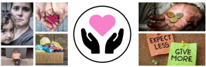 . (our mood board for this project)
A link to the full design doc can be found here.
THE IDEA: This idea initially originated from the design prompt: “Design something that has to do with friction”. We wanted to reduce the friction in interactions between homeless people, and people who wish to provide them with help and donations, but may be unsure how best to do that. The app is designed to aid in navigating an interaction with a homeless person as well as provides a portal for the donor to order a delivery (via UberEats, Postmates, Target, etc.) for that person in need. Our intention was to increase interactions between different groups and to provide several options in order to create the smoothest possible user experience for small, personal donations.
Here is a breakdown of how we addressed each of the 6 phases mentioned in my Design Manifesto:
- NEEDS: We developed a list of interview questions and conducted needfinding interviews. We identified three main takeaways from this phase:
- Need to be able to donate money to a trusted organization
- Need to feel connected to the cause they are donating to
- Need to know where their money went and what impact it has made
- EMPATHY: We conducted more interviews and created empathy maps (with four quadrants: says, thinks, does, and feels). Crucially, during this step, we realized we did not have the perspective of the recipient of this idea. Interviewing someone who is living on the street requires some thought, because it’s important to be able to properly convey the idea and get a thoughtful response, as well as to approach the interview itself with empathy and tact. I conducted the interview with a homeless man named Jamil who I had conversed with on previous occasions, mainly because I knew he would be able to provide thought-out and useful responses to my questions. Excitingly, the interview and resultant empathy map (pg. 17 of design doc) reinvented our perspective and helped us understand how to approach the problem a bit differently.
- PROBLEM: “How might we reduce barriers to donation by decreasing the associated social friction?”
- PARALLEL PROTOTYPES: My prototype was focused on creating a safety guide for users to feel that they had a pre-determined plan in place in case their interaction was going poorly. I was careful to use language that framed things positively and reassuringly, and I created a succinct set of bullets as a helpful guide. The idea was to keep a small logo (with a safety-connoted icon like a shield) available throughout the app that would be comforting to the user and secure their confidence in initiating an interaction.
- USABILITY: My usability test (see my demo here) helped me narrow down the best way to display the logo in terms of size, placement, and icon choice and it corroborated with my teammates’ usability findings that users preferred a storyboard style guide to their first interaction. We focused on the friction of initiating the interaction because we felt it was the most relevant and important part of making the design work.
- ITERATION: Our final prototype can be found here.
- TAKEAWAYS: If we were to continue with this project we would most likely conduct more usability testing with our polished prototype from phase 6, and we would simulate the usage of the app with more homeless people to see if the concept translates easily and works in practice.
CONTACT
Email: ppumilia@berkeley.edu
Phone: 303.406.1333