A Little About Me:

I’m a Computer Science major at city college turned Cognitive Science major passionate about UX Design for change by serving underrepresented groups in the health and wellness space. I am excited to build products that explore this field.
I’m a senior undergrad that cant wait to graduate but is also terrified of what awaits. I was born in Iran and lived there for the most part of my life apart from moving around for a few years. I moved here 5 years ago now and want to stay and do UX Design!
Through the design skills I gained in this class and the Fung Fellowship, an HCI fellowship in the school of Public Health, I have found my approach to solving problems in the design space.
My Design Approach:
User Comes First:
I have found that without truly understanding what the user needs the solution may look useful but it doesn’t solve the problem of that specific user group. User centric design has not been around for very long! Before this products were made essentially by engineers and had very steep learning curves and people did not have any other choice but to learn which took time out of their day and sometimes would never learn. We have come a long way from those days and it is very important to make your product easy enough to use that the user can figure it out without having to spend a lot of time on it. I keep the user’s needs and pain-points in mind while designing for them.
Building Empathy:
I found that to be able to design for the user’s needs, I have to build empathy for the user. In hearing this in the beginning of my journey into UX Design I couldn’t understand how this is essential. I believed naively that you think about the problem faced and just design what you think is right with a bit of secondary research to back it up but after having to interview people in the process of this class I realized there is so much I wouldn’t have considered if I would not have interviewed people. Initially, secondary research can give you a basis for the population but this does not suffice. After conducting secondary research one must engage directly with the user group through 1:1 interviews to get different perspectives and also common pain-points they face.
Always Validation, Never Assumption:
When making a design decision by myself or in a meeting I try to keep in mind what I have based this decision off of. If it’s through a common pain-point I found through user engagement then I will use that decision to design a flow but this does not guarantee the design solves the pain-point found as it may not be user friendly or the pain-point was not the main issue they were having so again the design has to be validated not just by one user but a few.
Designing for User Error:
We have all been there where you design something on Figma, Sketch or a Low-Fi prototype and feel like it’s the best thing you’ve designed up till now. You introduce it proudly to the person testing it and they do something they weren’t supposed to do… (or you think “You’re not supposed to do that” but you know it’s your fault for not thinking about that possibility). User’s are new to your design, they don’t pay attention because there are so many distractors in our lives today so we have to think of every possible error the user might make while using the flow and have a way of undoing it, going back etc. So I try to think about all the possible scenarios where something could go wrong but user testing also helps in this regard.
Iteration:
The image on the right is our design for our module “Design for Friction” we created a

meme app that told you to get off the app if you had anything in your calendar at that time. In this image I was testing the prototype on a college student which fell into our user group. She is also a designer and liked the idea but not the look and feel of the site but said that will improve when I iterate.
I asked her how many iterations she usually does to get to the final product and she told me it depends… Basically until your testing turns out really well. I used to think you iterate once and you’re done but after our last module I realized our work had just gotten started even though that was the second iteration of that idea. So moving forward iteration wont be off the table till the user’s happy with the product.
Design Doc:
Design for Iteration: Large College-Level Courses
Introduction
Every year, class sizes at large universities increase. For example, this Fall, UC Berkeley’s very own introductory course CS 61A exceeded 2,000 students enrolled, making it one of the largest beginner computer science classes in the world. Teaching and facilitating such large classes, though, also has its drawbacks and difficulties.
As a group, we interviewed both student teaching assistants (TA’s), graduate student instructors (GSI’s), and professors f
or college-level classes with over 300 students. We then tested out 2 of our prototypes made from the previous need-finding module in our INFO 213 class and iterated based on our user’s feedback.
Need Finding
We set 3 specific questions for need-finding and improving our prototype design:
- What kind of data would help TA improve their sessions?
- Would it be better to collect the data before sessions, during sessions or after sessions?
- Would it be better to keep students anonymous or not?
After interviewing 6 Teaching Assistants and 3 Professors at UC Berkeley we found a few insights that helped us pivot while including some of the features users liked in our prototypes from the previous module:
1:1 Interview Insights:
- TA’s cannot gauge the class while teaching
- Students don’t voice their issues
- Professors do not want anonymous feedback because it discourages a personal connection with the professor
- Would like feedback in more than once a semester as getting feedback at the end of the semester is too late to improve
- She feels like it is very important for the student to feel like they are in a safe space to want to participate and tell the professor if they do or do not understand the lecture content
- Students feel stressed when using Piazza, therefore, do not want to use it, results in a lack of interaction
Initial Prototype Testing Insights:
- TA’s wanted to have an interface to help them guide the section
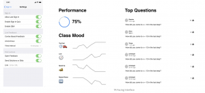
- The achievement bar on top was too cluttered
- Real-time understanding does not reflect the students learning process as it’s natural for students to be confused before understanding content
After considering both insights from 1:1s and testing we found our interviewee’s needs, we discovered a general consensus amongst all our subjects that there needs to be a method for testing the knowledge of students in a safe space where they won’t feel like an outcast. We specifically chose the word “communication” to convey an open-ended-ness of what exactly was being communicated previously but we have now converged to the communication being about the content of the lecture.
Target User Group
Our current user groups are split into 2 groups:

We defined our user groups to be Students and TAs as our solution is for the communication of these 2 groups and therefore they would both use this app.
How Might We Question
Original HMW Question: How might we streamline communication between instructors/facilitators and students?
After our need finding and research synthesis we flared and eventually focused until we reframed our HMW question.
Reframed HMW Question: How might we use technology to help TAs get a better sense of student’s understanding during sections?
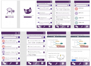
Low-Fi Prototype
Hi-Fi Prototype
- Problem 1: Which would be less obstructive? Collecting data before session, during, or after?
- Problem 2: How can we destress students and incentivize them to participate more?
- Problem 3: How can we cater to different professors’ preferences?
- Problem 4: What are the most helpful data? How can we better present analytical data that’s easy to understand?
Constraints of the Design Space
The technology that we developed should be very easy and intuitive to use following the common design practices because we must ensure that students attention doesn’t shift to using their phone instead of paying attention or take too much of their time to provide the feedback in a way that interferes with the learning process
In order to ensure that feedback isn’t constitutive, we must prevent dishonest feedback. Therefore feedback cannot be anonymous and we have to collect some personal information about the students. This is a data privacy concern/constraint from the TA’s and student’s perspective if TA’s or students have their performance logged in some way in the app.
Different professors and TA’s have different teaching styles. We tried to account for this but sometimes having many options introduces complexity to the intuitive usability of the interface.
User Testing
- Make the app lecture content or discussion specific. For example tie the sampling Time to based on the feedback at the end of each question and not based on a time interval
- Add a section where lost students or students who fall behind can read solution or watch solution video to not feel like their time was worthless and they are lost.
- Add functionality where students who are asking questions can reference. Students forget the question that were asked or want to easy way to refer to them
Next Steps
- Because of time constraints, we weren’t able to test the prototype in a live section so we want to test this prototype in a section.
- Make the look and feel of both sides seem more coherent. The 2 different sides were made by separate sub-teams in the team and therefore have a different look and feel to them so we would come to a conclusion about a universal color scheme that would work for both sides.
Reflections
Some things I learned during this project and working with this user group is that both TAs and professors want to create an environment that students can participate in but they are very limited in the time they can spend to make those connections and make them feel comfortable so a gap between these 2 groups of student vs. faculty arises which can be a barrier to them working very well together. When this flaw is highlighted both groups become a little defensive because they are frustrated but don’t know how to fix it so it’s important to be very open to rejection and reassure them that it is of no fault of their own. Another internal team lesson was that I should set meet up times while we are all together, set out to-dos when team members are face-to-face because it’s hard to bring everyone together again and explain their tasks etc.