About Me

Hello, my name is Ananya! I am currently a graduate student in the mechanical engineering department at the University of California, Berkeley. My interests lie in human-centered design, utilizing computation to augment engineering design, as well as ensuring ethics are considered in design. Though my background is primarily in mechanical design, I believe that the digital and physical world will continue to intertwine in the future and that it is important to consider design from both sides. Therefore, I want to be able to incorporate different perspectives from the human-computer interaction (HCI) and mechanical engineering design fields to inform my research in design theory and methodology.
Design Manifesto
My initial introduction to the design process was during an exploration of universal design – making sure products are accessible to all people regardless of factors such as age or disability. For that project, I worked with a team to take an existing item (a pocket knife) and redesign it so that it could also be used by someone with different needs (inability to hold the knife in its existing form). The process involved iteration of needfinding, prototyping, and user testing, much like in HCI, only resulting in a completely mechanical device. Transferring this process to the digital domain came with both new challenges and new opportunities. Below, I have outlined the takeaways from my experiences.
One of the benefits of designing in the digital domain, I found, was the ability to create something that many people could use at once. However, the large space of design possibilities when the group of potential users is large makes it difficult to narrow down the target population. When iterating on the prototype to improve the job application process, we interviewed a wide range of users relevant to the topic, including entry-level applicants, mid-career professionals, international students, and recruiters. This was helpful to determine how aspects of the design could be tailored towards those who would most likely need the solution, in comparison to the first round of interviews, which only included young job applicants.
Takeaway #1: Interviewing a diverse group of people related to the topic at hand before narrowing to a more focused target group can lead to unintuitive insights.
When designing for improving the job application process and improving safety on campus, we added features that were similar to what users may already be familiar with. Due to existing preconceptions on how such features might operate, usability tests involving them tended to reveal interesting information. For instance, some users liked the inclusion of swiping in the job application domain while others found too much similarity to Tinder to be a downside. This made us realize that while the two sides of the swiping interaction were equal in the casual dating context, that was not the case in the job application process. Therefore, we had to rethink the design on the recruiter’s side.
Takeaway #2: Maintaining balance between including what the user is used to and what could actually provide a better user experience can lead to more intuitive interfaces.
Takeaway #3: Synthesizing and utilizing conflicting information without letting one side or the other bias the design can lead to a solution that satisfies multiple needs.
When prototyping ways to help people navigate grocery stores in unfamiliar or new environments, we were challenged by constraints. We realized that not everyone would have access to a phone or Internet in a scenario such as going to a store in a foreign country. This led to ideas such as interactive displays or even flyers that would be placed in the store instead of traditional mobile applications or websites.
Takeaway #4: Being open to different media and thinking beyond the screen is crucial to designing for different contexts.
Finally, throughout all of the needfinding, prototyping, and usability testing, it was evident that keeping the user in the loop was just as important in the digital domain, though it was much more difficult. Due to the ease of prototyping a user interface (in comparison to a physical prototype), it was much easier to go down the rabbit-hole of developing very high-fidelity prototypes before getting enough feedback on the underlying concepts.
Takeaway #5: Several iterations at a lower fidelity can lead to more succinct and useful feedback on a higher fidelity prototype.
Overall, there were several aspects of the design process that I was able to transfer from my previous experiences and others that I learned through this work in human-computer interaction design.
Seek: the job application process re-imagined
by Cameron Lopez, Christoph Moser, and Ananya Nandy
The job application process is one that can be time-consuming and stressful, especially for those who do not have connections in the field and have to send out a large volume of applications to score an interview.
Needfinding
The first round of user interviews were with people who had either just started a new job or were searching for a job.
Insights from the interviews
- Users wanted to be able to send out many applications in a short time
- Users wanted to set up a profile once and not fill out repetitive information over and over again
- Users wanted to hear more feedback throughout the application process
Prototypes
- How might we store users’ data for more efficient use?
- How might we make the application process fun?
- How might we improve communication between employers and job applicants
Details from the first 4 interviews and initial prototypes can be found here.
We decided to iterate on the prototype that had the potential to be extended to fulfill multiple needs – a Tinder-inspired app that allowed users to swipe on jobs they were interested in to more efficiently go through the initial stages of the job application process. The interactive prototype is here.
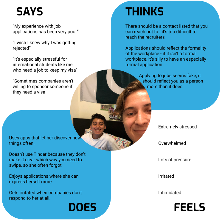
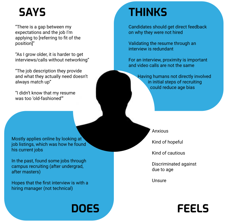
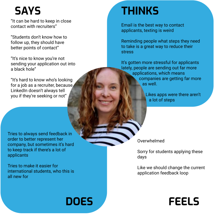
For a second round of needfinding, we interviewed a wide range of people to understand what needs were specific to each group. We conducted 3 interviews, including an entry-level job applicant, a mid-career job applicant, and a former recruiter. We then made empathy maps and identified trends.
Entry-Level Job Applicant
Mid-Career Applicant
Former Recruiter
We decided to focus on entry-level job applicants (i.e. recent college graduates), as we found that those were the people most likely to be sending out a high volume of applications. We then conducted 1 additional interview with an entry-level job applicant to gather more information within this target group.
Confirmed previous insights
- Issues with hearing proper feedback
- Time wasted due to redundancies across applications
- Stressful process that could be made more efficient
New insights from a recruiter’s perspective
- Recruiters have to deal with far more applications than they did in the past
- The large volume makes it difficult to provide feedback to applicants
From this information, we refined our problem statement:
How might we make the initial stages of the job application process easier and more transparent on the applicant side while also keeping it efficient on the recruiter side?
Prototyping
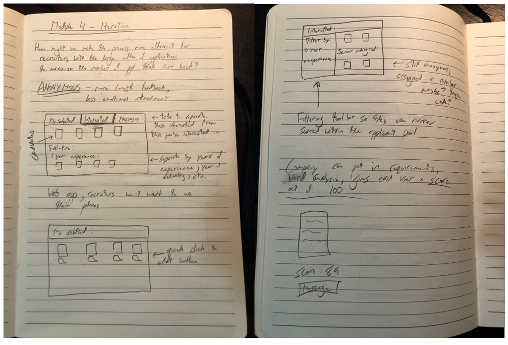
In this second round of prototyping, we added what would be the recruiter side to the mobile application. We realized that recruiters were unlikely to do their jobs using a mobile application and would be more likely to use a tablet or desktop version. To determine what features to add to the applicant side and how to structure the recruiter side, we created 3 medium-fidelity prototypes. The prototypes addressed the following questions:
Applicant
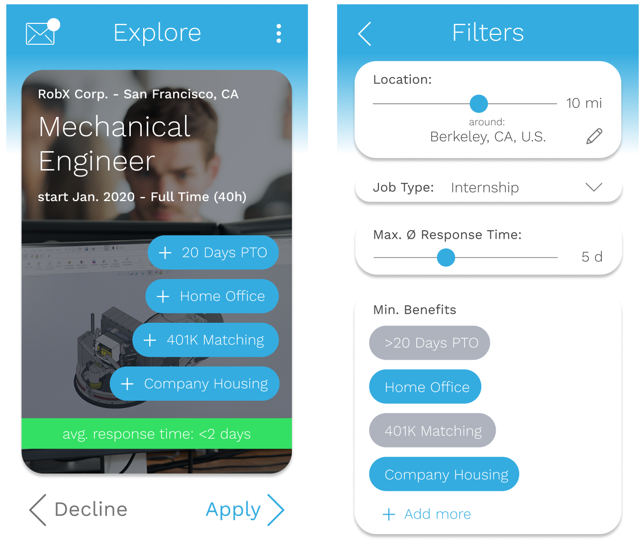
How might we make feedback more transparent for the applicant?
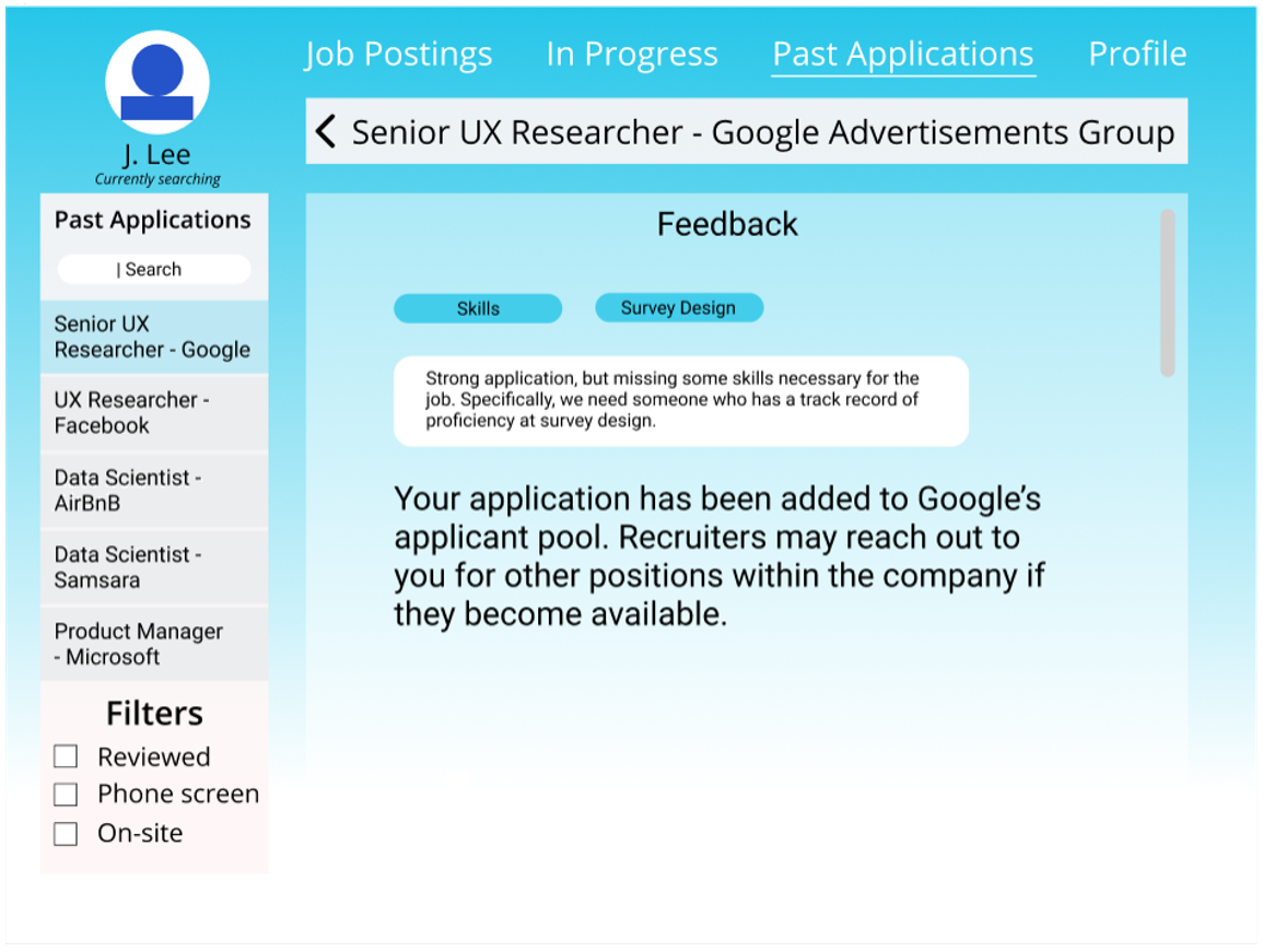
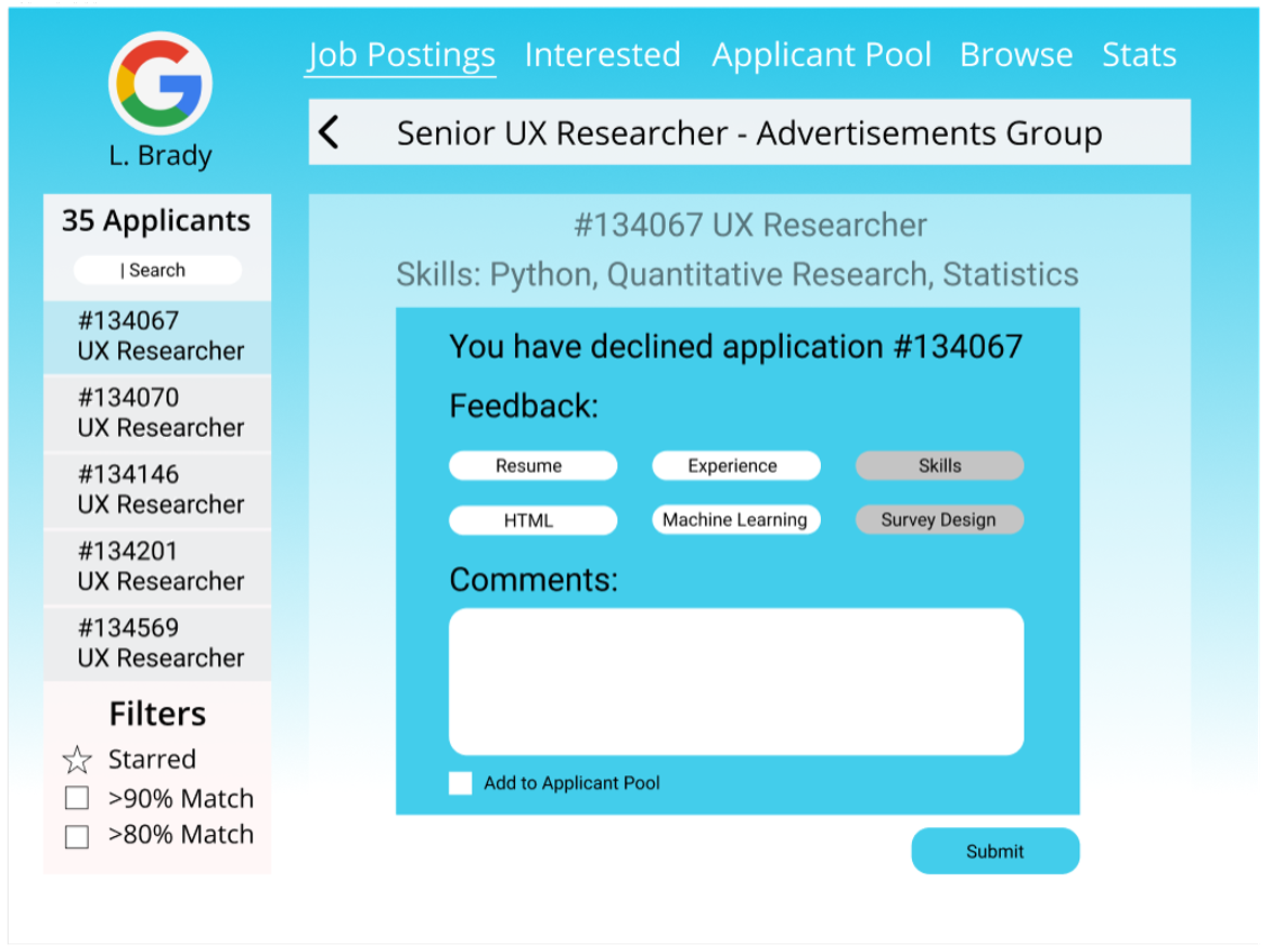
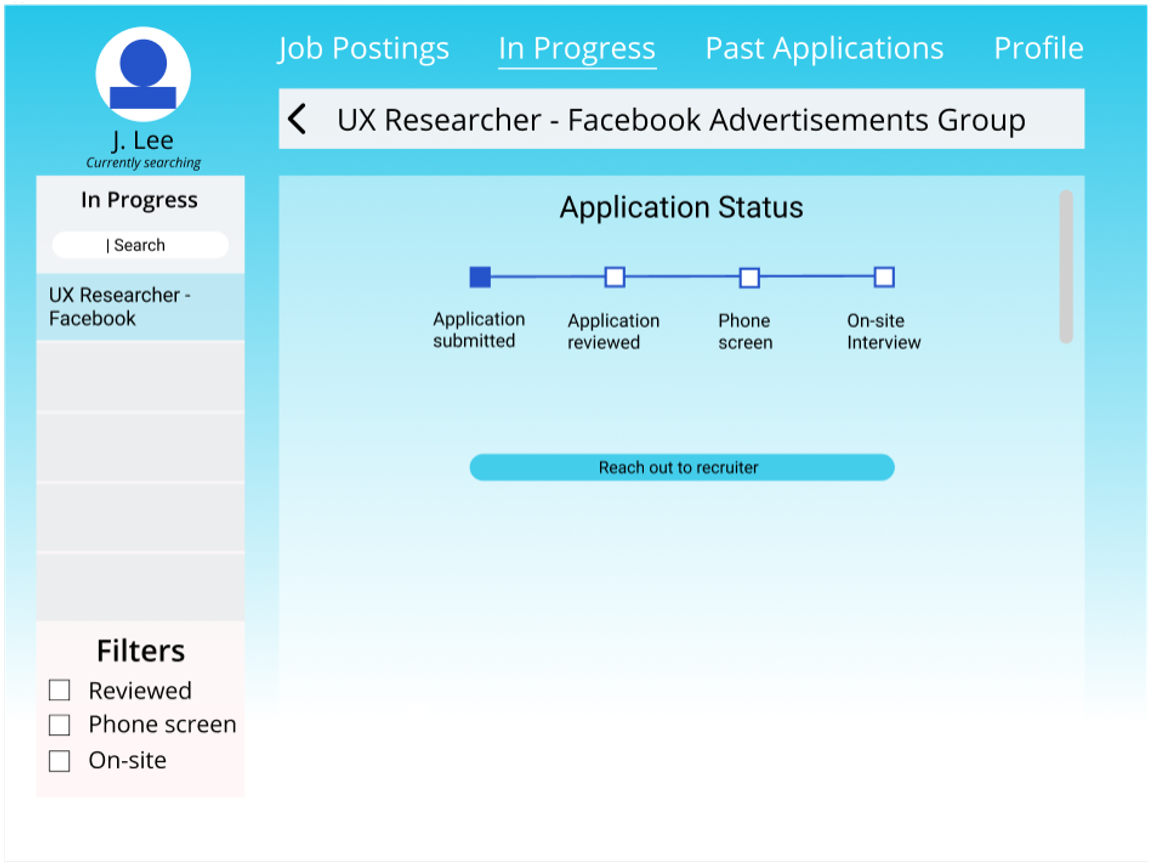
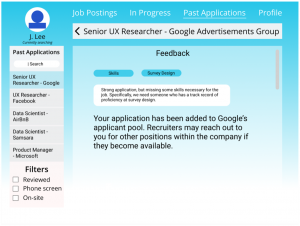
Features were added to both the recruiter and applicant sides to see what feedback would be needed to improve the applicant side while not adding an extra burden to the recruiters. One was the ability for recruiters to “quick-select” their feedback with the option to leave more detailed comments while the other was a timeline in the application process to check the status. This was so that people would know if their application was received and/or considered, as well as if it was accepted or rejected.
Recruiter
How might we minimize response times of companies?
This prototype intended to show both the applicant and the recruiter how long it had been since they had responded to an application. This addressed the worry that applicants had about their applications going into a black-hole. In addition, recruiters would then be reminded of the fact that they were leaving people hanging.
How might we make the process more efficient for recruiters?
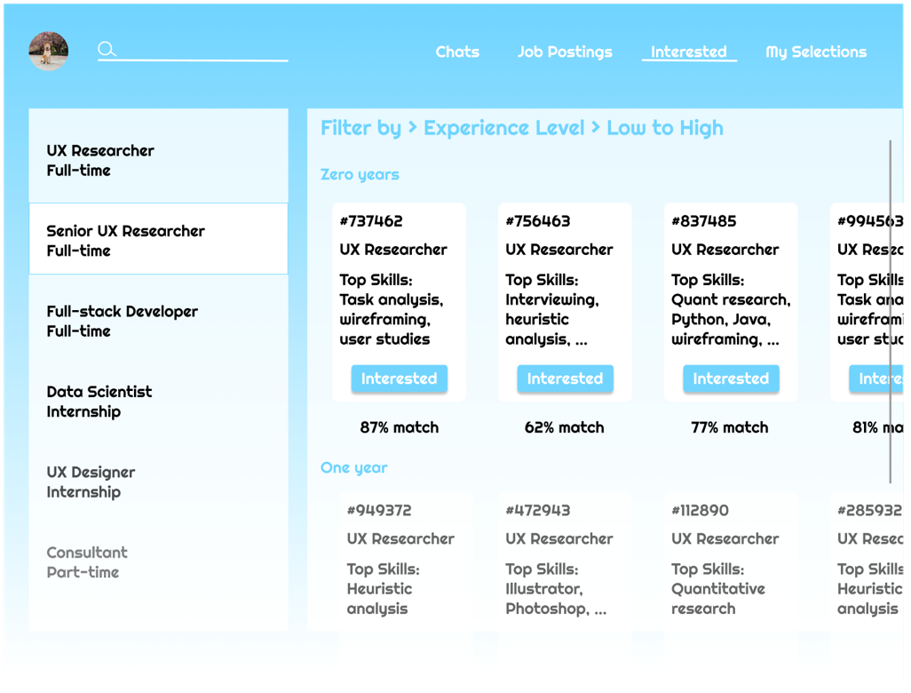
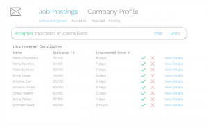
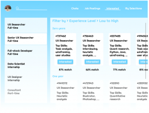
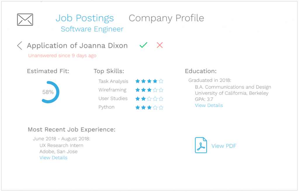
Initial sketches had a grid style that could display some info about each participant so that the recruiter could see a large volume of applicants at once, but still have the option to click on their profiles and chat. In addition, the prototype included some additional information such as a percent match and top skills so that recruiters could see a good snapshot of the applicants at a glance.
Usability Testing
What type of feedback is most useful to an applicant? (Comparison of information)

- Application feedback (strengths/weaknesses) is nice-to-have but not necessary
- In tag form, feedback is difficult for applicant to interpret
- Timeline is the most useful information
- Most important information was if the application made it to the recruiter and knowing if it was declined (so they can move on)
Since the application feedback was not significantly useful to the applicant, it does not make sense to have the recruiter spend extra time on it. On the other hand, the application status does not add any extra work for the recruiter, as the system can take care off it based on the recruiter’s actions within the application.
How will applicants utilize information about company response time?
- “Response time is very important because I want to have an idea what’s gonna happen in the future”
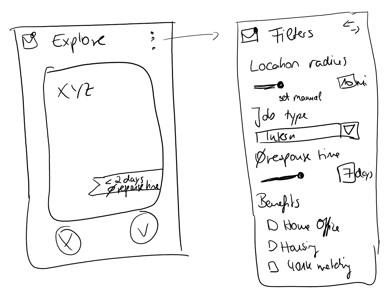
- Thinks the filter is quite nice
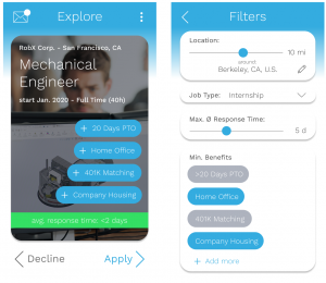
- Would probably change the filter to not miss any companies (start with companies with low response times, successively setting it higher and reswiping).
Adding a simple message regarding response time and allowing applicants to filter for response time if they want gives the applicants control over the timeline of their job application process. Based on testing, it seems as if the users would like this feature because it would not limit their search but provide information that they can use to make decisions on where to apply.
Which interface allows the recruiter to process the highest volume of applicants in the most efficient manner?
- Filter options and the chat function are useful
- The job posting should not be the home screen (the recruiter already knows it)
- The percent match feature could be a big time-saver for the recruiter if it worked reliably
- The grid layout is too cluttered with information
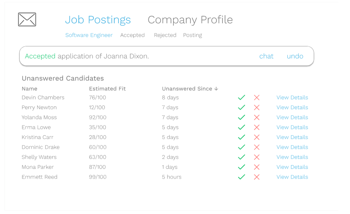
- The list layout with minimal information is better because the recruiter would click on every applicant anyways
- Reducing the visibility of a job posting that is not accepting a large amount of applicants is a smart way to incentivize hasty feedback
Overall, the usability test revealed that the minimal list style is preferable on the recruiter side. However, augmenting it with the grid style’s filters and chat options would give the recruiter more flexibility and easy-of-use.
Detailed user interview and usability testing notes can be found here.
Based on all of the usability tests, we converged on features that would balance both the applicant and recruiters’ needs.
Features
Recruiter (Desktop/Tablet)
- Less cluttered (no need for job posting or all the info about applicant)
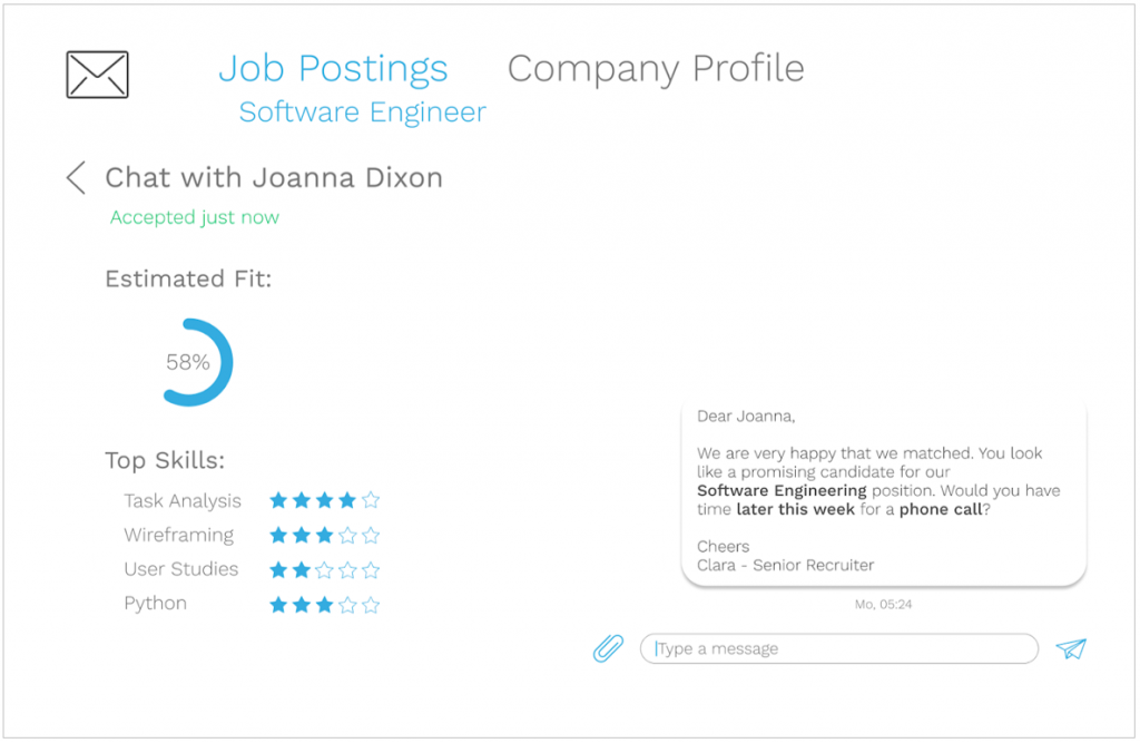
- Chat function
- Match percentages
- Visibility decreasing (separate error messages)
- Keeping old applications
- Just one most recent experience displayed for applicants
Applicant (Mobile application)
- Seeing if applications have been reviewed
- Seeing if applications have been rejected
- Messaging (organized)
- Several filter options
Final Design
Applicants
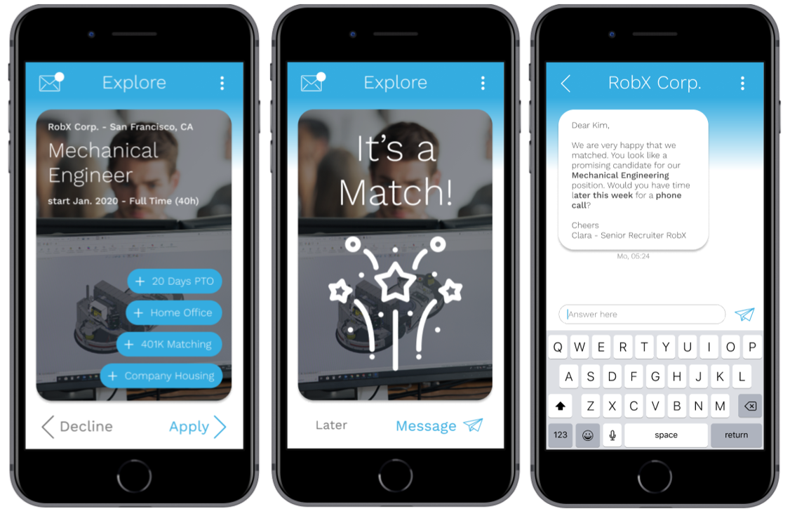
Swipe to Apply, Receive Matches, and Message
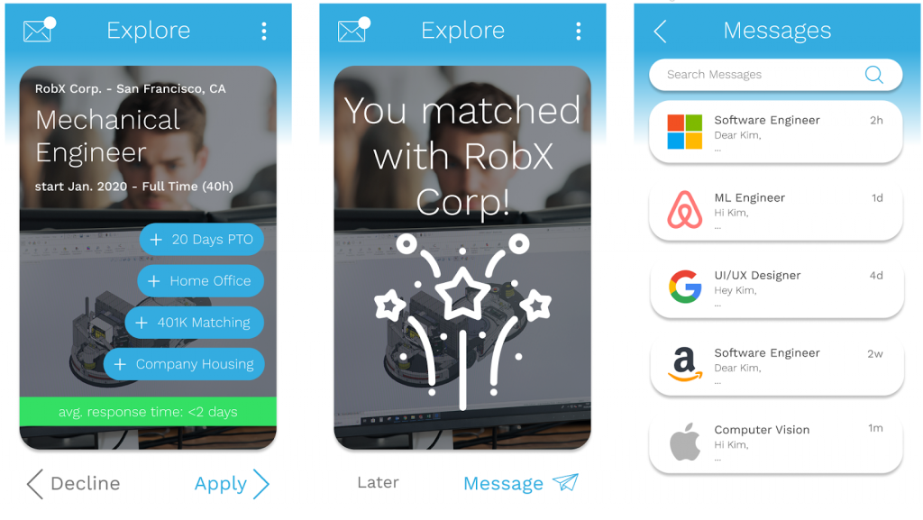
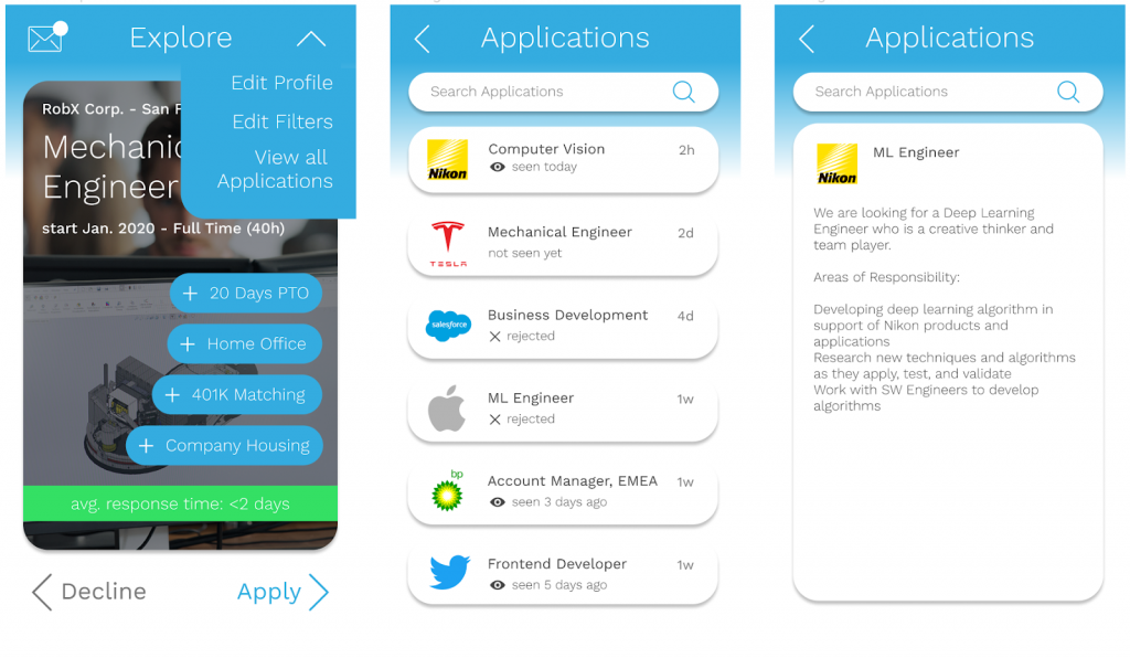
Customize Profile and Filters
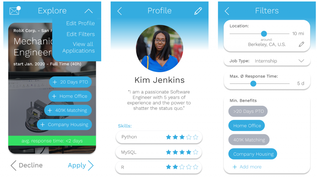
View Application Status
Recruiters
View by Applicants by Job Posting
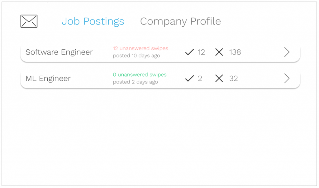
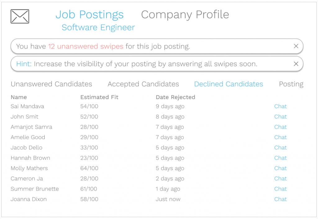
Incentivizing Fast Feedback (Visibility of Posting Decreases with Unanswered Swipes)
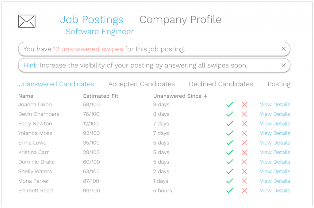
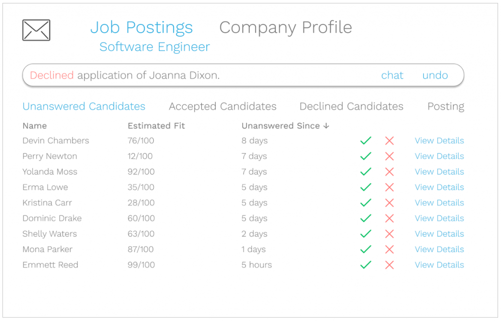
Option to Undo Mistakes
Profile Summaries
Chat Feature Included
Keep Database of Rejected Candidates for Future Consideration
The link to the interactive prototypes for both sides is here.
The interaction is shown below.
Most existing job application products and services allow you to upload a resume and other information, but we wanted to create a platform where you could apply more efficiently, have a central hub to refer to the applications and their statuses, as well as have direct contact with recruiters.
Other Modules
Designing for Friction: Riserly, the alarm clock that challenges you
Designing for Understanding: Grocery shopping in an unfamiliar environment
Designing for the Social Web: Safety on campus