Intro
 Hi, I’m Andrew Chen and I’m a Computer Science major at University of California, Berkeley. In this space I have worked on several projects, ranging from the mobile space to full stack web applications. While my major often puts me in the role of implementing the backend, I believe that having a deep understanding of how the user-facing side in human-computer interaction works is essential to creating any successful design.
Design Portfolio
When it comes to user interface design, I’ve discovered that its much more important to focus on the “user” than the “interface”. What this means to me is that during the process, it is infinitely important to circle back to the ideas that motivate each step of design, and that means focusing on the user needs. I’ve also discovered the importance of considering abstract ideas to construct a concrete design language — just blundering into the final product rarely adds up the careful consideration and a structured process.
LO-FI FOCUS
Before the panels and toolbars are actually implemented, blocking them out on pen and paper is essential for me. In fact, a lot of the critical thinking takes place in this stage — developing the knowledge to transfer what up to that point has been simply words into something actionable is a crucial step. Also, the speed of making a lo-fi prototype allows less investment in to failed ideas and more time to create a successful one.
Over time, I’ve become used to consistently using pen and paper prototypes: they also allow for a more nuanced discussion than just conversation about a proposed idea. When designing ArtMap, asking potential users with a lo-fi prototype in hand uncovered a lot of new insights.
INTUITION AND FAMILIARITY
One thing that I discovered over usability studies for every project I’ve worked on is the importance of making a design intuitive. Whether this meant referring to concepts in the space of the design (e.g. environmental volunteering), or UX elements that the user was already familiar with, it was important that there was nothing confusing about a design’s layout even without explanation.
For example, the shopping experience prototype referred to various “review” user experiences, drawing from a wide variety of influences (Yelp, IMDB, etc.) to create an instantly intuitive product. To me, success is when a user doesn’t have to question what the purpose of a screen or function is for before using it.
FLUID ITERATION

Being afraid to throw away or improve on ideas throughout the design process is a major block to improving a flawed design. It is crucial to go back to the drawing board over and over, and not be stuck in one “stage” of design — in my opinion, it is only through iteration over iteration that a product can become better and more accessible. That meant making several design passes, and not being afraid to go backwards in the design process. After all, some insights can only be seen when starting over.
PURPOSEFUL DESIGN
It’s easy to get caught up in making the interface more aesthetically pleasing, without considering the priorities of the user. As I worked on more projects, I realized the importance of considering task criticality when addressing functionality. How much of an impact does this function have, and what is the frequency of its use? By considering this, I was able to remove bloat from designs while maintaining their functionality.
This lead to a more simple design language that didn’t overwhelm the user or seem too cluttered, and something important that I kept in mind as I developed high fidelity prototypes, such as this one for ArtMap.
USER CONVERSATION
Going together with the iterative process, the feedback that is most important is definitely that of the target user. While the designers themselves can often see flaws in their own design, I discovered that there were several insights that needed fresh eyes. With user feedback from usability studies, glaring usability issues and even suggestions for how to provide much needed functionality gave a lot of material to go back to the drawing board with.
Design Documents:
Design for Iteration: A Platform for Environmental Volunteering
Overview
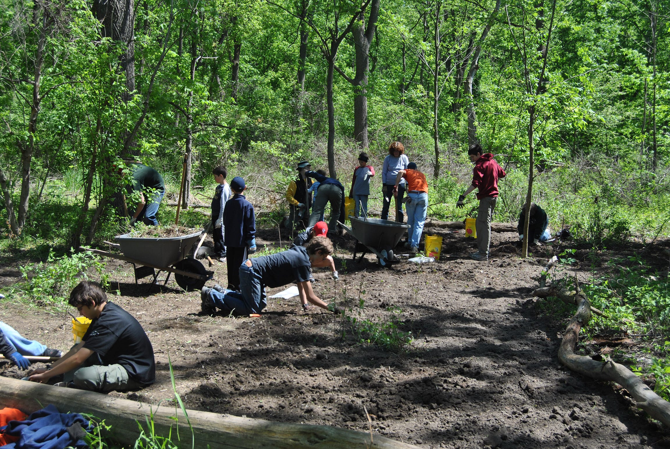
Global warming and other environmental issues threaten our planet on a daily basis. Although many people are aware of the threat and would tell others that they are willing to help, few actually take the time to volunteer. With our product, Envol, we are trying to address the issues that prevent people from volunteering.
The prototype is trying to solve the problem of many different volunteering events having different sign up processes and thus taking large amounts of time. In addition, the current standard of search (Google) does not give relevant search results. By standardizing the signup process and aggregating all events into one platform with a powerful search function, the user can efficiently find the events most relevant to them and spend minimal amounts of time signing up for them.
Interviews
From our interviews, we found that there were several pain points that formed a barrier between the average concerned citizen and the active environmental volunteer.
Our user group is composed of working adults, some who are active in environmental volunteering and some who have no previous experience. We engaged with this group by asking them questions about their priorities and thoughts on the current landscape of environmental volunteering. We also conducted user testing with the group. From our second round of needfinding, we were able to learn that people who are already involved in environmental volunteering have something in common with people who are thinking about starting, which is that they value their time immensely. It seemed like the major pain point and obstacle for people who wanted to volunteer was the amount of time they needed to invest in finding quality events. In terms of new information, we found that the impact of events is important to some users, who want to see their actions directly benefit the communities or ecosystems around them.
Needfinding Domain: Anybody who would potentially volunteer environmentally, of all levels of experience
Methodology: Interview
Interview Plan: Investigate the barrier between idea and action when it comes to environmental volunteering.
Interview Results and Key Insights
Interview 1
11/18/2019 3:00PM at Jonathan’s apartment
Interviewee is a 26 year old female working for the San Diego Water Authority
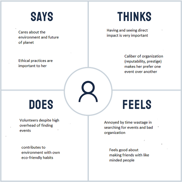
From the interview, I learned that individuals who are already motivated in terms of environmental causes can benefit from a platform that helps them save time in the search for volunteer events. It is becoming clear that time is an especially valuable resource for those who would actually be willing to go out and volunteer. In addition, the interviewee (who already goes out of her way to volunteer) cited long and convoluted sign up/search processes as a major pain point and deterrent. This shows that those dedicated to environmental causes are also not keen on spending lots of time to find a good event. There is also something to be said about the social aspect, as it is clear that volunteers would like to connect with like minded individuals in their volunteering experiences.
- User needs to be able to find events of a high caliber and ones that have a good location without spending large amounts of time.
- User needs to connect with like minded individuals in her volunteering experience.
- User needs to see her volunteering making a direct impact on her surroundings and participate in a well-organized event (waste less time, have more flexibility).
Interview 2
11/19/2019 5PM at Interviewee’s Apartment
Interviewee is a 23 year old software engineer working in SF
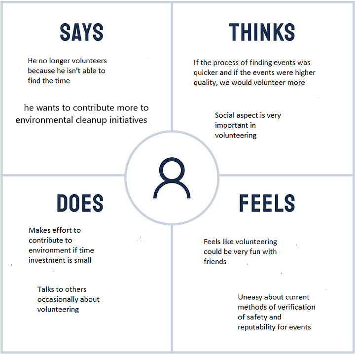
One of the target demographics for a potential app if participation would want to be increased would be those that say that they want to volunteer but just can’t find the time. From the interview, I learned that this demographic seems to convey that they would be more likely to volunteer if there was a tool/platform that allowed them to maximize their usage of time. In particular, the process of searching for the event needs to take minimal time and also the event that they possibly choose to attend needs to be close to perfect (reputable, fun with friends, and impactful) in order for these users to consider volunteering again. It is evident that the majority of people who volunteer don’t find the work nearly as fun as the social aspect, and thus an event without friends can dissuade repeat volunteers.
- User needs to see a social aspect in events in order to want to volunteer more.
- User needs better method of finding events that takes minimal amounts of time.
- User needs to be able to verify the safety of events consistently.
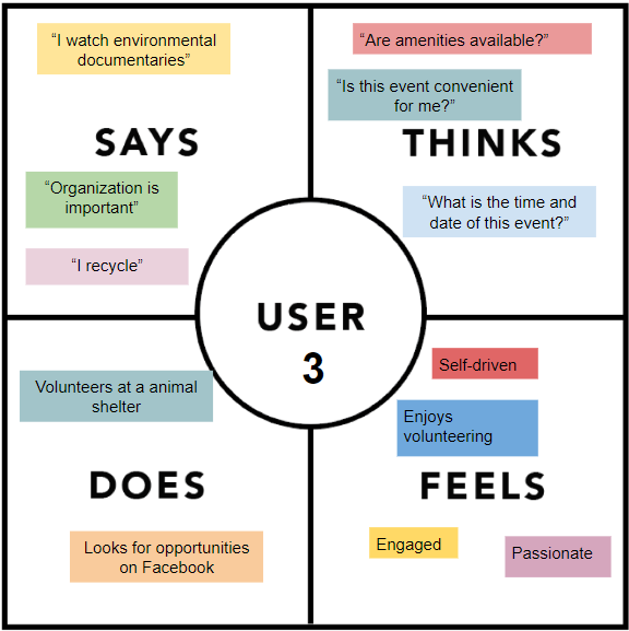
Interview 3
11/14/2019 4:05 PM at GCB Cafe
31 year old lawyer (subject declined recording/photograph)
Interviewee has most experience volunteering for other causes. He appreciates structure in his volunteer experiences, and needs to know the specifics of how, what, where, and when the task is to be completed. As a goal-oriented individual, he requires leadership and organization to make him feel like his time is being utilized effectively. And of course, he values the social aspect, especially as he is more committed to regular and less event-based volunteering.
- User needs to have structure and hierarchy in a volunteering experience.
- User needs to be able to know the details about any volunteering event.
- User wants to be able to see the impact of his or her actions at a volunteering event.
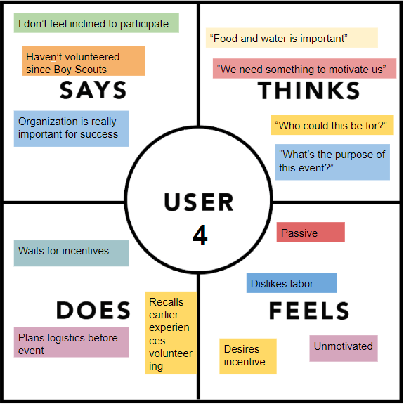
Interview 4
11/15/2019 6:15 PM at GCB Cafe
20 year old student (subject declined recording/photograph)
Interviewee does not have much experience volunteering outside of participating as a Scout during his childhood. He asserts that the most difficult part of volunteering is the logistical aspect, and as a rule requires an incentive to consider volunteering (in the Boy Scouts, it was a requirement to advance, if we understand him correctly). As someone familiar with the difficulties of volunteering as well as the lack of motivation to commit one’s time and effort to volunteering events, he recognizes that there is a distinct lack in the bridge from someone’s couch to the space of volunteering action. Many other users might empathize, as passiveness and a dislike of labor is not uncommon.
- User needs the event to be well organized.
- User needs to know the details of the event.
- User needs external as well as internal motivation.
We identified two main “concepts” for our users:
- Volunteer ranging from armchair activists to hardcore public servants compete against each other for the incentive — public recognition, in the form of internet points
- Groups encourage the social aspect, and help volunteers find similar-minded people, in terms of volunteering interests, while fostering cooperative competition — public recognition, in the form of internet points
How Might We…
How might we encourage new volunteers to invest time into volunteering?
How might we make volunteering more social?
How might we introduce structure and organization in to volunteering?
Prototyping
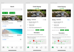
The design concept would be a consolidated platform where one can quickly and easily find the events that they prefer. Our solution creates one place where a prospective or experienced volunteer can find legitimate and impactful events with helpful features like ratings, incentives, and search functions.
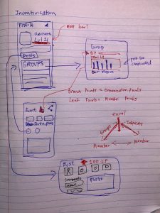
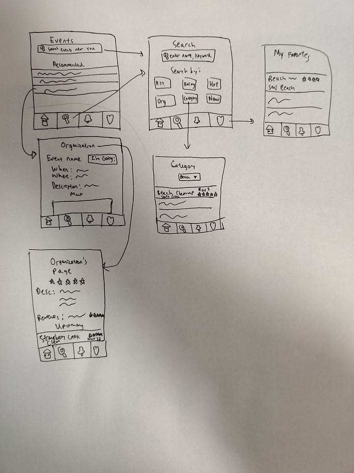
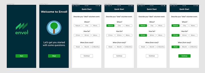
Lo-fi Prototypes
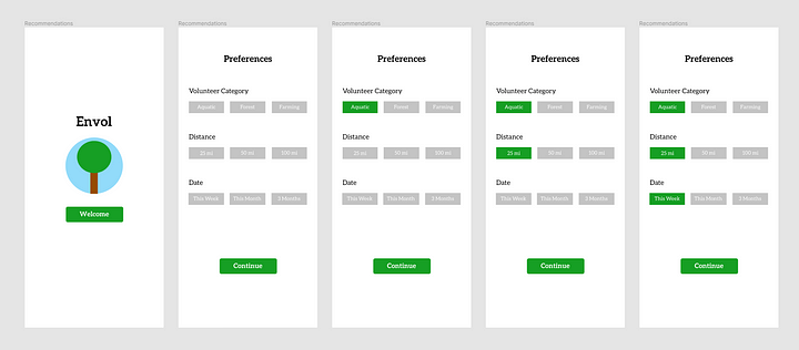
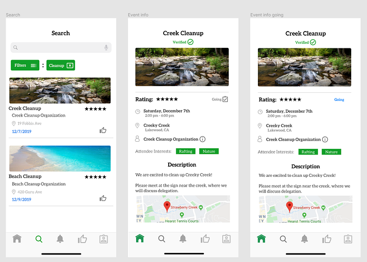
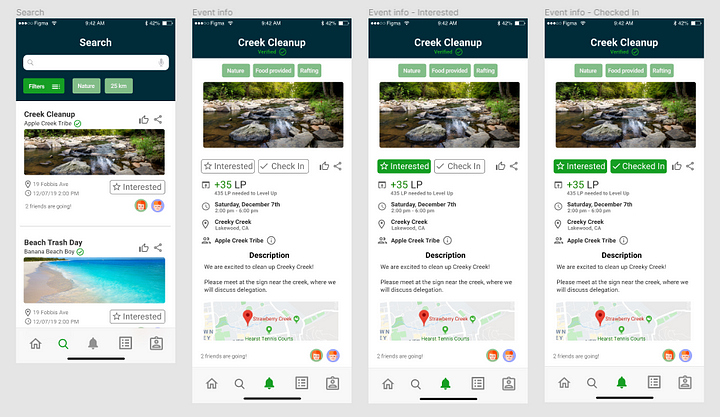
We decided that we would need to create an search page, where users could find events. Upon selecting an event, the user would be able to access all the aforementioned features, as well as see categories. The user would also be able to see what kind of organization was running the event. By joining such an organization, users would also be able to contribute to a social group centered around a sphere of environmental volunteering that they were passionate about.
In the age of instant gratification, a “recommended” section is essential and thus the app will use a ML model to provide the most relevant events to the user based on what they search for, favorite, and rsvp for. This will save the most time theoretically since there is a chance that what they are looking for will pop up on the screen the moment they open up the app. There is still a powerful search function which allows the user to search on their own criteria for events. Events and Organizations are rated by users so that users can look for the most reputable and impact-generating events/orgs.
These are some early sketches that we went with:
We were constantly asking ourselves: will giving users a tool that allows them to bypass what they claim is the most headache-inducing part of the process of volunteering (finding good events), will we be able to encourage more participation? In particular, will both eco-minded individuals (will their time be saved?) and people who vaguely want to start volunteering (will they take the first step?) both benefit from a tool like this? This helped establish a basis for the more concrete step of implementation.
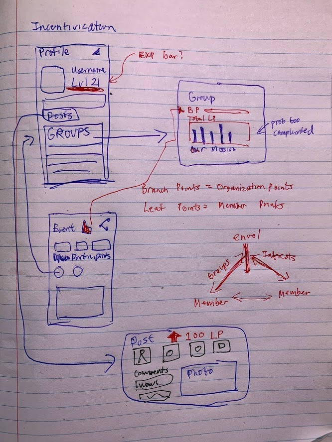
Later ideas in the lo-fi stage included the incentivization system, which aimed to tackle our first “how might we” in a more concrete way than just convenience given our interviews and first usability study. Also, we wanted to create a system that could recommend fitting events based on the user’s interests. This sprung out of our third “how might we”, in which we aimed to make volunteering seem less like vague acts of charity and more attuned to a potential volunteer’s actual interests — in other words, providing structure to the environmental volunteering experience.
Early Hi-fi Prototypes
The prototype is trying to solve the problem of many different volunteering events having different sign up processes and thus taking large amounts of time. In addition, the current standard of search (Google) does not give relevant search results. By standardizing the signup process and aggregating all events into one platform with a powerful search function, the user can efficiently find the events most relevant to them and spend minimal amounts of time signing up for them.
We wanted to iterate not only on the previous design, but further focus on our own designs that we created for this module. Given the feedback in the needfinding process and usability testing process, we thought it was necessary to adhere to these principles when creating our user interface:
- Simple and easy to use
- Use of color and rule of proximity to encourage target behavior
- Minimum amount of actions needed to find target events
- Incentive and social aspect
Our prototyping process was heavily intertwined in to our usability testing process, as we constantly iterated on our design given informal feedback, discussions with others, and the actual usability tests.
Usability Testing
Full Usability Study Plans, Guides and Results
With our usability study, we really wanted to use new eyes to probe our interface design for any inherent flaws in layout, organization, and structure. In combination with this, we could use this opportunity to determine what kind of prototype would line up the best with our overall vision and are easiest to interpret for the average user.
Main Questions:
Generally, we wanted to consider these three questions in our main line of testing:
- What effects do different methods of attempting to get users to follow through with volunteering have?
- Do users want to have the easiest search experience possible (tailored recommendations), and will this ease allow them to follow through more often?
- What makes a user prefer one event over another?
Participants and Recruiting strategy: We recruited two of the individuals that we interviewed during needfinding, because we were interested in seeing whether our design took their viewpoints into account.
Usability Study 1
Setting: Conducted the usability study with the same user (26 year-old water authority employee from San Diego) at her house on 11/29/2019.
Method: Monitored usability testing: tester is observed and engaged within physical proximity
Overview of Study:
- What questions did you want to be answered: Does making the process as easy and quick as possible make people want to go volunteer more?
- Which prototypes did you use: Our initial prototype
- What tasks did you have the participants perform: Compare looking for and signing up for an environmental volunteering event found via Google vs. most likely to work prototype
Top Three Takeaways:
- People who have already had some experience volunteering really value their time, and they want events that will accommodate for their schedule. They also want to have the events that are relevant to them be the first ones that they see (save time in search process). An easy search and signup process can really make people volunteer more because the initial barrier is removed and the time that they save can be put towards actually volunteering.
- Having the guarantee of safety and legitimacy is very important for just about everyone. Safety comes first whenever a person is going out potentially by themselves with people that they don’t know (which is the premise of a volunteer event).
- The social aspect is important to people who have small amounts of time to give away. Since people who are likely to volunteer out of their own volition are usually working adults, they want to be able to socialize when they volunteer because they are using their free time and they aren’t really able to make friendships at work.
Usability Study 2
Setting: Conducted the usability study with User 4 outside Blue Rock Cafe
Method: Monitored usability testing: tester is observed and engaged within physical proximity
Overview of Study:
- What questions did you want to be answered: Does including the incentivization actually engage the user more? Is the further functionality noticeable, even without being mentioned? Is the app more intuitive and user friendly after making changes based on user feedback? Going through all the major functions of the app: is it navigable, even with further functionality added?
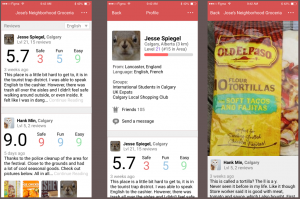
- Which prototypes did you use: Original version, only with rating system (Prototype A) and Newer version of prototype with badges, XP, and overall overhauled UI language (Prototype B)
- What tasks did you have the participants perform: Compare looking for and signing up for an environmental volunteering event
Top Three Takeaways:
- Larger, friendlier UI elements with clear interactivity (rather than just colored text) and a more effective use of color are important in making sure functionality is presentable to the user.
- Conceptually, incentivization should work, but it needs to have a large place in our design. Perhaps a group and profile screen would impact this.
- Making different parts of the design distinct visually makes it clearer to the user what the purpose of the active part is, and also improves the interface in terms of navigability.
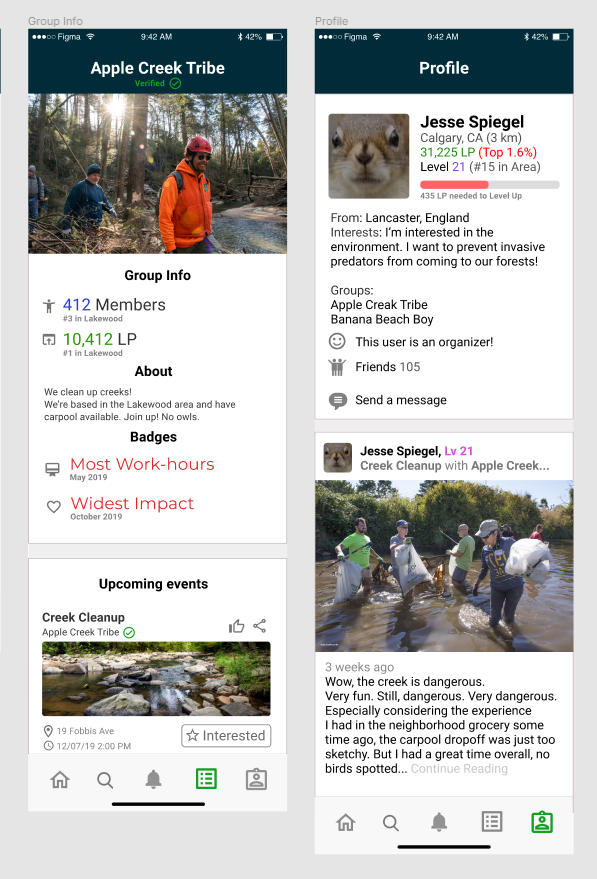
These created two new pages, the group info and profile screens, which further cemented the social aspect of our app (adhering to our second “how might we”). We further overhauled the existing pages of our app to implement the incentivization and signup systems and cement a more fluid and appealing design language that we obtained from our needfinding and usability study processes.
Final Result and Takeaways
We attacked this problem from start to finish based on the idea of iteration, from lo-fi to final prototype. To do this, it was a constant struggle to work in user feedback as we constantly tweaked and overhauled our prototype. These two new ideas eventually ended up overhauling our existing systems drastically, but we feel the effort was worth it in iterating towards a direction that would most benefit our user needs.
Still, there is no doubt room for even further iteration:
- Focusing on a narrower proto persona. We have uncovered that needs, interaction and content, as well as the way of exploration do differ within our current target group from user to user. Trying to address everyone’s needs did require a lot of effort, but it did make our final product much more useful in our opinion.
- Addressing several usability issues: for example, the iconography, flow of actions, system feedback, and utilization of familiar concepts from the context of environmental volunteering should be improved. While there are usability improvements we believe we’ve made in the volunteering experience, though they definitely can be expanded on.
- Further expanding our prototypes beyond Figma mobile devices. Maybe including physical objects and bigger displays for actual use while volunteering, which would also widen our product’s impact.
Further Links
Past design documents
Offscreen
Bringing mindful awareness to screen time.
Collaborative Shopping
Making it easier to shop in an unfamiliar environment.
Art Map
Improving vistors’ museum and gallery experience.