Info 213 Final Portfolio
Design Manifesto
About me:

I am a first-year graduate student at UC Berkeley, working toward a master’s degree in information management and systems in the School of Information. I spent this past semester honing my user experience design skills in Info 213, a course geared toward designing for optimal human-computer interactions. Through this course I was able to fine-tune my design process and use it to create four fantastic new app ideas. The purpose of this post is to delve into how the beginning design modules influenced my design process and then detail how I used my newly-refined process to complete my final design project.
How did the design process impact the decisions I made?
The iterative design process impacted the decisions I made by allowing me to know exactly what the user wanted along every step of the way. Without thorough interviews and user testing, each one of my designs would have turned out drastically different, and wouldn’t have been nearly as beneficial for the people using them. I’ve come to realize that it’s really important to listen to the needs of the users rather than attempting to impose my own desires onto them.
In fact, the design process can’t even really begin until you’ve completed a multitude of user interviews in a domain of choice, because otherwise you won’t know if anyone will even use an app idea. Through trial and error I found it most useful to conduct interviews over a wide range of potential users before focusing in on a specific target group. This allowed me to see many different viewpoints and focus in on only the most pertinent user needs.
What design methods did I use and why?
I used a lot of different techniques throughout the course of the semester. For me, the portions of the design process that had the biggest impact on my final designs were parallel user testing, task analysis, and user interviews. I used the user testing and task analysis methods often because once we had a few initial prototypes created it made it easy to get feedback on which aspects of our applications individuals liked and didn’t like. Being able to see physical representations of multiple ideas side-by-side and walk through them made it easier for participants to critique the ideas, which made it all the more helpful for me in my design process.
For instance, with my application Duber, a dog-sharing carpooling app, there was lots of helpful feedback that paved the way from a basic medium-fidelity prototype to a nice, polished hi-fidelity prototype.
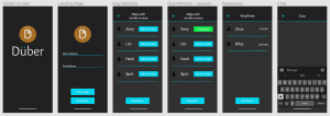
Medium-fi prototype
The process above turned into the below process after user testing and refinement on my part.
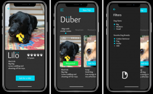
High-fi prototype
User testing was essential to the final design in every module I completed, which you can see more of in the following sections further down the page.
In addition to the importance of user testing, one other design method that was incredibly helpful to me was the flaring and focusing of brainstormed ideas. Coming up with a multitude of potential questions we could answer and then narrowing in on only a few of them to address, and then flaring out again to propose as many solutions to those questions as possible before honing in on what we should prototype to solve was very helpful to me. It allowed my team and me to come up with a smorgasbord of wild, wacky ideas and see as many different perspectives as possible before narrowing in on a final idea. My teams and I utilized this technique in the beginning stages of the last two modules to design applications for individuals who wanted to spend more time with dogs and then again to iterate on an application that makes applying to a large volume of jobs easy and fun. I found this technique to be immensely helpful in both situations. Without flaring out to try and propose ‘dark horse’ ideas, my group never would have landed on the ‘tinder for job applications’ that we ended up iterating on for our final module, which you can see our initial prototype for below. The point to flaring is that you never know if something is a great idea or not unless you get it out there.
High-fi prototype at the conclusion of module 2
Finally, in the beginning stages of app ideation I made use of empathy maps to summarize user interviews quite often. It allowed for a very succinct way to visualize a snapshot of what each interview consisted of, and I found them very useful when going back to look through the interviews again. You can see some of my empathy maps from different modules below.
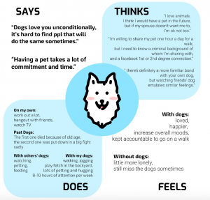
Empathy map from module 3
Empathy map from module 2
How did this differ across different methods?
User testing was certainly more helpful in some instances than others. In our first module, while designing an application geared toward ensuring that e-scooters were properly parked before allowing the user to leave them, we didn’t have multiple prototypes to test.
User performing a user test on an early Figma prototype
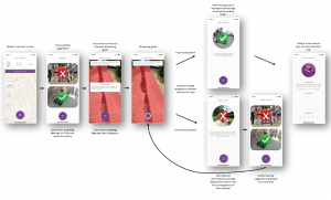
Final wireframe of our high-fi prototype
For this reason it was difficult to gain a significant number of insights from users, because there was nothing to compare the design or the idea to. The only ideas we could gain were things the user was able to think of themselves rather than them gaining inspiration from several different prototypes and being able to pick and choose which aspects of each they liked/preferred.
However, in our last module (which I’ll get into in more detail below) my team was able to compare several different prototypes at once. This allowed us to get more honest feedback on which aspects of the designs users liked or didn’t like, and it led to a far more efficient and insightful user testing session in my opinion.
The flaring and focusing aspects of the design process as well as the empathy mapping were fairly consistent across different modules, both providing similar insights and allowing for healthy questioning of our design decisions. The ideas in question were of course different across the different design modules, but the application of these particular design concepts remained the same, with no outstanding hiccups to note. You can see how we brainstormed and ultimately decided on ideas in the photos below:
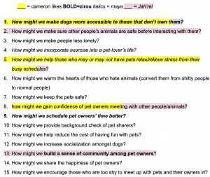
List of How Might We’s where we highlighted or bolded ones we were interested in
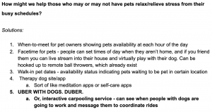
Solutions posed to one of our How Might We questions
Were some topic areas more challenging than others?
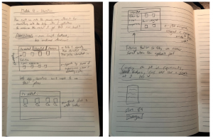
Some topic areas were definitely more challenging than others. For instance, in the course’s second module, I was tasked with designing a way to make job applications more fun while allowing users to express themselves in ways more complex than just their resume. My solution was to allow users to play ‘brain games’ and display their scores on their user profiles for companies to see. This is where I ran into challenges, because it was difficult to create a playable game for users to walk through. In addition to testing the overall process, I wanted to be able to prototype some actual games, so to address this I made a paper prototype of the game I had in mind and had someone test the actual game process to gain feedback. You can see the paper prototype and the final game aspect of the application that I arrived at after receiving user input below.
Paper prototype of the game
High-fi Figma prototypes of the game after testing with the paper prototype ->
In terms of actual course topics, I found letting the user fill the silence during user interviews and user tests fairly difficult at first. It seemed unnatural to me to let the silence hang in the air and not say something to break the tension. However, once I got the hang of it, I found it led to far more information from the user, as it is often their natural reaction to want to fill that silence with more information as well.
Additionally – I wasn’t able to grasp this concept until the very last module – I realized that prototypes should not be very high-fidelity. They should be just high-fidelity enough for the interaction to be able to run smoothly, nothing more. My lack of realization in the earlier modules made it more difficult for me to change the designs based on user input that I was receiving. However, in the last module it allowed for a lot of wiggle room and a lot more improvement between iterations, which was a drastic improvement for me. But I’ll get into that more later in this post.
So, how would I define my design process?
From the four modules we completed throughout the semester, I think I can confidently narrow down my design process into 5 main points. They are:
- Begin with interviews across a wide range of user needs before focusing in on a problem to address.
- Make empathy maps to summarize interviews, it makes it much easier to look back on the main points and saves a lot of time in the long run.
- Flare and focus early and often in order to see a wide range of perspectives. You never know if something’s a great idea until you put it out there.
- Don’t put too much detail into prototypes, it’ll only make it more difficult to change when you ultimately get feedback.
- User testing, user testing, user testing. Along every step of the way, as often as you can. And be sure to refine the design after each user test.
Module 4, Final Iteration:
Seek: The Job-Finding App
The final module was the culmination of a semester’s worth of design knowledge and practice. Here you can see how I applied my design process to an entire iterative design project, from need-finding to a high-fidelity prototype. The final result is Seek, the job-finding app: a solution to the cumbersome job application process that new college graduates face every day.
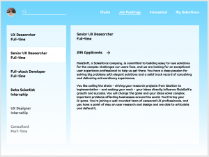
We had created the prototype below at the conclusion of module 2 to answer the questions of “How can we make job applications more fun” and also “how might we store user’s application data for more efficient use?” We arrived at this prototype knowing that users wanted to be able to send out a lot of applications in a short time, be able to set up a profile only once so they wouldn’t have to fill out repetitive and redundant info, and hear more feedback throughout the application process. Our final module built upon this previous knowledge and prototype.
Figma prototype at the conclusion of module 2
Target User Groups and Need Finding
We began our final module by interviewing a wide range of people currently going through the job application process. We did this to get a sense of a variety of different needs before honing in on a specific target group, a technique I had arrived at through experiences from my previous modules. We made empathy maps to summarize each of the initial interviews and used these to identify trends to be able to focus in on the particular group of job applicants which we felt was the most in need.
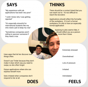
International student empathy map
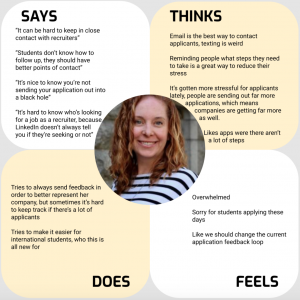
Empathy map for user seeking apprenticeships
Referencing the empathy maps from our initial round of interviewing above, we felt that entry-level job applicants were the most likely to be sending out a very high volume of applications. We felt that this target group would benefit most from an efficient job application app.
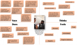
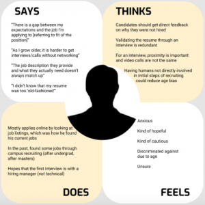
Once we had identified a target group after our initial interviews, we interviewed one more soon-to-be college graduate as well as a former college recruiter to try and see how we could formulate our app to be efficient from both the applicant’s as well as the recruiter’s side. You can see the empathy map for the college recruiter below.
Recruiter empathy map
Through these interviews we were able to confirm a lot of the insights from the applicant’s side that we had seen in our previous iteration, such as:
- The fact that many people had issues with hearing proper feedback
- They felt it was a waste of time to have so much redundancy in job applications
- It’s overall a very stressful process that could be made far more efficient
Because we also opened up our need-finding to job recruiters, we were able to see what they needed from a job application app as well. The interview with the recruiter revealed that recruiters have to deal with far more applications than they did in the past, and that feedback is also where many recruiters struggle.
How Might We’s
After evaluating all of the info we gained from our need-finding interviews, we flared out to come up with a long list of potential questions we could address before focusing in on three:
- How might we make feedback more transparent for the applicant?
- How might we minimize response times of companies?
- How might we make the process more efficient for recruiters?
Afterward we then flared out again to propose solutions to each one of these questions, then decided to focus in on one solution for each ‘how might we’ and make a prototype for each.
Prototypes
Our first prototype addressed the question of how might we minimize application response time of companies. It built off the already existing prototype that inspired this iterative module.
We began with some initial sketches and brainstorms of what we could add/accomplish from both the applicant and the recruiter’s sides. We realized that it may be difficult to decrease response times of companies, so we decided to implement a filter option where users could filter job openings by average response time of the company. So if a user is concerned about response times, they can set their filter lower to hide companies that tend to take a long time to respond, thereby decreasing the time it takes to receive feedback.
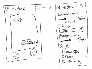
Low-fi sketches for filter options.
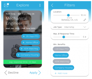
Medium-fi phone app prototype for applicants.
On the employer’s side, we ultimately decided that we would decrease the visibility of an employer’s job posting if they were not responding to applications, incentivizing them to reply more hastily.
Medium-fi desktop prototype for recruiters.
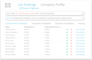
Our second prototype aimed to answer the question of how might we make the job application process more efficient for recruiters, due to the large increase in the influx of applications in recent years.
Again, we began with low-fidelity sketches that had sort of a grid style – something where we could display some info about each participant so that the recruiter could see a large volume of applicants at once, but still have the option to click into their profile and chat with the applicant.
Low-fi sketches showcasing the grid style
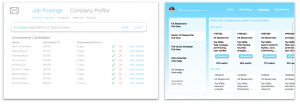
We iterated on this design in the medium-fidelity prototype by implementing a filter option and a sidebar containing current job postings, and included some info such as a percent match and top skills so that the recruiter could see a good snapshot of the applicants at a glance. This prototype allows recruiters to see concise lists of interested applicants. The recruiter can also change tabs to see applicants that they’ve already accepted and quickly message these applicants to set up initial interviews. They can also apply filters to the applicant pool to prioritize different qualities in interested candidates.
Job posting screen
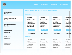
Interested applicant screen
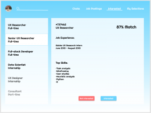
Applicant profile
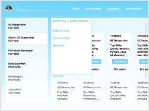
Filter screen
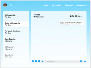
Chat screen
Our third prototype aimed to answer the question of how might we make feedback more transparent for applicants.
For this prototype we added features to both the recruiter and applicant sides to see what feedback would be needed to improve the applicant side while not adding extra burden on the recruiters. One key feature we added is the ability for recruiters to quick-select their feedback with the option to leave more detailed comments. This served to make the feedback process easier for the recruiter, increasing the probability that they would leave feedback for the benefit of the applicant.
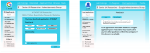
Feedback screens from our web-based recruiter (left) and applicant (right) portals.
Another feature we implemented was a timeline in the application process with which the applicant could check their application status. The important part was that people know if their application was received and/or considered, as well as if it was accepted or rejected.
Feedback screen (left) and application status screen (right).
User Testing
We performed 3 user tests total in order to answer our three how might we’s that we created our prototypes to answer.
Our first user test compared prototypes 1 and 2 to answer the question of which interface allows the recruiter to process the highest volume of applications in the most efficient manner.
Prototype 1 (left) and prototype 2 (right) were compared in this user test to gain insight on the recruiter’s perspective.
For this first user test, we wanted to gauge which of the above prototypes allowed the recruiter to process the highest volume of applicants in the most efficient manner. We had a former college recruiter walk through various tasks using both interfaces.
For the interface on the right, we asked the recruiter to navigate to interested applicants, click on a user to get more info and then express interest in that user, change the job filters, and open chats with different candidates.
The recruiter liked the filter options and liked that applicants were separated by how well they fit the job posting. She was also a fan of the chat feature and thought it would be useful for scheduling initial interviews and phone screenings, but that email would need to be transitioned into later in the process as more people got involved. Her favorite feature was the percent match that displayed for each applicant. She said that over time if the feature was reliable that it could save her a lot of time. However, she noted that the open roles aren’t the best thing to see when the application opens, because as a recruiter it’s their job to know the job descriptions. She also noted that the candidate screens could be displaying more people than they currently are.
For the interface on the left, we asked the user to attempt to figure out why the visibility of their job posting had gone down and to attempt to remedy that, and then to open a candidate’s info page and express interest in them.
The recruiter thought that decreasing the visibility of the job application if they’re not responding was a clever way to ensure that companies reply to applicants. She also liked the layout and found it easier to digest and navigate than the interface on the right. She thought it made it very easy to go through a large volume of applicants, because she would click into each user profile regardless of how much info we presented in the summary card. Additionally, she noted that it was very easy to interpret the approve/deny buttons due to the symbols and color scheme.
Our second user test tested both the efficacy of the filter options on the applicant’s side as well as compared prototypes 1 and 2 to investigate the user flows from the recruiter’s perspective.
Filter function added to the phone app prototype.
For the applicant’s side of things, we asked the participant to first set a filter to only show companies that respond within a maximum of two days. We then had them view communications with companies that they’d previously applied for.
We gathered that there should be a filter option for average response time, not just for maximum response time. Additionally, the participant stated that the option to adjust the filter with the scale was nice, but suggested potentially a manual number input as well. The user also stated that we were missing a way to organize the chats with different companies, and that that would be a useful feature to add.
Prototype 1 (left) and prototype 2 (right) were used to compare recruiter interfaces once more.
From the recruiter’s perspective, we ran the same test as we did in the first user test so that we could compare results between them.
The feedback was similar in that for the interface on the left, the user stated that they liked the way it was structured and that the flow was very intuitive. And for the interface on the right, they stated that it was a little bit too cluttered, although they did like the side bar containing the list of job postings. Overall, the takeaway from the recruiter side of this user interview was that we should keep the interface as simple as possible and have more advanced functionalities available through menus or toolbars that can be clicked.
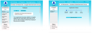
Our third user test compared two methods of feedback within prototype 3 to see which the user preferred, and also compared a web-based interface with the phone application.
Phone figma prototype
Prototype 3, where we tested the feedback and application status features for applicants as a web-based prototype.
For our final user test, we tested a web interface of the application against the phone interface to see if we could gain any important insights that we couldn’t have on the phone app. For the web interface, we asked the user to explore job postings and navigate to an application that has been submitted. We then had them navigate to an old application. Then for the phone application we asked the user to navigate through the app and indicate interest in a company.
The user said that for the web interface, they really liked the internal forward feature because recruiters already do that, and suggested that it would be good if the applicant got a notification if their application was forwarded. They also appreciated the timeline feature and the fact that there was feedback included on declined applications. However, the user preferred positive feedback over negative feedback in order to know what to highlight to future recruiters and find better fits for jobs in the future.
For the phone application, the user liked being able to filter through which types of jobs showed up because it helps applicants sift through jobs that they’re qualified for. However, they stated that the tags were slightly confusing and could be more customizable.
Overall takeaways from the last user test included that even easy, low-fidelity feedback from the recruiter on strengths and weaknesses is good. Additionally, knowing that the application has been seen/reviewed by a recruiter helps the applicant feel better. And finally, that a swiping ‘match’ where they actually apply for the job might not be as effective as swiping ‘networking’, where they are simply expressing interest in the job.
Final Design – Seek, the Job Finding App
Once our user tests were completed, we were tasked with identifying the best parts of each of the three prototypes to include in our final high-fidelity prototype. This proved to be fairly difficult, as finding an interface that was efficient from both the applicant’s and the recruiter’s side was no easy task. The two seemed to be intertwined in a push-pull relationship, where it was hard to improve the efficiency of one side without damaging the efficiency of the other. We had to find the perfect medium point that took both sides into account in order to create an optimally efficient job application app that was user-friendly on both the recruiter and the applicant side. I believe our finished product does just that.
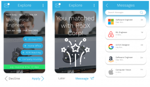
Users swipe to indicate interest in a company, and the app stores all of their data so no redundant info
Building off the previous iteration from module 2 as well as feedback from our most recent user tests, applicants swipe right or left to indicate interest in a company, providing a fast, efficient way for users to get their profiles out to a large amount of companies in a short amount of time. For this iteration we added a bar at the bottom of the screen that indicates how long the company typically takes to respond so that the user knows what to expect in terms of response time. There is also a messages tab where users can see messages they’ve received from different companies and use this to communicate once the companies have reached out.
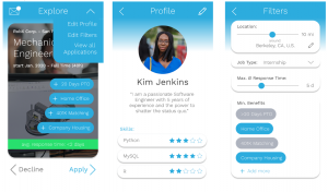
Users can edit their profile to implement filters
From our user testing we knew that the filter option for company response time was received very well by users, so we chose to implement it in our final design. Users can simply go into their profile and adjust their filter options, and the app will only show companies that respond within a given time frame. There are also other filter options to choose from, such as distance radius, benefits, and job type.
Users can see application status for everywhere they’ve expressed interest
The user can also see a list of all jobs that they’ve applied to and see a small note about their application status for each one. We implemented this application visibility after receiving lots of feedback from users about wanting to know where in the application process they stood and that they appreciated being able to see if their profile had been viewed. It all ties back into increasing feedback for the applicant.
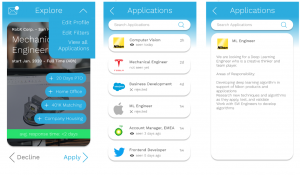
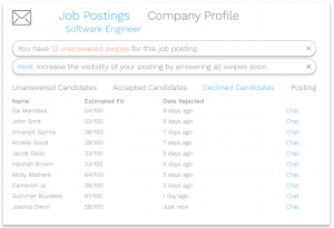
Minimalistic list of job postings, no extra job info cluttering the screen for the recruiter
New to this iteration is a process for the recruiter’s side, which was not implemented at the end of module 2. From our interviews and user testing we knew that the recruiter preferred the very minimalistic, no-nonsense layout that you see above. All of the positions are listed and are easy to click into, but there is not unnecessary information about the job positing that the recruiter should already know. But perhaps the biggest thing is that we were told that a recruiter would not want to be on their phone swiping through an app while at work, so there would need to be a web interface for the recruiters. So of course we accommodated for this in our design.
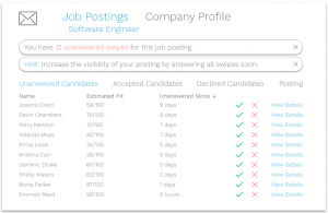
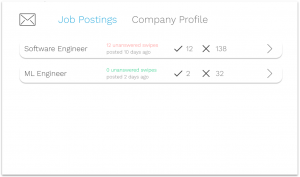
Job posting visibility goes down if the posting gets stagnant
From the user testing with the recruiter we knew that limiting the visibility of a post is a very good way to incentivize someone to respond to applicants. And the recruiter also indicated that she liked that our web page notified the recruiter when this occurred so that they could quickly work to amend the issue.
You can also see that we retained the estimated fit algorithm that suggests how good of a match a particular applicant will be, but we didn’t include much else in terms of info on the main applicant page. This is because our user tester informed us that as a recruiter, she would click into every applicant profile regardless of how much info we showed on the main screen, so there was no use in trying to put too much info and clutter the screen.
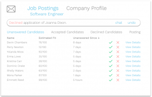
Can undo any acceptances or rejections (top) and also see a database of rejected candidates (bottom)
We were also told that the ability to undo mistakes was crucial as a recruiter. And what’s more is that we were informed that a database of rejected candidates is also necessary to an operation of this sort. The recruiter informed us that often someone won’t be a good match for the position they applied to, but they may still be an interesting candidate that may fit well for another position. For this reason it’s important to keep track of who has been rejected, so we added a tab where the user can click into all rejected candidates to view their profiles and chat with them.
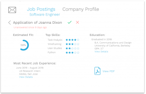
Applicant profile emphasizes estimated fit, top skills, and most recent job experience.
The recruiter can also click into any one of the interested applicants to see a short summary of their profile, with the option to download their resume if they need to find out more information. The estimated fit algorithm got a lot of positive feedback, so that is of main emphasis on the profile page. Additionally, we gathered that the most important things to include in a quick snapshot look at an applicant are relevant skills, education, and the most recent job experience, so we included all of those on the screen as well. All of these features are present in order to save the recruiter time so they don’t have to parse through an entire resume if someone doesn’t appear to be a good match.
We were also told that the ‘check mark’/’red ex’ motif was a good way to represent accepting and denying an application, as they’re fairly universally recognized symbols. So we chose to stick with that representation throughout the user flow.
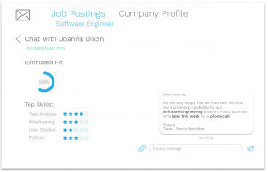
We implemented a chat function within the app to allow for easy initial contact.
Finally, we included a chat function so that the recruiter can reach out to applicants directly within our app without having to fuss with email or other contact information in the initial stages. We were told that a chat function within a job-screening-esque application such as this would be a very useful feature for scheduling initial interviews or sending out coding challenges. However, we were told that the chat function would only come in handy for the first stages of the application and that it would need to switch to email eventually as more teams/people got involved with the application process. This could be something to adjust moving forward – we could focus on making our application recruiter-friendly for the entire recruitment process, from application to offer.
That concludes the high-fidelity prototype! We aimed to produce a highly efficient way for users to apply for jobs and get prompt feedback, and I believe we did that. The process is quick and easy for applicants, and efficient for recruiters so that applicants don’t have to worry about not hearing back or not getting feedback.
High-Level Lessons
From the two modules I spent in the job application design domain, I learned a good amount from user interviews and user testing that could help others wanting to break into that field. These lessons include:
- Feedback is one of the most important things for applicants, but one of the most difficult things for recruiters. Working to bridge this gap is a very important issue that still doesn’t have a fool-proof solution.
- Increasing the efficiency for applicants will often decrease the efficiency for recruiters. The biggest challenge of any job application platform is finding the perfect medium point that optimizes both ends.
- People hate redundancy. Try to eliminate it as much as possible.
And that’s it! I learned a lot from this last module about the job application sphere and hope that these lessons or my prototypes can someday be used to improve the actual job application process. Hopefully someday we can ease some of the stress college students and recruiters have to deal with on a daily basis and make the process more enjoyable.
In summary, this user interface design class taught me a lot about the iterative design process and believe I now have a very strong foundation for any design projects I choose to undertake in the future. Thanks for reading!