About Me

Hi! My name is Helen, and I am currently a senior at the University of California, Berkeley, where I am majoring in Cognitive Science, minoring in Computer Science, and pursuing the Berkeley Certificate in Design Innovation. As you can, see I’m interested in a lot of things, but my interdisciplinary background enables me a very holistic understanding of the digital design space.
In the past, I’ve been a Publicity Officer for Berkeley ANova and a Marketing Intern for ClickTime. Since then, I’ve found my sweet spot at Cisco as User Experience Design Intern. I am most interested in UX research, information architecture, low to mid-fidelity wireframing, and interaction design.
In my free time, I enjoy dancing, creative writing, and working with kids in youth education. Ask me about my favorite urban dance teams, my most recent boba adventure, and my stance on the role edTech plays in under-resourced communities.
Learn more about my work, and find my contact info, at my official professional portfolio!
My Design Manifesto
My design philosophy is mostly based on my experiences of working with students in under-resourced schools. I noticed that many edTech tools have pre-existing, oftentimes false assumptions regarding students (ie. typing basics, access to high-quality hardware, etc.), and realized that this was fundamentally a user research problem. This most likely arose because the designers of the tool had a differing background of pre-existing digital fluency that the students did not have. Thus, my design philosophy (aka, my manifesto) is based off of these two truths:
- Any design solution resulting from unspoken assumptions will be marginalizing, regardless of how innovative or creative it is.
- When we as designers acknowledge our privileges that our users may not share, we can then design solutions rooted in inclusion and acceptance.
I witnessed this manifesto most prominently in Info 213 in my second module assignment, in which we designed for large course facilitators. In talking about Piazza, a commonly-used, yet much hated, communication tool for students and teachers, I realized that it fulfills a lot of needs specifically for professors of small classes. This isn’t what Piazza is used for, though, and with a little more thoughtful research, perhaps Piazza could have been very innovative in directly addressing the needs of students in large classrooms.
Selah: A New Museum Experience
Introduction
Museum-going, we found, was an activity that users enjoy because they are distraction-free, stress-free environments where people might learn something new. However, the addition of new digital tools could come with new distractions. Thus, our project strove to, at an overall level, pursue possibilities that allow users to learn about and interact with installations without the necessity of another screen.
Needfinding
We performed user interviews on four individuals who go to museums at least 4 times per year. For a detailed user interview guide of all the questions we asked our interviewees, click here. After our interviews, we created empathy maps for each individual.

Click here for Chang’s interview notes.
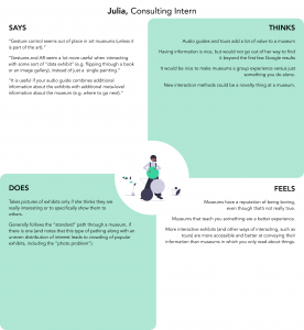
Click here for Julia’s interview notes.
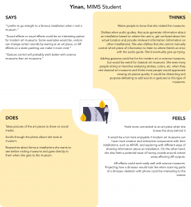
Click here for Yinan’s interview notes.
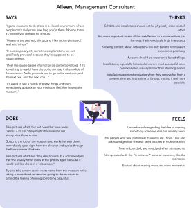
Click here for Aileen’s interview notes.
From our empathy maps, we noted several major patterns amongst interviewees that guided our next steps:
- Learning is fun! Interviewees like having contextual, environmental information about installations.
- Although interviewees reported taking pictures often at museums, they admitted that they often don’t revisit these photos after taking them.
- Interviewees tended to be turned off by audio guides because they are clunky and hard to use.
- Users like museums because they provide stress-free, distraction-free environments
Thus, we wrote the following user needs:
- A discreet way to experience and capture museum installations without distracting others.
- More control over auditory information in museum guides.
Ultimately, this led us to our final HMW statement:
How might we provide an immersive, yet stress-free museum experience for visitors without distracting others?
Ideation
We ideated concepts and solutions with various “what if” statements:
- What if we could take advantage of screen-less technology to lessen distraction?
- Screen-less technology might also be more more cost-friendly and, therefore, more feasible for museums to provide. It also is less visually-distracting.
- What if we could facilitate control of audio guides via touch for a multi-sensory experience?
- Because museum installations are mostly visual-based, using touch interactions will not force users to visually switch between looking at an installation and looking at a screen, thus creating less distraction
- What if we could utilize personal, discreet wearables so that users do not distract others as well?
- We noticed that interviewees liked museums because they are distraction-free. We did not want to sacrifice this aspect of museums and thus wanted to explore more discreet options.
Based on these “what if” statements, we came up with the following constraints/parameters for our solution:
- A museum-provided wearable that Bluetooth connects to one’s phone, which is facilitated through a mobile application.
- Based on location and proximity to installations, certain music and audio clips are available regarding that specific installation.
- One is able to control start/stop of music/audio through the wearable.
- If necessary, less-intuitive interactions can be taught through a learning experience facilitated through one’s mobile device.
- Users can also “save” installations to view later if they want more information after visiting the museum so that they feel motivated to revisit installations.
Despite these set constraints and parameters, we knew that there were still several questions we wanted to answer via our user tests.
- What must the wearable look like for it to blend seamlessly into the user’s museum experience?
- What general touch interactions are common and intuitive amongst users when controlling audio?
Usability Testing
We performed usability testing “wizard-of-Oz” style via a blank strip of paper as a bracelet, where we gave interviewees headphones that played a podcast and asked them to control the audio via interactions on their “wearable.”
We also asked users for feedback regarding different kinds of prototypes that ranged in visual complexity. Here is our detailed usability testing guide, along with several notes we took at various interviews.
Here is a video of one of our user interviews:
Based on these usability tests, we found that users tend to…
- Be more receptive to a “blank canvas.” They were a lot more receptive and confident of their interactions when it came to blank and more minimalist prototypes than the ones with more buttons and colors.
- Obstinately retain a “mental model.” After interacting with the blank bracelet, users stubbornly disliked other prototypes, saying things like, “That’s not how I’d do it” or “I don’t know what this is.”
- Have the same basic interactions, but require more learning with less intuitive ones. For example, for turning audio on and off, all users tapped the wearable once, but for saving audio clips and installations, users used a wide variety of interactions.
- Need feedback from the wearable. Users were not often sure if their interactions were successful, especially the ones with less auditory cues (ie. saving)
Final Deliverable
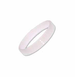
Our final deliverable is a museum-provided, touch-based wearable that allows the user to control the audio guide. We called this Selah, which in Hebrew, means to breathe between stanzas of music and rest.
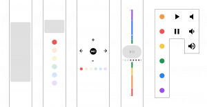
Our final wearable has several notable features:
- Simple interactions like tapping and swiping facilitate control of the audio guide.
- Screen-less, totally touch-based interaction avoids distracting both the wearer and those around them.
- Haptics and nondescript LED lights provide feedback to the wearer.
Additionally, as indicated in our usability testing, we discovered that a learning experience would be necessary for users to adequately learn certain interactions that are not as intuitive (particularly, raising the volume and saving for later). Thus, we also prototyped the learning process for a user in Invision Studio. This prototype also illustrates the various interactions we decided on.
Finally, we realized that our deliverable might benefit from several screens depicting what “saved” content might look like. These, along with low-fidelity views of the above screens and design inspirations from various existing apps, can be found at the following Figma link.
Next Steps
If given more time, we would…
- Usability test with a more high-fidelity prototype
- Explore prototyping options for the learning experience
- Define other screens (ie. “Home Page”)
- Explore the social aspect of sharing one’s museum experience
Additional Info 213 Work
Here is some additional work I did for Info 213. Click on the links for a more in-depth view of the projects.
- Minimalize – a mobile application that encourages education, summarizing, and control of one’s phone applications, thus encouraging less digital distraction.
- Needfinding in Large Classes – designing solutions for those who facilitate large college-level classes. Specifically, I designed the prototype “Thumbs Up”
- Designing for “Empty Nesters” – creating and testing solutions for parents whose children have recently left home. Specifically, I designed the prototype Mom-Unity.
My Professional Portfolio
To see some of the more high-fidelity, long-term projects I’ve worked on, check out my professional portfolio!