About Me
Design Manifesto
-
Don’t ask your user for their needs
For me, the need-finding phase is the most important part of our design. During the past, since we focused more on software development, we care less about actual user needs so that we always make them up by our assumption, which is absolutely not suitable for real projects because unreal user needs will definitely lead to products that users don’t need. This mismatch between user needs and unreal user needs indicates that more precise user experience information needs to be collected in order for it to be used effectively.
I have totally completed 3 interviews during this course. At the first time, we don’t know what question matters so we just tell the interviewee our project details and tell them we want to solve their problem, finally, the user came up with lots of obvious problems like lacking water and space which can not easily be solved by our user interface design. In the follow-up module, we tried to ask more indirect questions like their daily procedures. After then, we can use an empathy map to analyze what they say and what they do, and finally find out their frictions even they don’t notice them at all. In this way we can get deeper user needs which is easier for us to by user interface design.
-
Flare and converge on Low-Fi Prototype
-
Do Usability Test
Usability test is always the best way to test your product since your product is made for them. It helps us to find what the user really thought about our design. For example, in our last module, we deliberately omitted the save button to simplify the procedure of the user, so that every modification they made will immediately be applied and the user doesn’t need any redundant steps. But in reality, the user doesn’t dare to exit the editing page since they don’t know whether their modifications are saved. So this reminds us to have either a save button or a notification bar showing that all modifications are saved. So that our design will finally work in practice.
-
Iteration
Never expect to complete your prototype in one round. Like I said in the usability test, we could always find defects in our design. And the best remedy is to have another iteration based on what we found in the usability testing.
Module 4
Need Finding
During module 3, some of our group-members focused on how we can make the cooking-experience better for people who cook. It was discovered that a lot of the interviewees we talked to had occuring needs for input on how they could experiment with their food in a convenient matter. Another recurring theme was the necessity for input on how to use ingredients the users already have at their hand. We felt like some of these needs were largely unaddressed in the prototypes we made in module 3, and we therefore wanted to do a second iteration on cooking — only this time we focused our interviewees more towards the experimentation part of cooking, addressing interviewees in particular that likes to or want to experiment with food on a consistent basis.
The questions we used as guidance to conduct our interviews can be found here: https://docs.google.com/document/d/1oS0EtiHCEcZq3kGxoT9MDehGHOA1BT_JPbNhEBszTkk/edit?usp=sharing
Interview 1: with Telma:
Place: Berkeley 10 am.
Description: 21 years old, college student studying psychology and training as a track and field athlete.
Summary:
Telma cooks 4 times a week, and sometimes likes to experiment and discover new foods. She uses the web for recipes when she either is unsure about the dish she is making or if it is a new dish. She prefers the recipes to be in text format, since she has had bad experience with video recipes in the past. When she is looking for a new dish that she wants to make, she searches for the dish on google and looks for something that looks good. She then if she is unsure if the dish is good check out the comment section for guidance.
Says:
– “I try to not let things get old, so I use things that are open and try to empty it”
– “To get inspiration, for example if I want to cook Indian which I know very little about I need something to reference (a recipe).”
– “I share recipes when people ask.”
Does:
– Looks up recipes online, but don’t have a specific website.
– Cooks meals about 4 times a week. (dinner)
– Experiments with food when she doesn’t have the right ingredient at home.
– Checks the comment section for tips
Thinks:
– Cooking is fun
– Want to eat healthy
Feels:
– Happy when she gets a new dish to taste good.
– Happy, when the food she makes tastes good.
– Good that she tries to not throw away food.
– Good that she eats healthy.
User needs:
– A way to easier discover new cuisines.
– Better video recipes.
– Good tasting food
Interview 2: with Per Anders
Place: Over FaceTime at 11AM
Description: 52 year old working father. Cooks roughly every other day.
Per Anders described that he doesn’t always know exactly what he will make when he goes to the store for grocery shopping. A lot of the times, he will just buy a set of ingredients which he knows can be included in a lot of different dishes. Then he sorts of goes from there, and decides what he should make based on the ingredients he have available. However, he explained that when you have some “go-to” ingredients like this, you often wind up making the same things over and over again. He would like input on how he could use these ingredients into creating new and exciting dishes. He continued to explain that he of course likes the recipes he keeps going back to, but that in order to vary things he usually adds some random spices or similar that he things will be good. Additionally, he explained that he feels like it is easier to experiment with different ingredients the more you have used them. Because, as you use the ingredient more, you get a fuller picture of how that ingredient works in the final “mix”, and what “purpose” it serves in the dish.
The user-needs that was discovered during the interview with Per Anders was the following:
– New ideas on how to use his ‘go-to’ ingredients.
– Suggestions on how he can mix new ingredients in the food he usually makes.
– Information on how the different ingredients in a recipe serve to constitute the final dish.
The interview in its entirety can be found here: https://docs.google.com/document/d/1JoRF-JSvMwfftdy8VegFUdoBobvQYoYhhOO4-ZWea8g/edit
Interview 3
Location : Interview over Google Duo on November 20 at 1:50 PM
Description : 24, Female, Working, Cooking since 4 years, cooks once in 15 days
Think : The user thinks that it is not always feasible to buy ingredients so she has learned patterns of alternatives for ingredients.
Says: The user says that if there are multiple recipes for a dish, she would choose the one with ingredients that are available.
Does: The user experiments with cooking especially with deserts and on festive occasions or when guests come to visit her.
Feel: The user feels happy when experimenting with cooking is successful.
User needs :
- User needs to be able to find recipes with ingredients that are available to her
- User needs to be able to look for alternatives for missing ingredients
- User needs to be able to discover new recipes with familiar ingredients quickly
From the need finding interview and needs we came up with these how might we’s.
– How might we give users new ideas on how to use the ingredients they are familiar with?
– How might we make new dishes out of existing ingredients you already have?
– How might we enable users to use up their ingredients? (through less food)
– How might we enable the users to modify existing dishes?
– How might we inform the user of the different ingredients that can be substituted?
– How might we let users find new recipes/dishes?
Prototyping
After our need finding, we saw that a lot of the people who want to experiment with food find themselves in a “rut”. They continually kept making things that were similar, and never really widened their culinary horizon, even though they expressed a want to experiment with food.
Therefore, we decided that we were going to focus our prototyping around the following “how might we”:
- “How might we give users new ideas on how to use the ingredients they are familiar with?”
Firstly, we decided to each make some low-fi prototypes that would help us determine the final direction of the prototyping. We ended up with these:

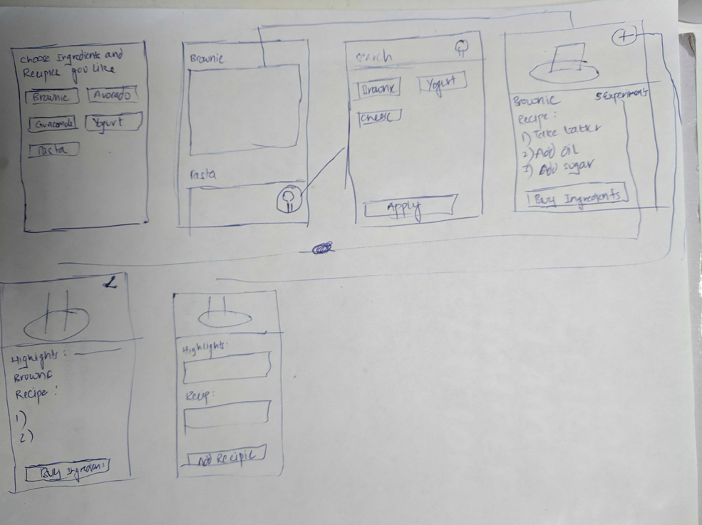


After low-fi prototyping, we discussed, and decided that prototype “Recommendations based on interests, with variation display and filter function” was the way to go. It included ways to filter (so that users could use ingredients they were already familiar with) and it included ways to see different variations of dishes — so we decided that this was the lo-fi that best served the problem we had decided to solve. It also shared similarities with prototype “Recommendations based on ingredients you have app”.
We all decided to prototype different hi-fi variations of the same lo-fi prototype. This produced a total of 4 different variations, with one additional “base”-prototype.
The base prototype looks like this:
For further inspection, it can be found here: https://www.figma.com/file/Y2dZYVFHn37udIcl5j21qJ/Version1
It has a welcome-page, that seeks to gain information about the users culinary interests. These interests can then be used to display different recipes to the users. The recipes are presented as in the bottom right screen. From here, the user can either filter based on ingredients by pressing on the search-icon. This will take the user to the rightmost upper screen. Also, from the display-page, the user can click on one of the pictures. This will give the user information about the recipe, and an opportunity to scroll through different variations of it, as is evident by the two upper leftmost screens.
The four different variations are as follows:
The feed variation
Can be found here: https://www.figma.com/file/p4g6VyKy9wL88adVfAvHyu/Version2-Recipe-Display?node-id=1%3A499


Instead of just displaying a picture of the dish and it’s name, we decided to try out a version where the recipe itself is added on top of the picture. The intention was to it easier for the user to quickly navigate through different recipes based on ingredients or for instance how complex the recipe looks.
Filtering ingredients variation:
Can be found here: https://www.figma.com/file/dAX56cPPjM7SLWQ0O3rKWa/Version-3%3A-Manage-Ingredients?node-id=0%3A1
Instead of using category to filter ingredients like our basic version does, we decided to categorize all the ingredients based on alphabet. For the basic version, you can tap on the category icons to change category and once you click on the ingredients chip, that ingredient will be added to your collections immediately. For the variation version, you can scroll to see all the ingredients based on their alphabet and choose what ingredients you like.
Variation display
Can be found here: https://www.figma.com/file/igHODlTjdkUJAhn1EBOpWn/Version-4%3A-Variation-Display
The variation is on how we display the experiences of other users. In the left on it is displayed as a comment, and in the right one it is displayed as two buttons showing what was removed and what was added.
“Initial login variation”
Can be found here: https://www.figma.com/file/XW8umlw9Dulys0tAvxiOaL/Version-5%3A-starting
Instead of showing progress, this prototype tries to show the user that it can’t press continue. It turns red when they have chosen at least 4 interests
Usability Testing
The usability testing followed quite naturally after the hi-fi prototyping. As we all had created different variations of the same prototype, A/B-testing seemed like a good option. We decided to each compare our variation to the “base” prototype. As the variations considered different parts of the whole prototype, the intention was that we would be able to get good feedback covering all the parts of the application as well as its general flow.
We gave each participant the same tasks, but focused our follow up questions on our parts of the application.
- Go through the welcome procedure.
- Filter so that you only get recipes containing eggs.
- Assuming you have the following ingredients:
– Eggs
– Sugar
– Butter
– Baking powder
– Cocoa Powder
– Flour
Find a Brownie Recipe you can make with these ingredients. - Now assuming that you don’t have eggs, check if there is a way to make brownies without eggs?
The ideas was that this workflow would allow us to test the whole application. In addition, it corresponds to how you might imagine a user could use the app.
“The feed”
In our first user test, we aimed to answer the question: “How do we best display recipes to the users?”.
As a result of our initial need finding, we tried to create an application that makes it easy for users to get new ideas on how to use the ingredients they are familiar with. Naturally, how these ideas are presented (in this case as recipes) to the user will affect the way the user interacts with these ideas. We have narrowed our focus down to different ways we can present recipes to the user. In prototype A (which can be found here) the user is simply given a picture of dish and its name. In prototype B (which can be found here) we show the users recipes the same way as before, however, the pictures with the dishes are blurred and the content on the recipe are placed on the top of the image — the intention of this was to make it easier for users to scroll faster through recipes.
A full review of the test can be found here: https://docs.google.com/document/d/1FNRrhD9fSyi47ScM2AUQWxKY9CC9rKYwnzmcIcgd3jI/edit?usp=sharing
However, in quick summary, this was the main takeaways:
– The welcome procedure seems pretty understandable for users.
– Users found it easy to find the “search” menu, however there is still work to be done in the design of the menu itself. Notably, the icons used seemed to be less recognizable than they should be.
– The “recipe on image” approach made it easy for the users to quickly browse through recipes. However, if such an approach is adopted, we should make it more clear that you can also click the image for more information.
“Filter ingredients”
In our third user test, we aimed to answer the question: “What is the best way to filter recipes with the given ingredients?”
To test which is a better way to filter recipes with the given ingredients, we made one basic version and one variation version and tested these two on two people, both of them are cal students. Instead of showing ingredients by categories like meat, vegetables etc., the variation version categorize ingredients based on alphabet. For both users, we asked them to complete the same task like using the ingredients filter and finding a recipe which contains eggs, but each of them is using different version.
Comparing to the basic version, we found the one who is using variation version is easier to access what he wants, like just click to go to the letter “e”, since alphabet is more intuitive. But the one who is using category based version had more trouble at the first time, since the meaning of the icon of the category is not straight to her, which cost her some time to get adapted.
Takeaways:
– We should show some system internal state to help user to realize what they are doing. Like after my user clicked on the “add ingredients” button, she hesitates for a while because there’s no symbols shows that she is editing.
– After editing stuff, there should be a save button instead a back button, otherwise the user would not think their modification is saved so they after clicking on the back button, they will lose every change they made.
“Initial Login”
In the fourth user test, we aimed to answer the question: “Which is the more intuitive way to show the user progress when selecting interests?”
We tested this by making two different versions of the welcoming procedure. One where there is a progress bar with 4 different circles that fill up as you progress, and one where the button is unclickable until you click enough “interests”. We presented the original version to 1 person and the alternate to another. One of the subjects was from needfinding phase, and the other a friend of the first (snowballing). We gave the subjects the same tasks as the above usability tests. These tests were conducted over google meets, and the test subject used the figma prototype. Here are some questions and some noteworthy answers.
Tell me 2 things you did not like about the welcome page.
From second version: Might not need the filter if the things you can choose from are general. You don’t need the most specific thing at the start, finding the specifics you can do later.
From first version: Boring, it could have been pictures of food, that makes me tempted, and food is a lot about eating with your eyes. Need more pictures.
Was it intuitive/not? What made it intuitive/not?
From second version: Yes, there are places to click but not too many. All places are far up, and the top of the screen is where I look. So, I liked that is was up in the field of view. Good contrasts, except the filter thing. Easy to press.
From first version: It was intuitive, but I it was hard to understand when it chose 3 things and all the three got dark.
General observations: One thing I didn’t set out to test, but ended up finding out, was that one of the interviews found the search bar to be a disturbing element. This makes sense because this is supposed to be a fast start up page, and if you begin to search for specific ingredients it takes longer. The search function from the main feed should take over for that criteria. Another thing that I didn’t set out to test but ended up getting feedback on was that the buttons are boring. The tester was very clear on that cooking is more than the practical part. She wants to look with the eyes, aka have pictures of the different “interests” instead of just text. In the end two user tests is not enough to say which version is the best, but we got a lot of other takeaways.
Top 3 takeaways:
– Choosing ingredients/ interests is something that might be better done with the addition of pictures.
– You don’t always need a search bar.
– When testing progress, you should make more slides to make it clearer what you are prototyping.
“Variation Display”
The study was conducted on two users with two prototypes which varied in terms of displaying the variations of recipes. There were some common observations in both the tests where both the users felt that the word ‘interests” was not intuitive. It was also observed that the add ingredients flow was not intuitive. One of the users had a hard time navigating around it. Interestingly, both the users drew parallel with other ecommerce apps in terms of design patterns. One of the users felt that after adding the ingredients there should be a way to move forward rather than backward. In terms of displaying the variations both the users said that the modifications should be displayed objectively because it is easier to understand. One of the users said that “Cooking is all about quantities” and the variations should also show the quantities of the ingredient which was added. The other user said that the variations should be summarised in the recipe detail screen itself.