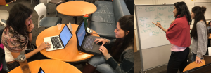
Welcome to the INFO 213 Portfolio of Kimberly Hirsch!
UI/UX Design Focus
Contact Me
kimberly_hirsch@berkeley.edu
(914) 623-2324
Link to my other professional portfolio
About Me
Looking back on my past, it seems that I always was on a path towards UI and UX design, but didn’t realize it until a few years ago. Growing up, I always loved art and design. While attending St. Vincent Ferrer High School in NYC, I was president of my school’s chapter of the National Art Honor Society and even took several design classes at FIT during the weekends. In my senior year, I even dropped AP Calculus to take yearbook, of which I became editor-in-chief. However, while deciding which school to attend for my undergrad, I was still lost. I was fascinated with how the human brain processes information and decided to become a Cognitive Science major at SUNY Oswego. After taking my first few programming classes, I fell in love with coding and picked up a CS minor. However, I was still unsure of what I wanted to do with my future until one of my professors suggested UI/UX design. I had finally found my calling, the perfect mix of my artistic interests, my love for CS and most importantly, my quest to understand how humans think and interact with the world.
After taking a few design classes during my senior year at Oswego, I joined the Master of Information Management and Systems (MIMS) program at UC Berkeley to hone my skills. I came into the MIMS program open and eager to learn anything and everything. I have already learned so much during my first semester while utilizing new design processes, learning how to work within Figma and designing my own unique applications. I hope to continue forward with the same open mind and can’t wait to see what the future holds in store.
When I am not busy designing for the digital realm, I often enjoy more tactile forms of design such as sewing, cake decorating and scrap-booking. In my free time, I also love to stay active while practicing pilates and kickboxing, going on hikes with my wonderful fiance, Jake, and of course, playing ice hockey.
Design Manifesto
Going into the Fall 2019 semester, I had a strong interest in design but had little formal instruction in the field. However, INFO 213 has taught me many valuable lessons in the realm of UI design, including the following 5 things that now serve as key pillars in my new found approach to design. In addition to the things listed below, I have also learned a lot in the ways of critiquing peers in a way that is constructive and respectful and that usability testing is possible and valuable at all stages of development, not just Hi Fi, as I may have thought prior to this class.
1. Always, always empathy map!
Empathy mapping is a valuable methodology because it requires the researcher to put themselves into the shoes of their interviewee. Another important lesson that I learned while empathy mapping was that an insight gathered from your interview may fall into multiple boxes and this is a good thing! For example, while constructing my empathy map for this final project my interviewee said that he prefers to donate goods more than money, because he often feels worried about what a the person will do with the monetary donation. This user subsequently does tend to donate goods more than money because he thinks that it is the safest way to guarantee that his donation will go towards the well being of the individual. In this example, I was able to illicit insights that fit into all four boxes of the empathy map just by asking the interviewee one simple question: “What do you normally give to a homeless person when you want to make a donation?” At first, I was perplexed by this…I asked one question and figured that the answer should only go into one box, but I eventually realized the value of eliciting such deep responses. By dividing his answer into the four boxes of the empathy map, I could truly understand and ultimately empathize with my interviewee’s experiences.
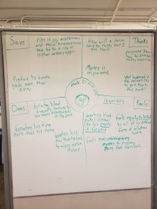
Kimberly’s empathy map Good Samaritan interview
Kimberly’s first empathy map
2. Craft questions carefully
I’ve already discussed the importance of empathy mapping, but with that all said, I thought I should rewind and discuss what I learned about the types of questions that should be raised during needfinding. The most important thing being that questions should never corner the interviewee into reaching a conclusion that you want them to reach. Questions should encourage true and honest answers. For example, in the past I may have asked the question “Do you think it’s a bad idea to donate cash to the homeless, compared to donating food or goods?” This question is poorly crafted because it is biasing the interviewee to agree with a predetermined idea. A better question that asks the same kind of thing would be “Some people feel uneasy donating cash directly to the homeless. Why do you think this is? Do you feel the same way?”. A simple rewording of a question can be very powerful.
3. Never go binary
I also learned to never ask a question that has a binary answer set: yes or no, this or that, true or false etc. In my experience performing needfinding interviews for this class, if you give the interviewee the option to respond with a one word answer, they will take it. For example, the poorly crafted question that I posed above: “Do you think its a bad idea to donate cash to the homeless, compared to donating food or goods?” is also poorly crafted because it gives the user the option to answer by saying a simple “yes” or “no”. A well crafted question should require the interviewee to really think about their response and examine the reasoning behind their beliefs. A great question causes the interviewee not just to respond but to think.
4. Heuristic Evaluation is a must
Another valuable lesson that I learned from this class is that heuristic evaluation is an invaluable tool for crafting a truly great user interface. Good design should fit the needs of the user in a seamless way, making it often far more difficult to spot good deign than bad. Heuristic evaluation embraces this theory and asks evaluators to access issues pertaining to the overall usability of an interface and also specify the severity of the problem. I found this methodology to be both comprehensive and highly effective. I used to think that heuristic evaluation should only be performed on final Hi Fi prototypes, but later learned that it could be valuable even at the Mid Fi level. I learned that just because an app is incomplete design wise doesn’t mean that heuristic evaluation wouldn’t be a valuable methodology for locating its most pressing interaction flaws. If give a little more time, I would love to have conducted heuristic evaluation on my final project.
5. No such thing as a bad idea
Whether it’s a dark horse prototype or an outlandish how might we, this class has taught me that no idea should be immediately dismissed. In fact, I learned that the dark horse ideas are more often than not the most intriguing and unique option. These ideas tend to be exciting and out of the box, and if iterated on, your users may come agree. I learned this during the second module, where we were asked to design for understanding. During this module, we looked at the need of job hunters and came up with the dark horse idea of a tinder style app for finding employment applications. At first, this idea seemed unorthodox, but once implemented we discovered that such an app can be a fun, fast and easy resource for finding new applications. A couple of my teammates from this project even took this prototype and iterated on it for their final project. This experience taught me to never doubt any idea, no matter how unusual it may seem at first.
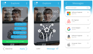
Tinder style app for job applications
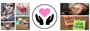
Good Samaritan
Friction – Take 2!
From our first take on this project when we were ‘Designing for Friction’, we decided to take the concept of it further and go in depth. Go over all aspects of the design process again, parallel prototype and usability test it this time around to see if this could actually fly and be useful in our current day world.
Why did we decide to choose this topic?
Helping the needy is difficult. Giving in person isn’t always easy due to stigmas related to the homeless and fear of interaction. Charity organizations help but a large percentage of donations go to overhead and the giver is disconnected from those they are helping. This is where Good Samaritan comes in! Good Samaritan allows users to utilize delivery apps that they may already have on their phone to easily deliver food & goods directly to members of the homeless population.
Components which curated our ‘Design for Friction’ Moodboard
Our Approach
We broke our design process into 4 main phases. First the research, to help figure out what the real issues were, where the gaps lie between people donating to the needy and homeless and how, if possible, this could be overcome. From where we moved on to draw our observations by Empathy Mapping. This helped us conclude state our problem statements in the form of ‘How might we’s’. Once we knew the kinds of problems we were focusing on solving this time around we prototyped our individual solutions and ran usability tests on these, but this time in comparison with out first version of this app which aimed to overcome the friction in the donation experience. From the feedback received we iterated our designs to produce our final solution: Good Samaritan 2.0.
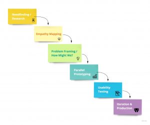
Design Process used for Good Samaritan
Needfinding/Research
User Group: Anyone who lives in an environment where they are near the homeless on a semi regular basis
We went about creating the following a need-finding interview guide to gather insights and map out how our target users feel about the donation experience.
- Introduction: Tell me a little bit about yourself, what do you do – what is your routine like?
- Tell me more about a donation experience you remember, either of you or someone else donating something
- What was the most memorable thing about this for you?
- How did it make you feel?
- How did the person you donated to react?
- What items do you feel more comfortable giving?
- Do they feel safe doing so?
- What makes them feel this way?
- What would make them feel safer?
- Tell me more about a donation experience you remember, either of you or someone else donating something
- What are your thoughts on donating to the homeless in Berkeley?
- How does it make you feel?
- What do you feel is most challenging about this?
- If you were to donate something here, how would you go about doing it?
- How does it make you feel?
- Have your donation patterns changed over time?
- Some people feel more comfortable donating items to the homeless rather than money, why do you think people have this preference? Do you feel the same way?
- Can you tell me what your experience is with donating items to donation centers (Goodwill, Salvation Army, etc.)?
- What types of items do you donate?
- Can you tell me about your experience volunteering for charitable organizations (Food banks, soup kitchens, etc.)?
- What orgs?
- Why do you volunteer for these/this org?
- How many on-demand delivery apps do you have downloaded on your phone?
- Which apps do you have?
- How often do you use these apps?
- Have the apps that you use change over time?
- Describe how you feel using these apps. (Are they easy to use? Have you had any negative experiences using them?)
For the receiver (homeless person)
- Tell me more about yourself
- Where do you get the majority of your food from?
- Are you open to accepting donations?
- Have you received donations at any point in time?
- How do you feel when you get donations?
- What type of donations have these been?
- Which have you appreciated the most?
- Tell me more about a memorable experience when you received a thoughtful donation
- Tell me more about the challenges you face while reaching out to people for donations?
Interviews
User 1: Sneha’s Interview
Location & Time: UC Berkeley Campus, 5.15 PM.
About User: Male/26; 1st-year graduate student who recently moved to Berkeley. Lived in Bangalore, India his whole life before this and was an active annual donor for the last 3 years, while he was working and could afford it.
Click here for complete interview notes
Needs:
- Needs to be able to donate money to a trusted organization
- Needs to feel connected to the cause he’s donating for
- Needs to know where his money went and what impact it made
User 2: Kimberly’s Interview
Location & Time: Video Chat Interview, 8:00 pm
About User: PhD student in Microbiology in Madison, Wisconsin, originally from NYC
Click here for complete interview notes
Needs:
- Needs to know where his money is going
- Needs to feel safe when interacting with a homeless person
- Needs to know that the impact of his donation will be positive
User 3: Joseph’s Interview
Location & Time: User’s home in San Francisco, CA at 8:00pm.
About User: User is a 30 year old female professional working in San Francisco, CA. She regularly supports non-profit organizations, donates clothing to Goodwill, and volunteers at food banks.
Click here for complete interview notes
User 4: Phoebe’s Interview
Location & Time: Berkeley, 3:00 PM
About User: 21-year-old woman with long brown hair and blue eyes. She is a 4th year undergraduate student at UC Berkeley studying Education who grew up in Redwood City, CA.
Click here for complete interview notes
User 5: Phoebe’s Interview 2 (Homeless Person Perspective)
Location & Time: Outside Brewed Awakening coffee shop, early afternoon
About User: Tall, thin, generally friendly demeanor. Has lived in Berkeley his whole life, and has been living on the street since 2003. He carries a pocket Bible and tends to reference Christian teachings, even in casual conversation, to help elucidate his points.
Interview Transcript:
Introduction: Tell me more about yourself.
- I was born in Berkeley and I like to eat lots of foods from different cultures.
Where do you get the majority of your food from?
- I mostly end up eating cafe food, bread, sandwiches, burritos, Cheeseboard pizza, and sometimes a bean bowl.
Are you open to accepting donations?
- Yes I accept donations and any sort of friendliness, and God tells us to give to the poor and to be gracious in receiving things.
Have you received donations at any point in time?
- Yes, I get something every day. I rarely go to bed penniless. Our culture has such abundance and surplus it’s hard to go hungry here. And regardless, why let a person get to that point? It is important to be brotherly and neighborly.
How do you feel when you get donations?
- I feel glad. The church says accept with thanksgiving. I’m glad people are paying attention and putting effort into the process
What type of donations have these been?
- Mostly food, but recently someone gave me a hand-me-down North Face jacket. It was too small for me so I gave it to someone else.
What types of donations do you appreciate the most?
- I like most when people share their time and talk to me about what they’re doing in their lives. It’s the most meaningful when people make an effort to be interested and engaged instead of just walking by. It opens up new paths and doors to life and potential.
Tell me more about a memorable experience when you received a thoughtful donation.
- My Muslim friend said he would come by on Thanksgiving. Everything was closed and deserted, and I was worried he might not show. He came down the street carrying a huge tray of turkey slices and rolls, anArabian style thanksgiving dinner. This was 2 years ago, but it was really special.
Tell me more about the challenges and barriers that arise which make it harder for people to donate?
- The main problem is fear. Often, people can’t acknowledge their kinship with fellow humans.
Do you like the premise of this app?
- Yes, I love it! The app would connect people better in our technological world!
Empathy Mapping
3 Key Takeaways about User Needs:
- Need to know where their money went & impact it made
- Need to feel safe during their interactions with their receivers
- Needed to feel comfortable approaching people in need.
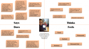
Kimberly’s empathy map from needfinding interview
4 Key Takeaways from the interview with a member of the homeless population
- We realized we made too many assumptions
- Most valued donation is time
- The hardest thing about living on the street is feeling invisible
- He liked the idea, thought it would combat digital barriers
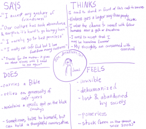
Zoomed in Empathy map from interview with homeless person
Problem Statement from the Empathy Maps:
After contructing all five empathy maps, we realized that all four of our non-homeless interviewees had a need to feel safe and comfortable while approaching and talking to the homeless. On that same note, our homeless interview felt a need to be respected and acknowledged when being approached. With this said, we crafted our primary “how might we” question to focus on social interaction.
“How might we reduce barriers to donation by decreasing the social friction?”
Parallel Prototyping
From all our interviews there was a common consensus: there was concern about being able to actually approach the homeless in general! Of course right? How/Why would anybody use our app if they felt too hesitant and apprehensive in the first place to even approach the person they wanted to donate to?
This is what our problem was and what we want our designs to answer. Thus, each of us made our own versions of a ‘Walkthrough’ which would essentially guide a user through how the app works by also, providing them an interactive guided script on how to actually go about overcoming this ‘social friction’ between them and the person they wanted to donate to.
Kimberly’s Low Fi Sketch & Early Mid Fi Prototype:
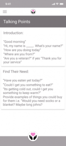
Many of our interviewees expressed hesitancy to approach a homeless person because they feel uncomfortable doing so, afraid they they may enter an unsafe situation. With this said, we though of integrating an interaction guide that will inform our user of small tips and tricks to facilitate a positive interaction. We did a bit of research into the content of this interaction guide and suggesting thing like making eye contact with the person before you approach them to get a sense of if they want to be approached. We also prototyped a talking points resource that the user could click on a at any time to view a few quick and simple things they could say to facilitate a positive and productive conversation.
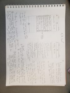
Low Fi Sketches of interaction guide
Mid Fi Prototype
Sneha’s Low Fi Sketches & Early Mid Fi Prototype:
Considering our concepts were reducing the friction to donation and reducing the friction to social stigma of approaching the homeless and connecting these two factors. We used these as the focus area during our sketching phase. These were some of the iterations we went through.
On how to onboard someone walking them through the app’s ‘Interactive guide aspect’. When considering the implementation of a choice to ‘donate through organizations as well. How might someone go about doing this then? The final testable lowFi prototype I conducted my usability test on.
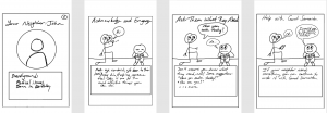
Joseph’s Low Fi Sketches:
The following sketches depict a cartoon storyboard intro that the user would have to scroll through before placing an order.
Usability Testing Guide
Once we had our prototypes ready and knew the main question we wanted answered from them, we moved on to creating our Usability Test Guide. Remember, your prototypes have to be answering a single question which is generally linked to your ‘How might we..?’ so that you always remember what you’re trying to solve for. Here’s the usability guide we created for our use case with a link to the prototypes each of us tested: https://bit.ly/2qQY1pi
Target Subjects: Students and employees at Cal, Berkeley civilians
Goals:
- Determine if users have enough information to approach a homeless person, if they are doing this for the first time
- Determine if the app reduces the social friction of direct donations with the walkthrough
- Determine if users would prefer using this app to actively donate to the needy around them
Introduction script
- We are trying to get feedback on an app to help individuals approach the homeless to donate something they might need and make them feel better
- Please talk out loud and share your thoughts as you go through this experience.
- There are no right or wrong answers and we are not testing you. Feel free to be honest and as critical as you would like.
- We’re testing the app NOT you, so anytime you feel something odd about it – feel free to share, be as critical as you like.
- Do you have any questions before we begin?
- Let’s begin with some background questions
Pre Questions:
- How often do you approach homeless people (to give a donation or interact)?
- Do you ever hesitate to approach homeless people; if so, why?
- What is your strategy to approach homeless people? Where did you learn this?
- What would you consider a reason to end an interaction with a homeless person?
Test/Task 1: Observing the user while they experience the walkthrough of the app to see how they’re able to then navigate through the app and if they feel comfortable using it to ‘donate to someone homeless’
As a reminder this was a question we reminded ourselves to keep asking as we built our prototypes and tested our prototypes:
“How might we reduce barriers to donation by decreasing social friction?”
Script:
We are now going to try the prototypes
- Not all of the functions are developed and if something doesn’t work, I might ask you to imagine what would happen if it worked.
- You can feel free to talk about both the visuals and functions of the prototypes.
- Again, point out anything you felt odd about as you’re going through it
During Questions:
- Take a look and tell me know what you think.
- (Before clicking to next page) What do you think you have to do next?
- Is there anything that seems distracting from the goal in the design aesthetic?
- Which information stands out to you the most?
- What stood out to you the most during this walkthrough?
- How does the app make you feel?
- If you were hesitant/apprehensive before, do any of those sentiments linger? Why?
- What would you use this app for?
Wrap-up
- What are your overall impressions of the apps you were shown?
- Which functions would you use?
- Which functions would you not use?
- Was there anything confusing?
- Was there anything you specifically liked?
Usability Findings
Discussing and examining usability findings in person
Prototype 1 (Phoebe):
User description: 25-year-old undergraduate student at Cal. She is from Palo Alto and is in her 4th year as a double major in Cognitive Science and Art.
Click here for complete user insights from testing
Usability Takeaways:
- Minimize text to avoid overwhelming the user.
- Explain more clearly how the homeless person is supposed to participate.
- Make the icon for the disengage/safety tips more discrete and less central.
- Decision to move away from grayscale is reinforced since the user specifically did not like the gray prototype version.
Prototype 2 (Joseph):
User Description: 30 year old female professional working in San Francisco, CA. She regularly supports non-profit organizations, donates clothing to Goodwill, and volunteers at food banks.
Click here for complete user insights from testing
Usability Takeaways
- Explain the purpose of app before the storyboard screens
- Swipe instead of tapping on storyboard screens.
- Include safety tips so that people know what to do if they are uncomfortable
- Use the word “give” rather than “donate”, donate implies money is being given
- Storyboard screens were helpful, it reminds the user how they might engage with a person on the street.
- Add tips on donations, what to give if nothing is asked for
- Make it clear that first screen is a user persona rather than a real person
Prototype 3 (by Sneha)
Prototype tested: https://bit.ly/2PH32cj
User description & background: 1, 25-year-old female; Admin staff at UC Berkeley, was willing and excited to try out a new concept. Test was conducted at 12.30 PM on campus. The user does not frequently prefer donating directly. In general she doesn’t prefer approaching ‘unfamiliar people’. Her only experiences of donating directly include when she’s had to ‘drop money into a cup’ and walk away. As a woman she doesn’t feel safe and rather avoids approaching people as she never knows how the situation may turn out or when it would turn out into ‘wrong potential’
Overall user insights:
-
- App made her feel generous (because of the amount of money shown in the completion page)
- Liked the concept of the app & the idea – Considers it a feel good app & happy with a ‘donation’
- Was able to understand all the information on all the screens, but felt there could be some moved around (stated above)
- Like to see how she could ‘Track her donation’ & see who she was donating to
- She would be more inclined to donate with a trusted organization because of her aversion to approaching people
- Would like to know what people need & fulfil that need which she could see completing here
- Found the process of going to another site & purchasing seemed like ‘alot/ felt like more’ – Should be made more seamless;
- Information retrieval & presentation should be clear across both apps so a user doesn’t have to enter too much
- “Donating food can have it’s restrictions if you don’t know the person & what they do and don’t like” – A personal interaction is definitely necessary
- Liked the talking tips & knowing how the interaction guide was helpful in helping her approach a homeless person
Usability Takeaways:
- Concept Coherency conveyed of ‘Donation’ should make sure it’s consistent across the interface
- Heuristic implementation required: Feedback & Help, guidance to always be able to go back home needed
- User better illustrations for guidance, more representative of the interaction a user may perform
- Titles require descriptions
- Remove ‘Link another account’ is misleading. Using only few vendors of on-demand delivery
- Depict connection between vendor apps and GoodSamaritan – what happens in between?
- Description of the person must come before they’re guided to app
- Location can be omitted? Already assumed to be collected on the vendor app
- Summary & Impact are very helpful – retain with some visuals
For a complete detailed list of observation notes with the user please refer to this link.
Prototype 4 (by Kimberly)
Prototype tested: Demo
User description & background: Male, age 23 working in tree care and maintenance. He rarely donates money to homeless people but he has bought them food before. He doesn’t use many instant delivery apps.
Click here for complete user insights from testing
Overall user insights:
- He found the initial page in the walk through to be confusing, he thought it was odd that he was not first brought to a home screen.
- He liked both the interaction guide and talking points but thought that he wouldn’t have time to read through the whole interaction guide on the fly. Talking points are more useful for quick guidance.
- As someone who doesn’t use many instant delivery apps, he didn’t like that he would have to interact through another platform to place the order.
- He felt that sharing the donation on social media was braggy and make the donation less genuine.
Usability Takeaways:
- We should find a way to appeal to people who don’t normally use frequent delivery apps or change our user base to just be those people who already use those apps
- Both the interaction guide and talking points are a useful resource for our user, each with their own unique purpose.
- Create an interaction menu so that the user can access both the talking points and interaction guide from the same screen.
- Our initial walk-through can be confusing. We should ease users into the app instead of showing them maps and statistics right off the bat.
- Add in more guidance for the users description of the receiver. Perhaps we can ask the user to provide a name and physical description in separate text fields.
- Reorder the entry of delivery details in general. User was confused when he would be brought to the partner app.
- We should maybe rethink the option to share the donation.
Final Iteration in HighFi
Building through our parallel iteration phases we realized the importance of social interactions and the barrier of having them with your ‘not-so-regular-folks’, that one may not interact with on a daily basis. People do encounter the homeless everyday, but rarely do people consider interacting with them. We ensured to keep asking our one single question through each of our iterations. To finally deduce our final solution which was considerate of the usability findings & incorporated each of our takeaways.
Here’s the final interactive version of our app: https://bit.ly/2rxaEX1
Overall Improvements
- A complete introduction to our app, what it was about and how you could walk through to it
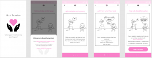
The introduction walkthrough of Good Samaritan
- A comprehensive interaction, disengage & talking tips guide for users to overcome their stigma and feel as safe as possible before approaching their potential receiver
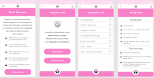
Good Samaritan’s interaction & safety guide
- Micro-interactions to help guide users on how this would work as a real app
Micro interactions providing feedback of progress
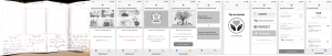
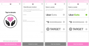
- An end-to-end connected experience of connection between apps to make it more seamless and easier to comprehend the progression a person would go through while also being able to quantify their impact
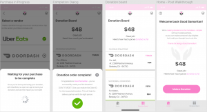
Connection between the vendor & Good Samaritan and impact of donation
A Final Look at Design
Our overall design takeaways included finer details details which mapped concepts we picked up over the course of this one semester in our Introduction to HCI class, helping just justify why we were making some of the decisions we were, guiding us to what our key decision were and keeping the user at the focus of what we were trying to solve by reminding to ask ourselves that one ‘how might we’ over and over and over!
Concepts we mapped throughout:
- Aesthetics:
- We made an association in the style of our app through bringing out a sense of ‘softness’, ‘affection’ and ‘empathy’ with our choices in typography and color combinations.
- We aimed to find balance with our incorporation of ‘white space’ through each screen a user encountered.
- Applying Gestalt’s principles on representing information in blocks we associated relative information together to let our design speak for itself
Find more details from our first article here.
- Using grid systems:
- These helped us maintain consistency across the app
- Defined guidelines for us to stick by, irrespective of who was designing
- Since the primary market we were designing for was iOS based, we heavily relied on Apple’s Human Interface Guidelines to guide us
- Using concepts from the Design of Everyday Things:
- We tried to keep a match between the real world and the system with subtle choices in our iconography(Eg. Shield to depict Safety) and states of interaction and the affordances of gestures users were allowed on each screen
- The 10 Design Heuristics – helped keep us on track while navigating to and from our onboarding to the interaction guides
- Focusing & Flaring is what helped generate ideas for the 2 concepts we tested to solve our one problem of ‘overcoming a social barrier between people’
We came out happy but acknowledge the improvements that could still be made with yet another round of iteration on this – we’re glad we got so far though! Thanks for reading!
PS. Here’s the link to our final presentation if you’re interested.