About Ryan Yenchen Liu

I am currently pursuing a Master’s in Information Management and Systems at UC Berkeley and focusing on technology for social goods. Having served a corporate foundation and two NGOs over 5 years, I am passionate about humanities and aspire to integrate my technology background to come up with solutions to address complex issues.
Adventurous will be the word I use to describe myself. I love to explore the nature and pioneer new places. On top of that, I enjoy photography and literature. They enrich my spiritual life and diversify my repertoire to compose a touching story.
Life is a big adventure, and I am ready to go!
Ryan’s Design Manifesto
I believe that less is more. My manifesto is to create a user-centered application that is pure and indeed solves problems for users without a steep learning curve. As a UX designer, I do have implicitly imbalanced power toward users and interviewees. Therefore, I remind myself all the time of seeing the problem from their angles and control myself not to create a design that is beautiful but of no use. Any visual design should have its function that serves users.
For example, I teamed up with several nonprofits to address educational ills in Taiwan and created a game-like learning platform that interested students and had their academic performances improved 20 percent on average. Before that, people often suggested building a platform that offered comprehensive online tutorials for students from rural areas. However, they forgot that those students didn’t lack resources but motivations to study and take exams. That was why no matter how fun and interesting the videos you made were, they were still not encouraged to study, not to mention many of them couldn’t access stable WiFi, or sometimes they didn’t even come to school for family problems.
I emphasize the need-finding process in my designs since a good design must start from the user’s need. For instance, in the second module of this semester, my team inspected long-distance relationships and aimed for building connections. In the beginning, we targeted refugees working as baristas under benevolent nonprofit 1951 and hoped to ease their pain of being separated from families. I then conducted 5 interviews, including two baristas and 3 international students, finding out that they were using social media or phone calls to maintain relationships. I surprisingly realized that they feel comfortable with independence. Therefore, the users’ need was not having a tool to connect, but to allow both parties of a long-distance relationship able to approach comfortably and positively while they pursuing their higher personal goal.
Also, I always examine my designs with usability tests to gather users’ feedback. In my third module, my team was dealing with safety issues for people having a high possibility to walk home at night. After interviewing several users, I questioned myself: how might we make urban travel feel safer? I then prototyped an application that guides people to travel along safe routes. I conducted heuristic evaluations in our group and interviewed several users to test how user-friendly my design was. Similarly, in the last module, I even conducted two rounds of usability tests to polish my design.
In summary, I believe good design should be simple, intuitive, truly cope with pain points. Every visual effect and function should go back to users’ needs and answer specific questions, which is the purpose of design.
Design Document: Minimalization (Design for iteration)
Introduction
The last module, my team were all interested in digital minimalization, since we all have experienced being swarmed by ever-changing social media, instant messages, and emails. We were all interested in and concerned with this topic.
In the first module, Minimalism, my team aimed at utilizing design to encourage people to do less of the bad and more of the good. Specifically, we decided to focus on We finally came up with and prototyped an application that provided lessons on digital minimalism, tracks of phone usage, and management of phone notifications. We did draw many users’ attention. However, we were too ambitious to zero in on the central question. We included too many features that some of them were embarrassed when the user struggled to combat the fear of missing out (FOMO).
This time, after several discussions, we determined to narrow it down and converged at the distraction caused by notifications.
Needfinding
Two groups of users were our target audience: students and faculties, who both had high demands of managing a big amount of information in a short time. To dig out users’ needs, we listed several possible questions in our questionnaire and performed user interviews individually to penetrate it. Click here to see Ryan’s needfinding process.
The interviewee, a staff of iSchool
The main takeaways were as follows:
- Users were divided. One group was aware of this issue and consciously screen their information. The other group struggled to get less distracted but failed to achieve it, and this usually came along with insecurity and anxiety about their social connections.
- Users agreed this was an issue and they wanted to manage their notifications. However, they had difficulty navigating notification settings. Some didn’t even know they could manage settings for individual Apps.
- Users were afraid of missing important notifications because they get lumped together while frustrated with being distracted by pop-up notifications while using phone for other things
Then, we brainstormed several “how might we (HMW)” questions to cope with the pain points. To mention a few:
- How might we systematically organize notifications based on importance?
- How might we prioritize social interactions?
- How might we reduce the visual & information clutter
- How might we make modifying notification settings more flexible/accessible?
- How might we filter information based on time of day
- How might we make notifications less engaging?
After several debates, we summarized all these ideas, and the central question was focused on: How might we help people feel less overwhelmed when it comes to acting upon notifications?
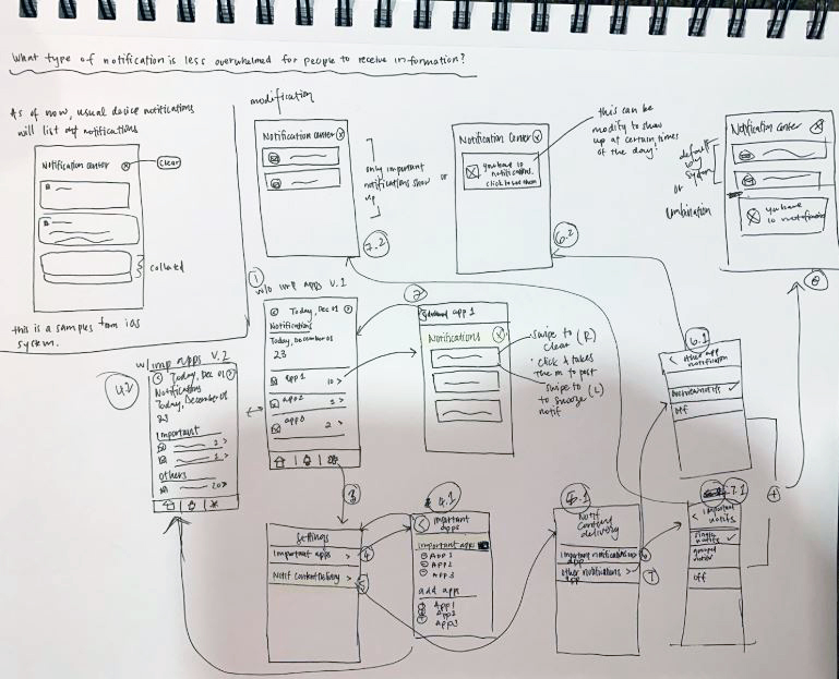
Ideation
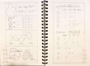
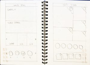
During the ideation phase, my team went through two rounds of lo-fi prototypes. In every round, each of us parallelly developed one lo-fi prototype to inspect one sub-question in response to our central question. Then we came together to see if our lo-fi prototypes successfully set an appropriate premise, answered the aimed question, and shed some light on our central question.
Ryan’s First Round Sketches
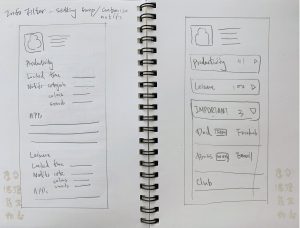

Ryan’s Second Round Sketches
Iterating upon: How might we make notifications more productive?
Finally, we decided to move forward using Yi and Shefali’s ideas to gather users’ feedback and to converge our ideas.
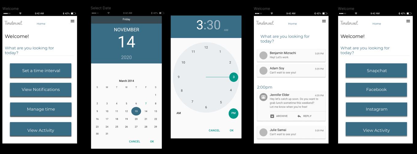
Lo-Fi PrototypeI
Lo-Fi Prototype II
First Usability test
The objective of this usability test was to find which of the two prototypes best serves our goal. The insights we wanted to collect from users were:
- Overall satisfaction when engaging with the app
- If participants could successfully manage information in the context of set tasks
- Whether they have pre-existing knowledge about certain features on the prototype
Since it was the end of the semester, we created a scenario that people could easily resonate.
It is the RRR week, you recognize there is no time to be wasted. You crack open your notes to start studying when your phone suddenly pings alerting you that you have a notification. Out of instinct, you pick up your phone and press the notification. All it took is one notification and you are absorbed into the application for two minutes. You notice that you’ve been sidetrack so, in order to be productive, you’ve searched up and downloaded two apps to silence your notifications. You would like to know which one will help you with your problem.
Then, we asked them to perform the following tasks with a set of Lo-Fi sketches.
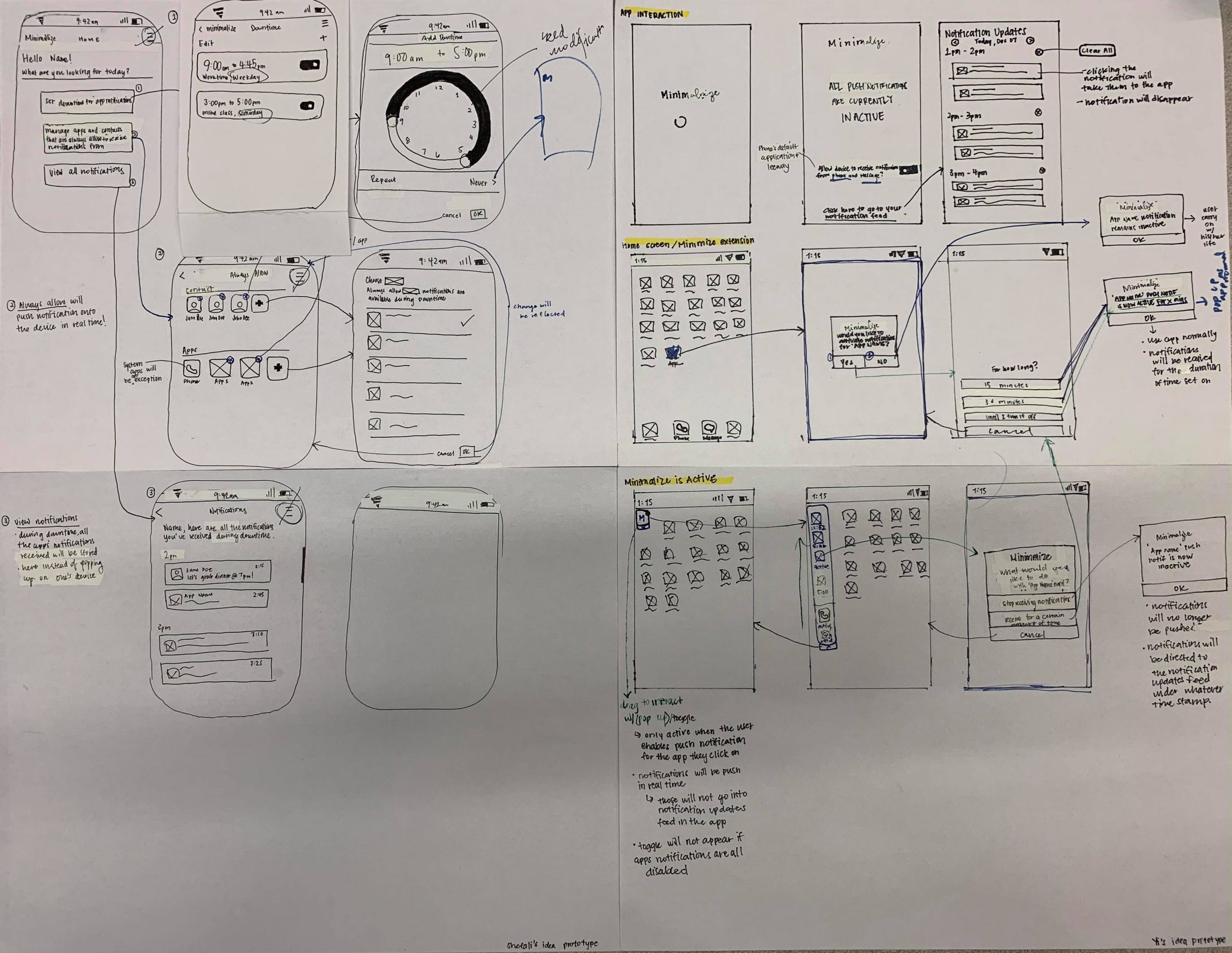
Sketches for the Usability Test
Tasks for Prototype I:
- Set DownTime for application notifications
- See all the notifications that were received during Downtime
- Manage applications and contacts that the user would like to receive ALL the time
Tasks for Prototype II:
- See all the notifications that were received
- Turn on notifications for an App
- Turn off notifications for an App
We recruited three users for the test and found many interesting facts. For instance, most of them were able to navigate through the first prototype effortlessly, because it was much more iOS-like. They also suggested we included gestures like swipe, which also originated from iOS. Also, they seemed impatient when they couldn’t figure out functions. Two of them told us they preferred not learning anything to use the App while appreciating the function that prioritized and allowed some information passing through the block.
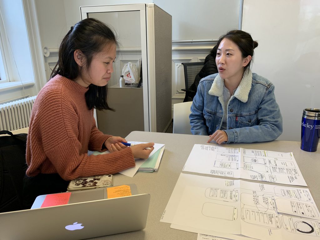
Yi and Ryan were doing usability test with a user
Prototype II was our Darkhorse and I personally like how it was framed out of the box. However, for the group who mindfully avoid distractions caused by notifications, the App featured a practiced they already did, which was staying away and muting cellphones. For the other group, they wouldn’t use it because they felt less control of the App.
Overall, I summarized our first-round usability test as follows. For details about the usability test, please click here.
- 2 out of 3 users preferred prototype I over prototype II because it is more intuitive overall for the user to engage with.
- All the users like to have some flexibility to choose their primary contacts and apps to receive notifications while blocking out secondary apps/contacts.
- Users want to have the ability to have a sense of control if using a certain app as two users’ impression from Prototype II’s welcome screen that the toggle on the bottom of the page gives them the ability to activate or deactivate the application or Prototype I’s time set up a function to freely indicate time to the very minute.
Mi-fi prototyping & Second Usability test
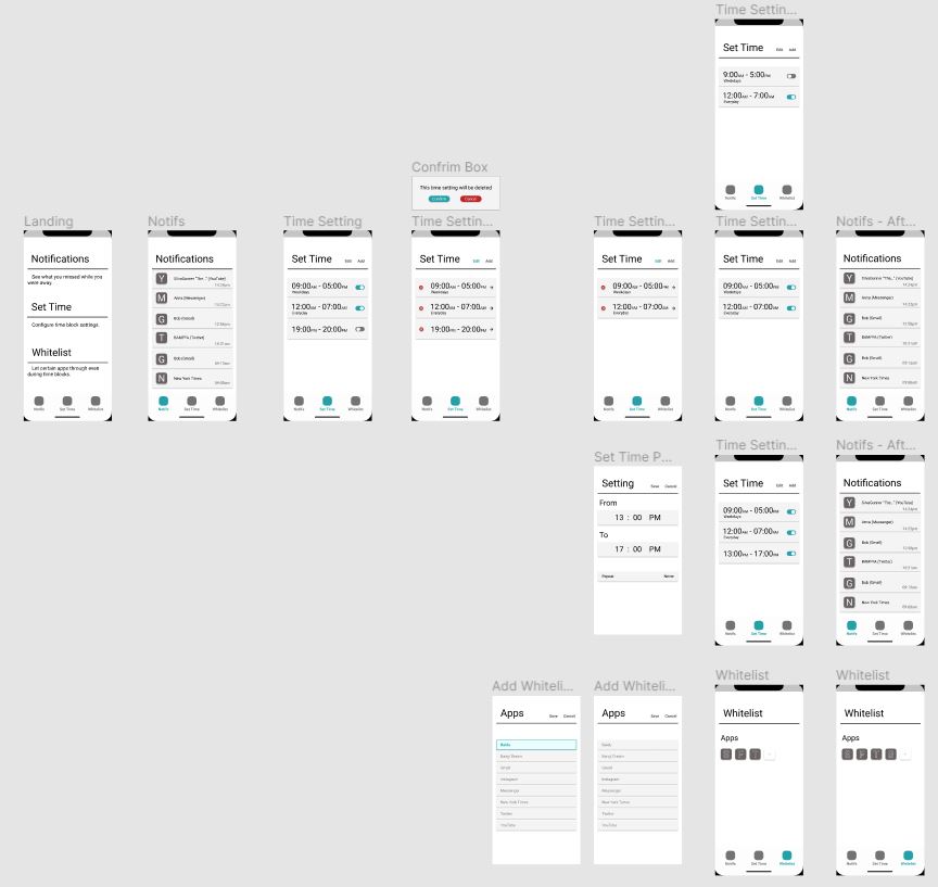
Based on our first usability test, I designed a mi-fi prototype for my team. It included features our interviewees favored and aimed at lowering the bar for learning the App while providing flexibility for customization.

Ryan’s Mi-Fi Prototype for Usability Test (Click the picture to see the prototype in Figma)
Then, we used the mi-fi to perform the second usability test. This time, we wanted to know if users find the App intuitive and if they feel the App useful to make notifications less distracted. With the same scenario, we then recruited another three users, to ask them to perform several tasks.
- Set DownTime for application notifications
- Checked all the notifications that were received during Downtime
- Enabled exceptions that can always reach out to you even if you are under DownTime
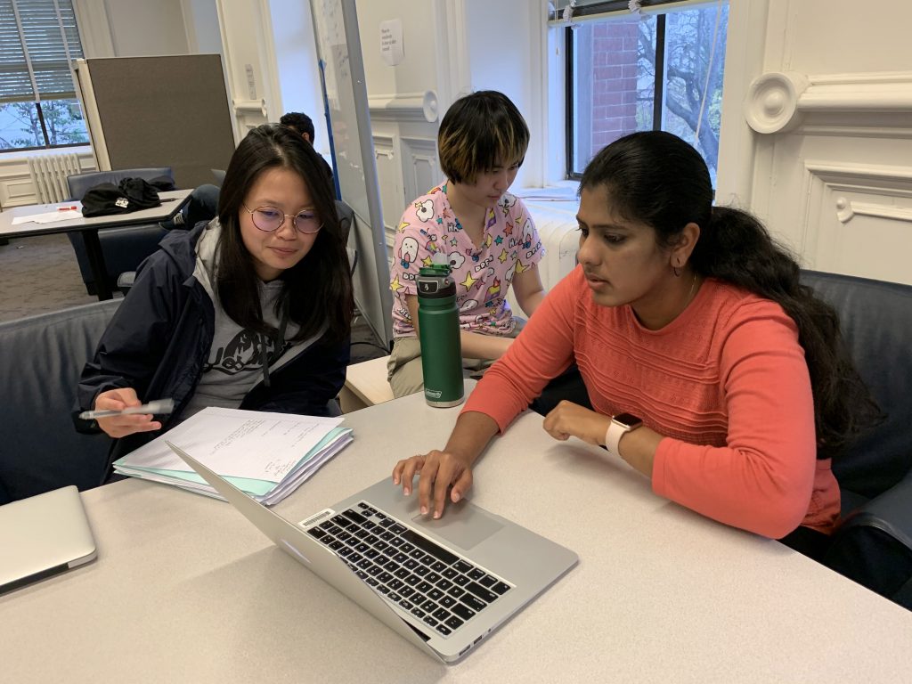
Yi, Jamie, and Ryan were doing second round usability test
This time, we found that all three users set DownTime effortlessly and were able to find all historical messages, along with minor suggestions like changing the order of messages. However, all of them couldn’t understand the purpose of “Whitelist” at first glance. They felt some descriptions may help them grasp the meaning of it. Also, if the App walked them through all functions at the beginning, they wouldn’t be faced with the confusing “Whitelist” without any assistive information. This also contradicted heuristic principles. Therefore, the main takeaways were as follows.
- Liked that this app is not as rigid and they’d be able to tailor a whitelist based on their work conditions, but they were not well-informed how to use it.
- Were down with having the notifications page so that they know what they missed, but individual notification timestamps would make more sense than hourly presented. Also, a page-clearing function would be expected.
- Enjoyed the ad hoc simplicity. They were satisfied with fewer functions for the App would be less overwhelmed and could be learned easily.
For details about the usability test, please click here.
Conclusion & Final Deliverable
Our final deliverable added the first-time tutorial to walk users through the App. Also, we had some info icons that prompted users when they got lost.
Final Prototype (Click the picture to see the prototype in Figma)
One of the most interesting things I learned is that users indeed hate learning new functions. Including my final module, I heard many users suggested applying designs of iOS or Google when I did usability tests. It’s like a dilemma. We want to create something new to address issues that current Apps or designs can’t do, but users prefer functions from current mainstreams for its prevalent and they already know how to use it. To a certain level, it limits new designs while bringing benefits for UX designers. It reminded me of a sociological class I took. The class introduced a concept called “paradigm shift”. It was often used in a different context, but I feel it still suits my observation. A paradigm represented something that has been done within a prevailing framework, and only if a paradigm is incompatible with a new phenomenon, then people will adopt a new. It tells a lot about people’s nature.
Revisiting my design manifesto, I do feel a simple and easy-to-learn App is the way to go, and this doesn’t contradict creativity. You can make a design user-friendly and creative at the same time, and that’s the art of design and the value of a UX designer. To summarize, I feel the need-finding and usability tests are mirrors to help us look into the blind side, which allows me to keep humble and keep users on my mind.