About Me

Hello there, my name is Yi! I am currently a fourth-year undergraduate student studying Cognitive Science at the University of California, Berkeley. My interests are, but not limited to, design thinking, behavioral psychology, and social intelligence in order to understand people’s decision-making processes. This semester, I am a research assistant at Zhou Family and Culture Lab investigating how sociocultural background plays a role in self-regulation. During my free time, I love getting lost in a new city, snacking on pineapple buns, and reading in bed. I am currently seeking a full-time role starting in Summer 2020.
Let’s Connect:
Design Manifesto
Less is more, the guiding principle of my design practices. No matter what the workflow is from needfinding to prototyping, the simpler the better.
Less is more productive when it comes to prototyping for user testing
It optimizes the overall performance and allows me to produce more products in a short amount of time. I’ve utilized different techniques from storyboarding during module II to paper prototyping in the latest project that my team and I worked on.
I had a realization when I conduct user testing with a high fidelity prototype during the module III, the user was hesitant to express her thoughts about the functionality of the application because she was too fixated on the idea that it resembles an actual app that could be found in the App store.
At the end of the day, I want to receive feedback about the functional experience without worrying too much about putting effort to create the aesthetics (even though it is also important, I don’t believe this should be tackled until the final product). This allows me to learn to fail fast and improve upon it.
Less is more, to narrow down on ideas
Whether it is collaborating with a team or working solo, the common challenge faced after a brainstorming session is the ability to reduce ideas down to a realistic amount to work with. During module II, my team and I used heat map voting to decide on the ideas we wanted to proceed with prototyping. In addition, in the latest project, my team used Borda count voting to determine a design concept we wanted to iterate on. These two kinds of methods prompted me to not get too caught up with just one idea, rather think realistically about the choices.
At the same time, I know this design principle has some imperfections.
Less is more of an issue when it comes to functionality for users.
The latest prototype I’ve worked on to manage phone notifications was driven by this design principle. The expectation was creating an app that was user-friendly by turning off all applications’ notifications with the ability for the user to select and enable notifications for the apps they want to receive notifications from. But, the users found the overall experience unpleasant because it was too tedious to have to activate each app’s notification. This leaves me with the impression that I am designing for the user, not the solution I believe is suited for the user’s needs.
Less is not more when it comes to needfinding
Some of the limitations to this design are based on the specific users I’ve worked with. Simplicity might not be the best route to go with just given the limited knowledge we have on them. Especially from module II, the intuition of less is more was counterintuitive. My team and I focused our needfinding on Vegans who dine out. Even though we have a couple of interviews, it is not a holistic representation for us to deeply understand Vegans. Through this process, we had gained some insights as well as disprove any assumptions we originally had.
Less is not more informative for the users, if not properly introduced
If there is a feature that a user will need to learn, there should be a brief introduction to it. There were a couple of instances where it falls short on informing the user about the feature such as from module III when I tried to highlight the text-based feedback in my design to the lastest project where my team and I attempted to introduce a whitelist feature. Both times, both my team and I were driven by the assumption that users usually avoid “brief tutorials” since they would rather explore the app on their own. However, that was not the case for both instances as a result, I’ve become more meticulous in my assumption thinking process to identify my knowledge as a designer and figure out what the users might know.
All things considered, less is more is the mantra I’ve come to appreciate to think of design beyond just visual aesthetics. This principle could be applied to all aspects of the design space considering the minimum effort can reveal so much information.
Minimalize – Case Study
The phone notifications management app
Introduction
Minimalism is a new movement making waves everywhere, from lifestyle such as Marie Kondo’s decluttering techniques to determine what brings joy to people’s lives to digital space known as digital minimalism to build a healthier relationship between people and technology. My team and I chose to reiterate on Minimalize as a way to balance the relationship between the user and his/her device by silencing notifications during certain times of the day so s/he can go on to focus on the present.
Goals and Objective
The goal of this project was to focus on minimizing the user’s interaction with notifications during a particular period of time that s/he would receive on his/her mobile device. One of the original features from the original design was “a notification manager that allows the user to categorize his/her mobile applications and adjust their notification settings based on categorization.” We wanted to help the user to have the choice to decide when they want to be temporarily disconnected from the nuance of the digital world as well as let s/he has the ability to still be updated in the digital space.
Tools
- User Interview
- Paper and pen (Sketches, Paper Prototypes)
- Figma (Mid-Fi prototypes)
- User Testing
Needfinding
Target User
Our app is designed for people who find notifications distracting, so our user group is young adults who use their device.
User Interviews
We conducted 5 user interviews from a few college students, a co-worker, and a staff member from the School of Information to share their experiences about their phone notifications.
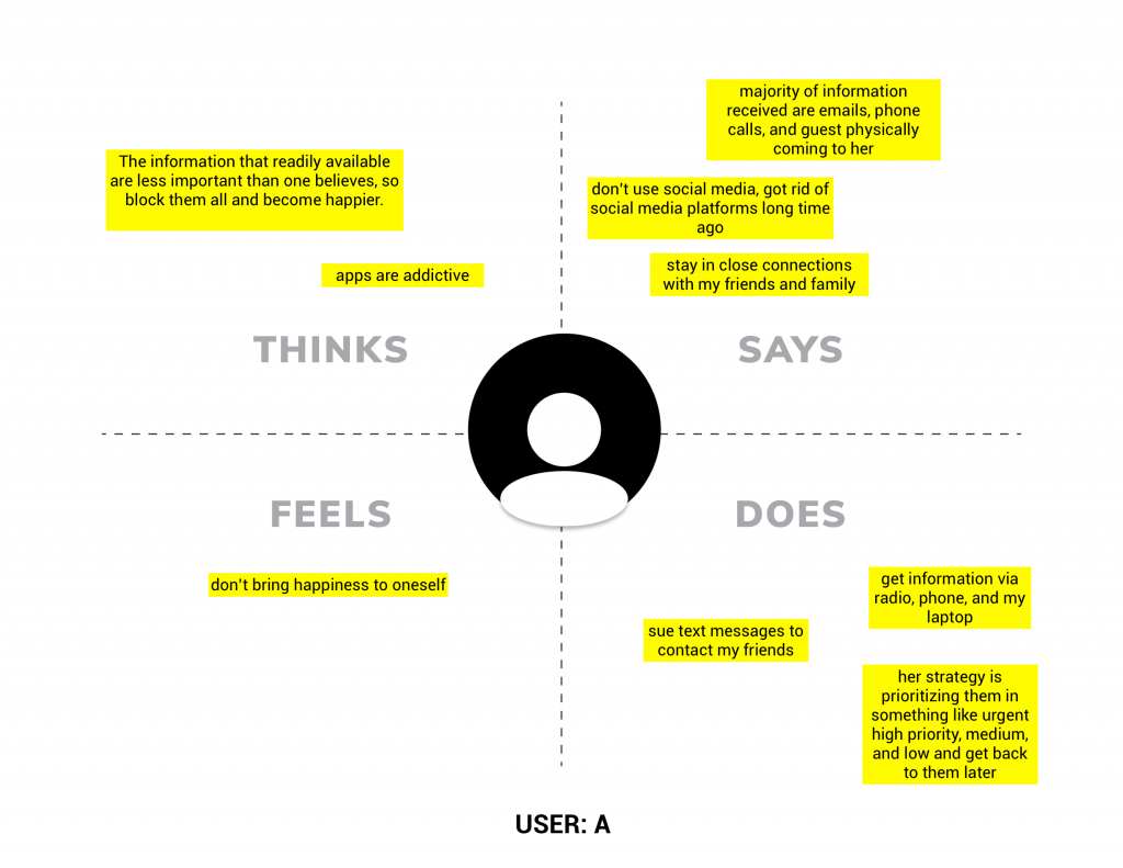
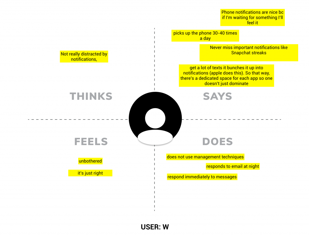
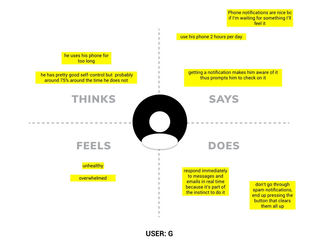
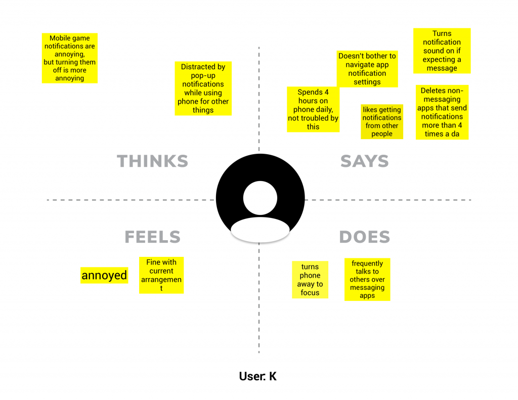
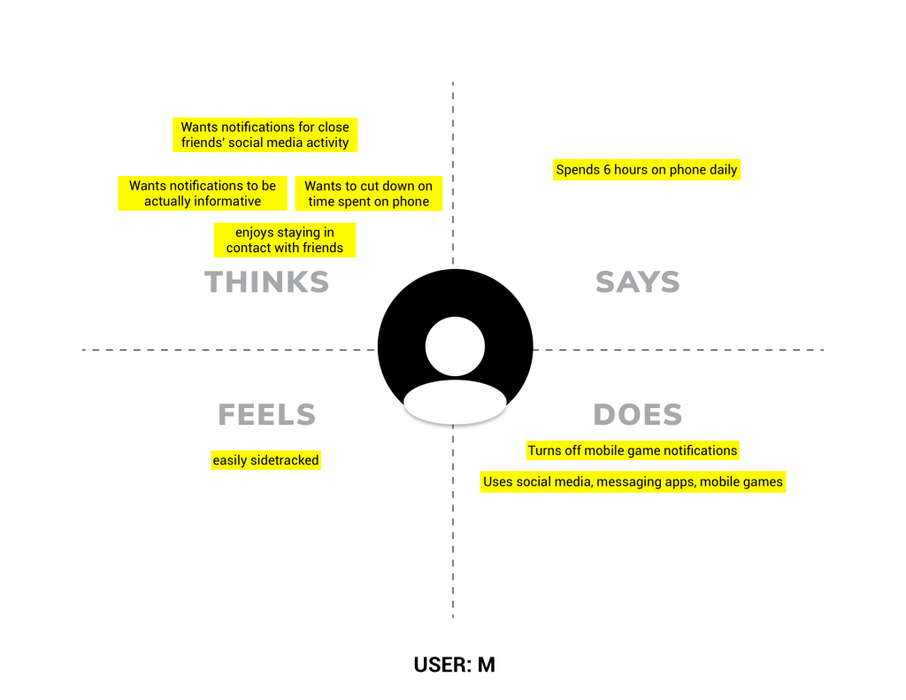
These are the needs we have identified from our user interviews:
- User needs to be able to stay connected with their friends and family
- User needs to be able to use their device less in order to be more healthy and happy
- User needs to be able to receive informative notifications
Then we came up with several how might we statements to create solutions from the user needs.
- How might we help people respond to their notifications in a sustainable manner?
- How might we help people feel less stressed about their notifications?
- How might we increase the rate of response or action upon work or communications-related notifications?
Design Question
How might we help people feel less overwhelmed when it comes to acting upon notifications?
Low Fidelity Prototyping
We prototype on several scenarios:
- Imagine if we could prioritize communications from people vs other types of notifications?
- Imagine if we could modify notification settings to be more flexible/accessible?
- Imagine if we could create a function that filters information based on time of day?
- Imagine if we could turn all notifications a user may not want to receive?
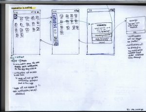
We ended doing two rounds of lo-fi sketches given the different scenarios and reduce the number of choices down to two prototypes which are shown down below.
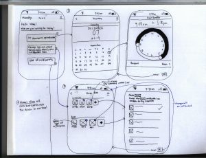
Prototype I: Timeterval
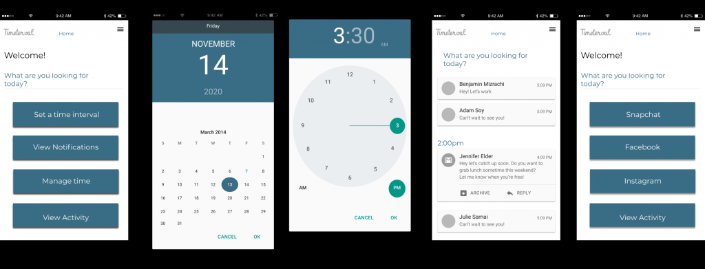
Prototype I allows the user to customize when s/he would like to turn his or her notification off. In addition, the notifications are collected into one single feed so the user can see what s/he missed during the times when the app is active. Click here to see the Figma file
Prototype II: Minimalize
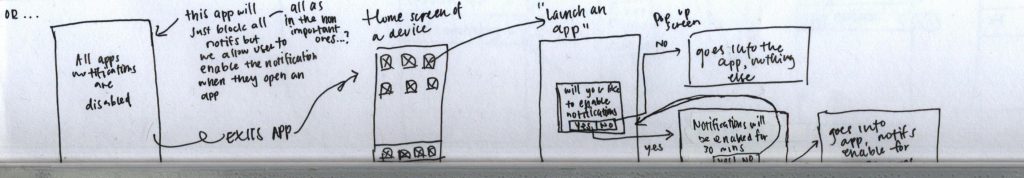
An animated version of the lo-fi sketch for prototype II [click here to see figma file]
Prototype II’s approach by default is turning off all app notifications. The user can enable notifications by interacting with their choice of the app for a certain amount of time so it leaves them with some flexibility but keeping the functional aspect of muting notifications that are not important.
User Testing & Validating
As a team, we decided to conduct two types of user testing.
Initially, we had two prototypes with two completely different approaches for the same idea, thus we decided to conduct user ‘learnability’ testing to see which of the two prototypes serve our user needs.
After we identified the prototype that served our user needs, then we created another prototype and conduct ‘problem discovery’ testing to understand do users find the labeling of each page to provide a context of the app’s functionality.
User Testing #1: Learnability Testing
Prototype I
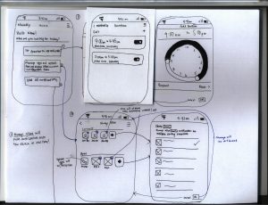
Prototype II
We conducted a total of 3 user learnability testing using Paper Prototypes of the two prototypes shown above.
The user testing plan is broken down into three scenarios to gather insight about overall satisfaction when engaging with both apps, whether the users were successful with each activity, and see if the users had preexisting knowledge about certain features of a management app.
Results
- 2 out of 3 users preferred prototype I over prototype II because it is more intuitive overall for the user to engage with.
- All the users like to have some flexibility to choose their primary contacts and apps to receive notifications while blocking out secondary apps/contacts.
- Users want to have the ability to have a sense of control if using a certain app as two users’ impression from Prototype II’s welcome screen that the toggle on the bottom of the page gives them the ability to activate or deactivate the application or Prototype I’s time set up a function to freely indicate time to the very minute.
Findings and Recommendation
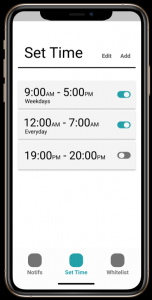
- Labels should be more clear
- prefer to have “alarm clock view” of preset times to turn off notifications over a calendar view
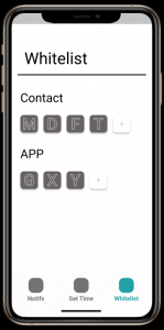
- there should be more discrepancy when it comes to selecting/unselecting an item to add for the white list
- there should be a way to access different pages instead of having a page of the listed options
User Testing #2: Problem Discovery Testing
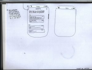
Based on our initial user testing findings, we created a mid-fi wireframe for prototype I.
We conducted a total of 2 user learnability testing using the mid-fi prototype shown above to see do users find the labeling of each page to provide a context of the app’s functionality.
The user testing plan is broken down into three scenarios to gather insight into whether the users were successful with each activity, whether notifications should be grouped or not, and see if the users utilize the mental model while engaging with the app.
Results
- All the users were unfamiliar with the label jargon ‘whitelist’ and eventually understood it after interacting with the feature
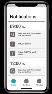
- All users found the grouping different apps’ notifications into one overall notification to be ineffective because they are unsure what they are supposed to do with that information
- All users found the whitelisting contacts impractical because that is accessing the device contacts by default, which they’ve mentioned some of their communications are done on other platforms rather than the system’s messaging app.
Findings and Recommendation
- include little notes or instructions somewhere to clarify what the user is able to do in each page of the app
- notifications should display from most recent to least recent
- singleton notifications are preferred because once the user taps on it, it should navigate to that app directly
- have a guide that teaches the user about the key features in the app
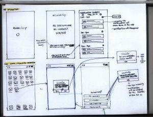
‘Final’ Product
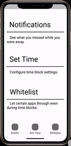
mid-fi ‘final’ prototype
Design decisions
Due to the limit of time between usability testing #1 and usability #2, we decided to forego our focus on visual design. Instead, we decided we wanted to focus on the overall experience of the application.
Based on our second usability testing, we refined the mid-fi prototypes to include a help guide to inform the user about the functionality of the application at the beginning of the app. Also, we modified the notifications to singletons so the user has the ability to navigate to other apps after they tap on the notification. Finally, we removed the contacts category from the whitelist.
The lesson I’ve learned from this project
- Don’t prototype with the intention to create a high fidelity version of it so quickly
Initially, my team and I thought there would be a high possibility that we would be able to identify problem areas in a timely manner. Throughout the process, we faced several issues from having to narrow our scopes down from “engagement” to “timing app notifications” that led us to churn out several prototypes. Once we reached a decision on two prototypes, we were forced to go back to the drawing board to analyze the overall user flow. That led us to create paper prototypes to test which of the two prototype ideas has an intuitive interaction flow. From there, we knew we had so many questions needed to be answered so that led us to create mid-fi prototypes to be able to garner answers pertaining to just the interaction. If we invested our time into beautifying the prototype, then we would not be able to gather feedback about the critical issues within the prototype.
Next Steps
- carry out heuristic evaluations on our mid-fidelity prototypes to identify the severity of problems
- create a high fidelity prototype to focus on visual design
- conduct usability testing with more users to see whether having a learning guide at the beginning of the session will allow the users to navigate around the application with ease
Additional Projects
Here are some projects I had the opportunity to collaborate with others during the course of the semester in Info 213:
- Matcha: an e-shopping browser extension to resolve major underlying issues of online shopping experiences from compulsive purchase behaviors
-
Vegariation: a digital interface for a vegan restaurant to create a novel tasting experience for both vegan and nonvegan diners
- Fashion advice-seeking App: a mobile app for solo female shoppers to get feedback from other users in real-time