Hi, my name is Sneha Chowdhary.

I’m a Masters Student at the UC Berkeley School of Information, focusing on Human-Computer Interaction. I’m currently looking into how ethics can be integrated at every step of the design process through building tools which create this impact.
I found my space in curating experiences and building visions through design when I watched my grandma struggle to use her smartphone – which made me empathize to say ‘I can fix that!’ and got me thinking of how I could have a much bigger impact.
Working in the shoes of a UX Engineer – Product Designer and Product Manager, I’ve realized my potential lies in keeping users at the core of my design decisions, analyzing multiple perspectives and reminding myself of the single question I look to solve through each of my designs. Listening, practicing open communication and thinking on my toes are some of the things that have helped me be the glue within the teams I work with and lead. Designing for intuition with simplicity is what I aim to incorporate in my design process. My journey so far has been short but my passion and approach have kept my growth strong and shown me I can still make lives easier & happier – there’s so much more to go!
My Design Heuristics 101
Aim to match between systems and the real world while exercising control and freedom, maintaining consistency, preventing errors, helping users recognize rather than recall by being efficiently flexible & producing aesthetically simple – functional designs.
– Much courtesy to the Neilsen Norman Group for making me this mindful.
I: Observe | Research | Prototype | Test | Design | Iterate | Test again | Deliver | Analyze & Improve
What I believe
- Designers do not just solve problems, they also discover them
- Learning is essential, implementation is key
- Good UX is forgiving
- Balance is everything. In food and in life.
Design Case Study:
Design for Iteration [Reducing Social Friction]
The Project Concept:
For our Intro to HCI class, we had to pick a project we’d previously worked on and iterate it through it with a thorough dive into the design process. The concept we picked was: Reducing social friction.
Background: Helping the needy is difficult. Giving in person isn’t always easy due to stigmas related to the homeless and fear of interaction. Charity organizations help but a large percentage of donations go to overhead and the giver is disconnected from those they are helping. This is where Good Samaritan comes in!
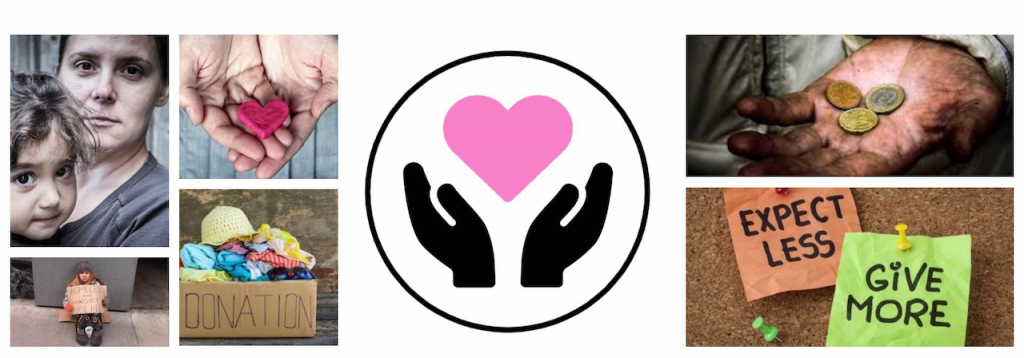
Components which curated our ‘Design for Friction’ Moodboard
Our Goal: The ‘How?’
Making direct donations to the needy (near you) convenient and accessible with our solution Good Samaritan.
Good Samaritan allows users to utilize delivery apps that you may already have on your phone to easily deliver food & goods directly to members of the homeless population near you.

Target Users: You & me and everybody else in Berkeley, California.
The Team: Phoebe P, Kimberly Hirch, Joseph Hayes, Sneha Chowdhary (Me)
Our Approach
We broke our design process into 4 main phases. First, the research phase, to help figure out what the real issues were, where the gaps lie between people donating to the needy/homeless and how, if possible, this could be overcome. From where we moved on to draw our observations by Empathy Mapping (still part of the research phase). This helped us conclude our problem statements in the form of ‘How might we’s’ (the result & final part of the research phase).
Once we knew the kinds of problems we were focusing, we prototyped our individual solutions and ran usability tests on them, which aimed to overcome the friction in the donation experience. From the feedback received we iterated our designs to produce our final solution: Good Samaritan.
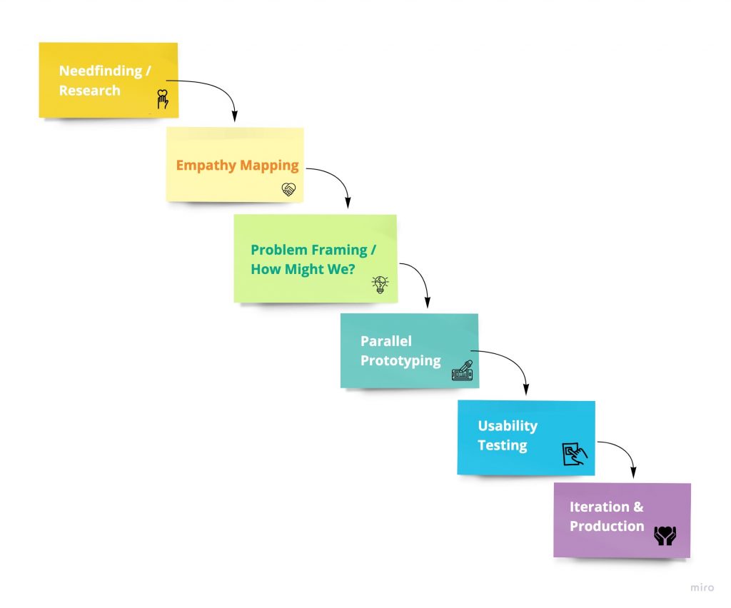
Design Process used for Good Samaritan
Phase 1: Research
(1) Need finding is the technique in the design thinking process that helps us uncover what a user is looking to achieve and how they’re actually looking to achieve it. Standard tools used to conduct need-finding include user interviews and observation studies.
Example questions we asked during the need finding phase included:
- What were we looking to answer when someone would use this app?
- Would someone actually use this app? How would someone feel using this?
- What & how do people prefer donating?
To conduct our need finding, we went about creating a need-finding interview guide to gather insights and map out how our target users feel about the donation experience & their experiences with the homeless. Our questions were asked such that they resulted in open ended answers. Here’s the link to the detailed interview guide & my findings.
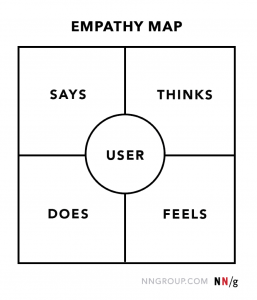
The standard empathy map template
The conclusion from need finding resulted into our (2) Empathy Maps. This is a design methodology that helped us uncover (interpret) and make sense of what our users were saying and what our observations from their actions indicated.
Once we collated our findings, to consider all perspectives, we even interviewed the receiver here to get thoughts from the other side. We structured these into the resulting empathy maps:
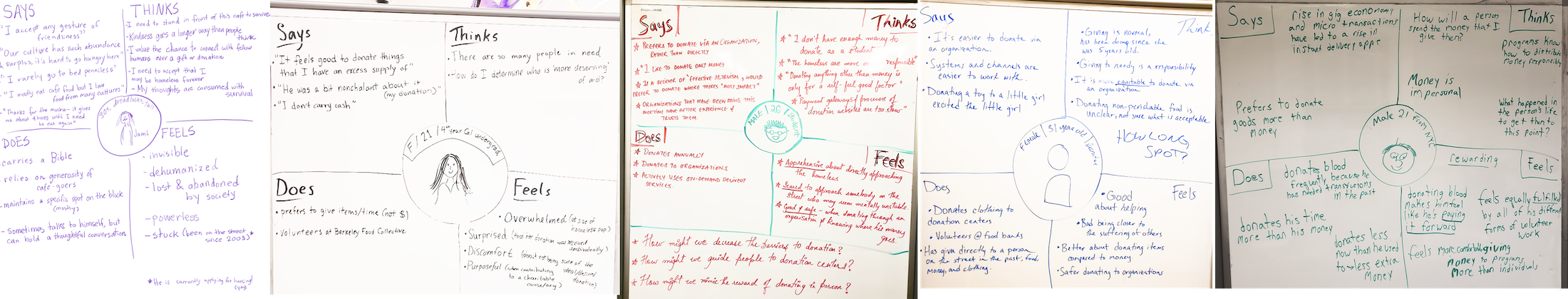 The conclusions from empathy maps, helped us deduce our target users primary needs:
- Need to know where their money went & the impact it made
- Need to feel safe during their interactions with their receivers
- Needed to feel comfortable approaching people in need
Which helped us frame our final (3) Problem Statement:
“How might we reduce barriers to donation by decreasing the social friction?”
Phase 2: Prototyping
The prototyping phase is where I like to sketch out my thoughts and let them run free. Concepts we learnt in class which conventionally help with flaring this include creating prototypes for
- Most likely to work
- The most rational
- Most likely to delight
- The dark horse
Since this was an iteration of a project we previously worked on, this time we decided to go with Parallel Prototyping instead so we could produce different perspectives to eventually test two of the key factors our ‘How might we’, tried to answer. i.e:
- Teaching someone how to interact with a receiver – reducing the social stigma & giving them the confidence and tools to do so
- Using the apps experience to make it easy to donate through a vendor – thus reducing the barrier of helping someone in need
Here are some of the low & mid-fi sketches which I used to answer these and eventually used for my usability testing:
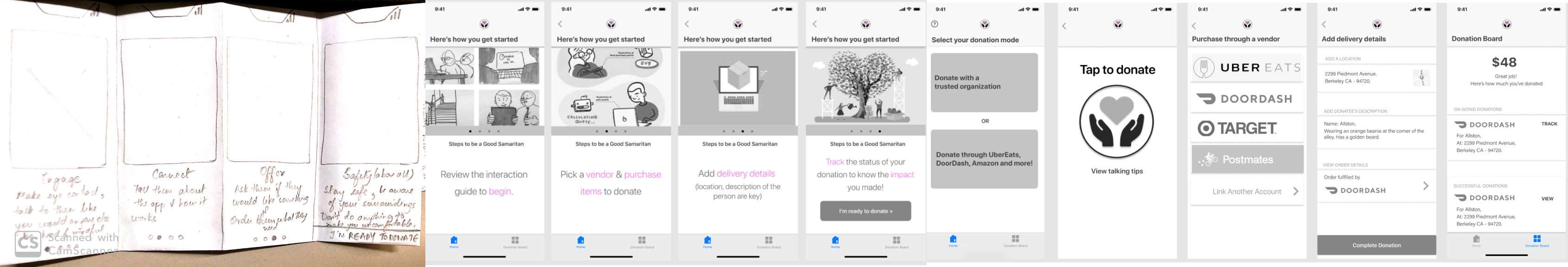
Left to Right: LowFi + Mid Fi onboarding experience and MidFi App experience
Thinking through my sketches I always try to use the heuristic evaluations, as my design methodology/guiding light. This helps me keep a check on where the user may get stuck and how I could get them out of there. Additionally, still ensuring that this flow was answering the question we set out to solve.
To validate it we moved on to actually test the prototype with potential end users through usability testing.
Phase 3: Usability Testing
In order to conduct a successful usability test, one must be prepped and what really helps is having a Usability Testing Guide. The point of the guide is to use scenarios your users would eventually perform on the app if it were a real one.
This can be achieved by creating ‘tasks‘, having a set of steps you expect the user to perform and seeing if they’re able to achieve it or not. The idea is to see how well your app has succeeded in answering the problem(s) it’s trying to solve and how seamlessly a user is able to progress through them.
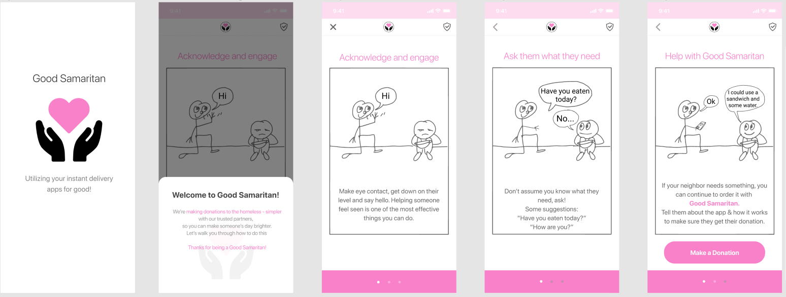
My teammate, Kimberly & I building our usability guide
To give you an idea of the components and framework of a guide, here’s the usability guide we created for our use case with a link to the prototypes each of us tested.
The findings from our tests were all summarized to leave us with key Usability takeaways which were so insightful and would not have seen light otherwise. Some of these included:
- Minimize text to avoid overwhelming the user
- Explain the purpose of the app before the story-onboard screens
- Include safety tips so that people know what to do if they are uncomfortable
- Depict connection between vendor apps and GoodSamaritan – what happens in between?
- Description of the receiver must come before they’re guided to the vendor app
- Having Summary & Impact once their donation was made was delightful
With these & some more – we went back to our drawing board to iterate toward our final solution. Here’s the link to the summary/analysis from the usability test I conducted.
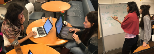
Phase 4: Iteration to our final solution
Iteration is essential to great design and ultimately a great product. Every iteration of a design seeks to include an improvement which helps achieve the ultimate goal in a smoother fashion for an end user. This is precisely what we tried do with our final solution by being considerate of the usability findings & incorporating each of our takeaways into it.
Here’s an overview of what we ended up with:
- A complete introduction to our app and what it was about
The introduction walkthrough of Good Samaritan
- A comprehensive interaction, disengage & talking tips guide for users to overcome their stigma and feel as safe as possible before approaching their potential receiver
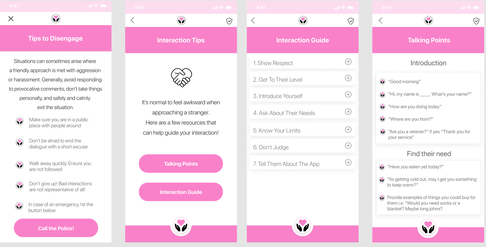
Good Samaritan’s interaction & safety guide
- Micro-interactions to help guide users with feedback based on their inputs
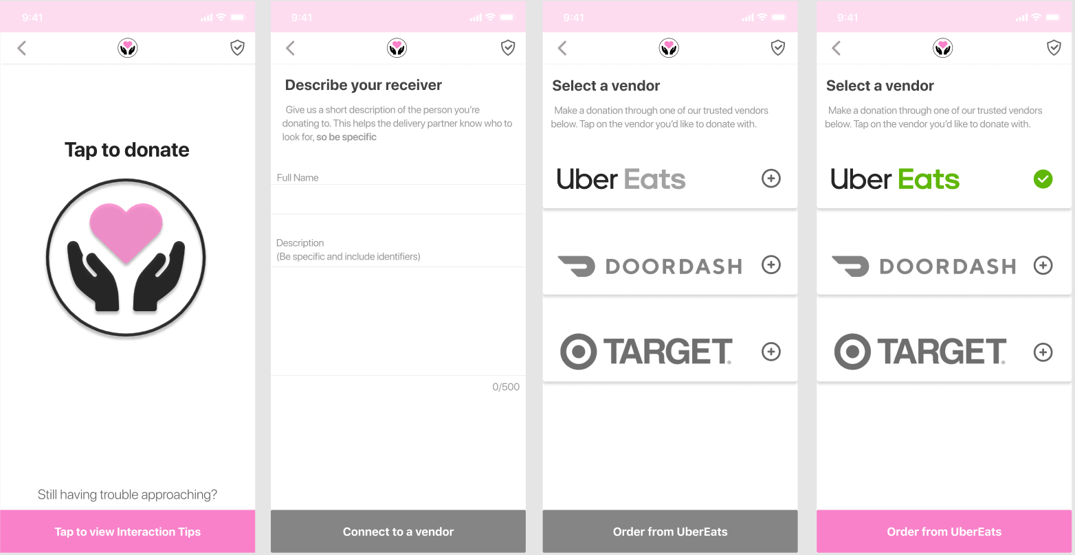
Micro interactions providing feedback of progress
- An end-to-end connected experience of the link between apps to make it more seamless and easier to comprehend the progress a person would go through while also being able to quantify their impact
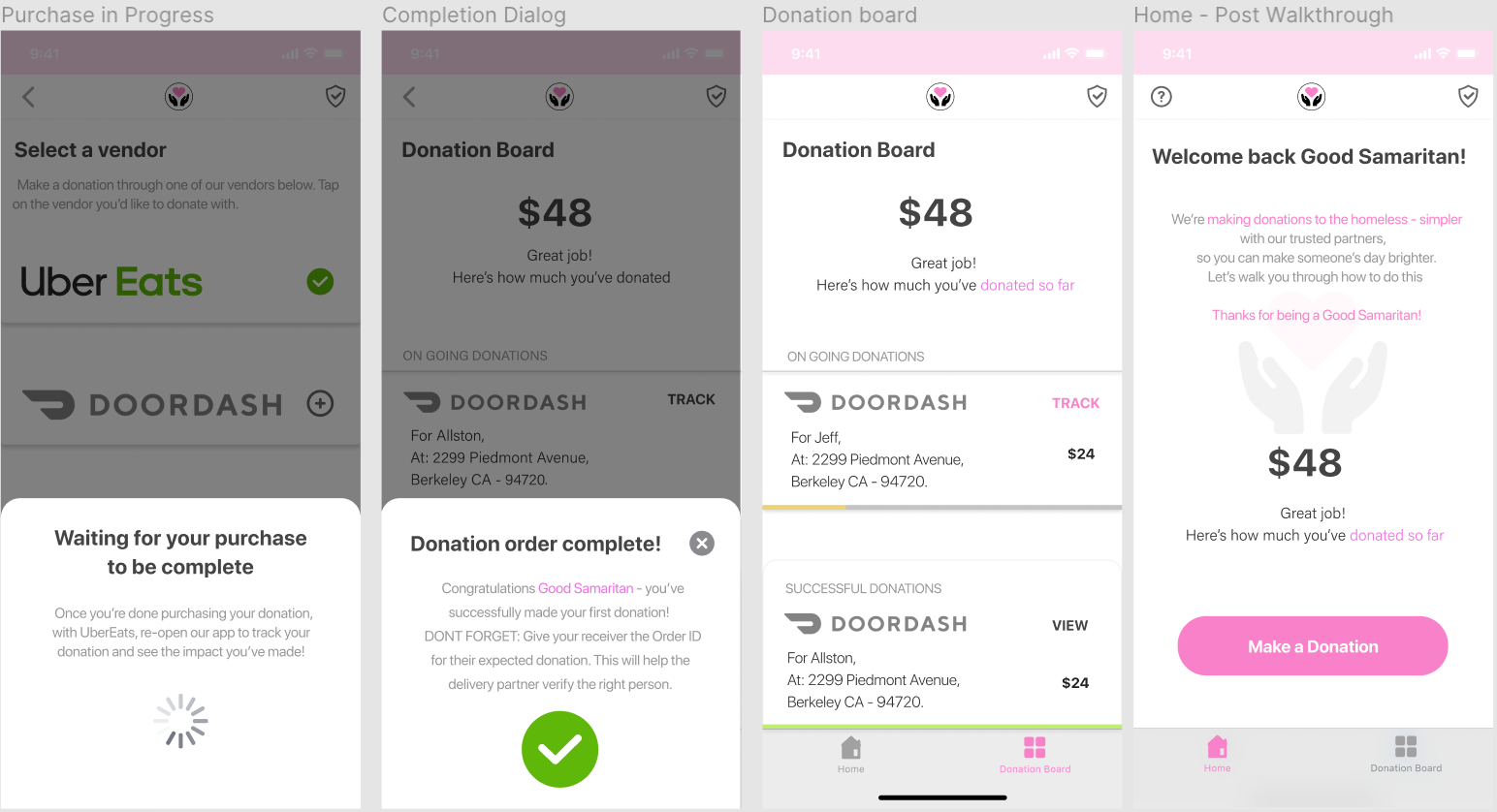
Connection between the vendor & Good Samaritan and impact of donation
And that’s a design wrap!
My overall design takeaways included finer details which mapped concepts I picked up over the course the Introduction to HCI class, helping justify why I was making some of the decisions, guiding me to what my key decisions were and keeping the user at the focus of what I was trying to solve by reminding to ask, that one ‘how might we’ over and over and over!
Concepts we mapped throughout:
- Aesthetics
- We made an association in the style of our app through bringing out a sense of ‘softness’, ‘affection’ and ‘empathy’ with our choices in typography and color combinations
- We aimed to find balance with our incorporation of ‘white space’ through each screen a user encountered
- Applying Gestalt’s principles on representing information in blocks, we associated relative information together to let our design speak for itself
Find more details from our first article here.
- Using grid systems
- These helped us maintain symmetry and consistency across the app
- Defined guidelines for us to stick by, irrespective of who was designing
- Since the primary market we were designing for was iOS based, we heavily relied on Apple’s Human Interface Guidelines to guide us
- Using concepts from the Design of Everyday Things:
- We tried to keep a ‘match between the real world and the system’ with subtle choices in our iconography(Eg. Shield to depict Safety) and states of interaction and the affordances of gestures users were allowed on each screen
- The 10 Design Heuristics – helped keep us on track while navigating to and from our onboarding to the interaction guides, delivering usability
- Focusing & Flaring is what helped generate ideas for the 2 concepts we tested to solve for of, ‘overcoming a social barrier between people’
I came out happy but acknowledge the improvements that could still be made with yet another round of iteration on this – but I’m glad we got I far though.
Thanks for reading!
Get in touch: snehachow@berkeley.edu | Linkedin