Something about me:
I am a designer who is trying to improve the user experience in every aspect of my design. I love the minimalist style that describes the stories and processes clearly; I have many whimsical delightful ideas that might not be very realistic at the beginning. When we were trying to relieve the stress related to pet raising for pet lovers, I suggested a mystery box that delivers a different pet to pet lovers every weekend. I value the feedback from all users. I always try to fulfill the need for all users in my user group with proper user need prioritizing. I believe that the software does not has to have all the functions, but it must be aesthetically pleasing. Since a style of the software would not change a lot while the functionality of the software is always improving.
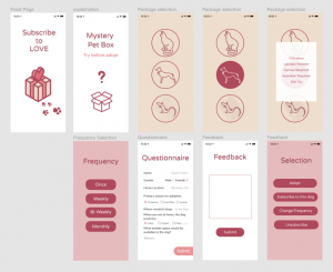
During the learning process, I realized that the balance between minimalist and conveying information is really important. In this project, I want to utilize minimal icons to convey the basic idea of the mystery box. However, the software was very confusing to the users without enough texts. Moreover, I learned that sticking to the same background color is also very important.
Update LOVE
Project Background:
Long-distance relationships are hard to deal with since the communication between individuals has been weakened due to different reasons such as the schedule conflict or timezone difference. In this project, we are trying to make close the gap of communication. My teammates have investigated this issue with both romantic partners and family members. After conducting user interviews, numerous responses were related to “keep in touch without bothering each other. However, talking about all romantic relationships and family relationships is too broad of a topic. As a result, we decided to focus our user group on the college student and their parents since these two user groups are really accessible to us as a student.
Need finding:
We then conducted a few need-finding user interviews targeting the user group we defined earlier. We came to the users with some lessons learned from previous prototypes and rough prototype ideas of ours. The users confirmed the need and proposed a few examples of how they usually interact with each other before the college student leaves home and after. They also provided us some functions that they think would be nice to have like what update they would like to have on each other.
Based on this interviews, we made 3 “How Might We”s that can solve the interviewees’ problems and help their communications with their children or parents.
- How might we unobtrusively allow both parties to feel connected and supported?
- How might we unobtrusively provide routine updates?
- How might we allow parents to motivate and track their child’s behavior?
We made 3 prototypes and tested usability each for these.
Prototype I: Notable(Figma)
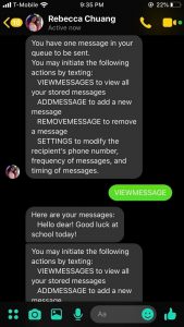
I created a Wizard of Oz prototype for a text-message chat bot to help users send texts following their specified schedule.
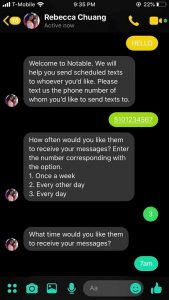
The problem this prototype intends to solve is: how might we unobtrusively allow both parties to feel connected and supported.
The questions this prototype tries to answer are:
- How do users prefer to communicate with a chatbot?
- Do users enjoy the experience of using a chatbot?
- How do users interact with a chatbot?
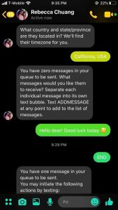
This chatbot works through text messages and is initiated by the user who contacts the chatbot’s number first. On the receiver’s end, the chatbot sends messages set by the user at the time of day and frequency set by the user. During initial set up, the chatbot prompts the user with questions that the user answers by replying to the chatbot. These questions include, “What time would you like the receiver to receive your messages?” and “which state and country are they located in?” so that the chatbot can generate the correct time zone for the receiver.
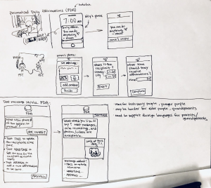
Prototype II: Daily update(figma prototype)
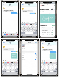
The “How might we” this prototype is trying to solve is “How might we unobtrusively provide routine updates?” We have made an add on feature to the Messages app. By utilizing the intrinsic workflow and chatroom interface, we want to reduce the effort elderly user has to obtain in order to use this feature.
The question this app is trying to answer is what information do users want to get updates on?
This prototype works as a add-on feature in the Messages app. After clicking on the app, the user can select between different types of daily updates. The interface presented the weight tracker template where the user can record information like their weight, the amount of protein they ingested, or whether if they ate fruit or breakfast today. After clicking on the submit button, the record will be sent in the chat room. This prototype can also forward people’s post from other social media. All the user have to do is to link their social media with this app and click on forward whenever they make a new post.
Prototype III: Mission(figma prototype)
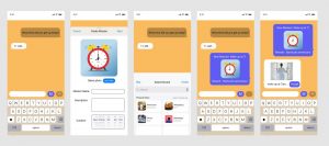
Our third “How might we” was “How might we allow parents to motivate and track their child’s behavior?” so we made a prototype that allows parents to create a mission with name, description, duration and reward. If their children completed the mission and the parents accepted the success, the children can get the reward like a book and drinks.(Parent user can choose it)
By using this app,
Parents can start conversation about what they want their children want to do and give them a present they want to give.
Students(children) can try to fix their behavior happily.(Usually, parents nagging bothers them and even though it is a very helpful advice for them, they don’t want to follow it.)
Parents and Children can both have fun of these series of things and consequently, they can start conversation smoothly.
Usability test:
After designing the initial prototype, we conducted 6 usability test with both the parent user and the student user.
Parent User I: Brait, 55-year-old dad who has 2 daughters
Parent User II: Joy Park, 47-year-old mom who has 2 daughters
Parent User III: Jake, 54-year-old parent of two college students
Student User I: Svan, 23-year-old college student who went to school overseas
Student User II: Youngin Jin, 20-year-old college student who lives in a dormitory
Student User III: Lou, 22-year-old Berkeley student. His mom lives in Southern California.
In conclusion, most users found the text version of too wordy and do not want to read through the long texts. They also prefer not to type long words to reply and make their choices. Most users found the daily update to be helpful and easy to use. Some users thought the weight tracker is the only update they can do which means that our prototype didn’t reveal enough update types. However, they do not want to send the record every time they record something. Moreover, they would prefer a better presentation of the data like a story page or a data library. For the mission prototype, the users were confused by the prototype and thought it was a scheduler.
Final prototype:
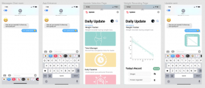
Refined prototype of Prototype III(Mission): Link of this figma prototype
Based on the feedback from the usability tests, we decided to further improve the daily update prototype. First of all, we provided three update types that the user can choose from. Moreover, if the user clicks on the weight tracker, they can see all the past records of theirs in a chart which helps them to keep track of their weight change over time.
Conclusion
Long-distance relationships between romantic partners and families are hard problems to solve. We conducted a few user interviews and also a few prototypes. We decided to focus on college students and their parents. After conducting user need-finding interviews, we confirmed the need from the users. When the child leaves home and left for college, it is hard for the parents to get used to life without their child. Moreover, many parents are having trouble ensuring that their child is safe and sound. They also find it hard to ask for the update of the child’s life without disturbing their live. As a result, we started to think about how might we provide an unobtrusive, supplemental avenue of communication for routine updates between empty nesters and their children?
As a result, we created three different prototypes: a text-based chatbot that delivers predesigned messages at a pre-scheduled time, a daily update feature that sends the data of the user to their parent’s and vise versa, and an app that creates incentives for people to fulfill the missions created. With different questions in mind, we decided to conduct a few usability tests with both the parents and the college students. Most users understand the workflow for the chatbot yet not willing to read through every text. Most users understand the workflow for the daily update feature yet wanted more record presenting and library features. The mission creation app is pretty confusing to the user. As a result, we developed the daily update feature further utilizing the feedback from the user.
After presenting to the class, the audience provided valuable feedback and suggestions. One such suggestion was adding a photo-sharing feature to the health tool so users could share photos of their meals which would be an easy way to share nutrition information. Another idea was to limit the number of updates people can request each day. These would be great directions for us to pursue moving forward.