About me

My name is Daniel I’m a 4th-year computer science and electrical engineering major at UC Berkeley. My areas of concentration are two very distanced types of design: Computer Architecture Design and Human-centered design. You can find My technical and non-technical work on my portfolio or connect with me on LinkedIn. Outside of my time a school I love photography 📷, cooking 🥘, playing tennis 🎾, hiking, and sailing⛵️. I’m also very interested in the intersection of politics (social decision making) and technology. I’m currently looking for product management or UX research internships.
Design Manifesto
How might we design, and why?
To begin with, I would like to take a step back and share why I believe we should all learn how to design. During our life journey, we all collect an array of experiences, some are positive, some are negative. We can control some of these experiences and turn the negative ones positive. Design is a great tool for that, if we follow some of the principles of human-centered design relays on we can, in fact, help others who share the same universal experiences turn their negative experiences positive more easily, and make an impact.
Personally, some of my obstacles have forced me to design alternative routes that I wish to share with others to make their life easier.
Failing Forward ⏩
To find these alternative routes I had to first learn that the common routes didn’t work for me, I had to fail. I wouldn’t have discovered these alternative routes had I not failed many times until I reached the goal. The notion of falling forward is one of the key principles in design. It’s the beginning and end of every design cycle. We have to iterate over and over again until we reach the solution that answers the need we initially aimed to solve.
I typically like to use rapid prototyping by creating low fidelity prototypes that are sufficient to depict to the target user how the prototype works and gauge if the design is headed in the right direction. This technique worked great this semester as I learned valuable feedback that changed my perception of my design of an app to help TA’s better understand their students (Link module 4). For example, the red and green websites that allowed TA’s visually see where their students stand in terms of their understanding provided many insights to the users’ concerns.
Take a risk, ride the dark horse 🐴
Sometimes finding an alternative path or a solution that works requires us to take a leap of faith and look through our user’s lens. We must identify with the user to design for the user and listen to their feedback. I personally like a shadow and interview my users, and then summarize my findings using a design ethnography and personas. Then after the prototype is read I use the initial mental model and user interview along with the testing outcomes to better understand the use using empathy maps.
a kaleidoscope of narrow ideas
To improve the product even further, sometimes you need to create an array of solutions that take a different approach at solving the user need In a specific manner, much like how a kaleidoscope uses the same jewels to create different images. This will allow the designers to better compare and contrast (flare and focus) their design and receive more authentic feedback from the user to identify the approach that solved the issue in the most effective way. We used this technique during the last design for the iteration module where we used the feedback we got on the four products we built to condense all the features that proved to be effective for our users.
Gaussian blur
When users provide ambiguous feedback that makes it hard to find a general trend I love to have an official brainstorming session that uses sticky notes and Dot voting to hypothesis new approaches and classify them into categories that can, later on, be consolidated into categories that the prototypes focus on.
The Final Pitch 🏁
There any many techniques that can help the designer be more informed about their design process. The designer must pick the techniques that are the most adequately for their users or product. For example, a product that is used by one user at a time might be more suitable for A/B testing but a product that serves many users simulants lot might be better tested in focus groups or shadowing (ethnographies). Using the different design techniques we can better designers by better understanding our users and weather we solved their needs.
Final Design Project – Get It! app
Design for Iteration: Large College-Level Courses
Introduction
Every year, class sizes at large universities increase. For example, this Fall, UC Berkeley’s very own introductory course CS 61A exceeded 2,000 students enrolled, making it one of the largest beginner computer science classes in the world. Teaching and facilitating such large classes, though, also has its drawbacks and difficulties.
As a group, we interviewed both student teaching assistants (TA’s), graduate student instructors (GSI’s), and professors f
or college-level classes with over 300 students. We then tested out 2 of our prototypes made from the previous need-finding module in our INFO 213 class and iterated based on our user’s feedback.
Need Finding
We set 3 specific questions for need-finding and improving our prototype design:
- What kind of data would help TA improve their sessions?
- Would it be better to collect the data before sessions, during sessions or after sessions?
- Would it be better to keep students anonymous or not?
After interviewing 6 Teaching Assistants and 3 Professors at UC Berkeley we found a few insights that helped us pivot while including some of the features users liked in our prototypes from the previous module:
1:1 Interview Insights:
- TA’s cannot gauge the class while teaching
- Students don’t voice their issues
- Professors do not want anonymous feedback because it discourages a personal connection with the professor
- Would like feedback in more than once a semester as getting feedback at the end of the semester is too late to improve
- She feels like it is very important for the student to feel like they are in a safe space to want to participate and tell the professor if they do or do not understand the lecture content
- Students feel stressed when using Piazza, therefore, do not want to use it, results in a lack of interaction
Initial Prototype Testing Insights:
- TA’s wanted to have an interface to help them guide the section
- The achievement bar on top was too cluttered
- Real-time understanding does not reflect the students learning process as it’s natural for students to be confused before understanding content
After considering both insights from 1:1s and testing we found our interviewee’s needs, we discovered a general consensus amongst all our subjects that there needs to be a method for testing the knowledge of students in a safe space where they won’t feel like an outcast. We specifically chose the word “communication” to convey an open-ended-ness of what exactly was being communicated previously but we have now converged to the communication being about the content of the lecture.
Target User Group
Our current user groups are split into 2 groups:

We defined our user groups to be Students and TAs as our solution is for the communication of these 2 groups and therefore they would both use this app.
How Might We Question
Original HMW Question: How might we streamline communication between instructors/facilitators and students?
After our need finding and research synthesis, we flared and eventually focused until we reframed our HMW question.
Reframed HMW Question: How might we use technology to help TAs get a better sense of student’s understanding during sections?
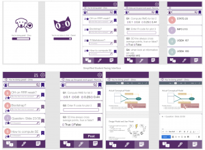
Low-Fi Prototype
Hi-Fi Prototype
- Problem 1: Which would be less obstructive? Collecting data before session, during, or after?
- Problem 2: How can we destress students and incentivize them to participate more?
- Problem 3: How can we cater to different professors’ preferences?
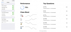
- Problem 4: What are the most helpful data? How can we better present analytical data that’s easy to understand?
Constraints of the Design Space
The technology that we developed should be very easy and intuitive to use following the common design practices because we must ensure that students attention doesn’t shift to using their phone instead of paying attention or take too much of their time to provide the feedback in a way that interferes with the learning process
In order to ensure that feedback isn’t constitutive, we must prevent dishonest feedback. Therefore feedback cannot be anonymous and we have to collect some personal information about the students. This is a data privacy concern/constraint from the TA’s and student’s perspective if TA’s or students have their performance logged in some way in the app.
Different professors and TA’s have different teaching styles. We tried to account for this but sometimes having many options introduces complexity to the intuitive usability of the interface.
User Testing
- Make the app lecture content or discussion specific. For example, tie the sampling Time to based on the feedback at the end of each question and not based on a time interval
- Add a section where lost students or students who fall behind can read the solution or watch solution video to not feel like their time was worthless and they are lost.
- Add functionality where students who are asking questions can reference. Students forget the question that was asked or want to easy way to refer to them
Next Steps
- Because of time constraints, we weren’t able to test the prototype in a live section so we want to test this prototype in a section.
- Make the look and feel of both sides seem more coherent. The 2 different sides were made by separate sub-teams in the team and therefore have a different look and feel to them so we would come to a conclusion about a universal color scheme that would work for both sides.
Reflections
Some things I learned during this project and working with this user group is that both TAs and professors want to create an environment that students can participate in but they are very limited in the time they can spend to make those connections and make them feel comfortable so a gap between these 2 groups of student vs. faculty arises which can be a barrier to them working very well together. When this flaw is highlighted both groups become a little defensive because they are frustrated but don’t know how to fix it so it’s important to be very open to rejection and reassure them that it is of no fault of their own. Another internal team lesson was that I should set meet up times while we are all together, set out to-dos when team members are face-to-face because it’s hard to bring everyone together again and explain their tasks, etc.